Apparel Five Panel Caps Logo Placement Basics
The tricky part of apparel Five Panel Caps logo placement is that the cap itself decides a large share of the final look. A front panel may appear broad on a spec sheet, then narrow once it curves over a real head. A logo that feels balanced on a flat digital mockup can land too high, too wide, or too close to the seam once it is stitched or patched. That gap between screen and wear is where most mistakes begin.
Five-panel caps give brand owners a cleaner front than many six-panel styles, which is why they are so common in retail, streetwear, and promotional runs. The single front panel creates a more open branding zone. It also makes the eye less forgiving. If the logo is even slightly off-center, too large for the crown, or competing with a seam line, the issue shows quickly.
Buyers usually talk about placement as though it were one choice. In practice, it is a set of choices: where on the crown the mark sits, how large it is, whether it is embroidered or applied as a patch, and how much the cap shape changes once worn. Those decisions affect read distance, perceived quality, and even the resale feel of the cap. A 2.75-inch logo on a low-profile unstructured cap can look precise. The same art at 3.5 inches on a taller structured crown may feel crowded.
That is why the conversation should start with the blank, not the logo file. Crown depth, front-panel stiffness, brim curvature, and closure type all influence the result. The best apparel Five Panel Caps logo placement is the one that survives those variables without losing legibility or comfort.
How the Front Panel Changes the Look
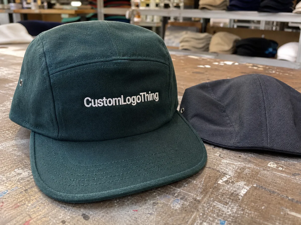
The front panel is the reason five-panel caps work so well for branding. It is cleaner than a crowded six-panel front, and that simplicity gives a logo more breathing room. But “cleaner” does not mean flat. Even on a structured cap, the panel curves, pulls, and bends in response to the crown shape. On unstructured styles, the panel can relax enough to change the perceived angle of the artwork by several millimeters.
Structured and unstructured caps should not be treated as interchangeable. A structured five-panel cap usually holds a taller front, so it can support a stronger mark, heavier stitching, or a slightly larger patch. An unstructured cap sits lower and softer. It often looks better with restrained branding, especially if the logo has thin lines or tight letter spacing. The same design can feel premium on one blank and oversized on another.
Brim shape matters more than many buyers expect. A flat brim creates a very direct reading line, while a gently curved brim shifts the logo’s visual center downward. On caps with a more pronounced curve, artwork placed too close to the brim can feel compressed. Add closure style into the mix - snapback, strapback, or fitted - and the logo may appear to move even though the measurements are technically correct. That is not a production error; it is how the cap reads in motion.
Decoration method changes the visual weight as much as placement does. Embroidery has height and texture. Woven patches hold detail more cleanly. Leather patches are about contrast and surface, not fine type. Heat-applied decoration sits flatter, but it is more sensitive to fabric choice and adhesive performance. For apparel Five Panel Caps logo placement, the method should be locked in before the final size is approved, because each decoration type changes how much front-panel space is truly usable.
Material also shifts the outcome. Brushed cotton and washed twill soften a logo slightly. Nylon and ripstop tend to keep sharper edges but can make stitching or adhesives more demanding. Heavier cotton canvas can support a more dimensional finish, though it may increase the risk of puckering if the stitch density is too high. A placement that looks exact in a PDF may need a modest adjustment once the fabric is selected.
Key Factors That Decide the Best Placement
Logo size is the first real filter. Buyers often start by asking where the logo should go, but the better question is how much usable space exists after the seam, crown slope, and brim line are accounted for. On five-panel caps, a logo that is slightly smaller and correctly positioned usually looks sharper than a larger mark that stretches into the panel edges. Clean spacing reads as intentional. Crowding reads as rushed.
Detail level comes next. Thin strokes, micro text, and layered gradients can survive on a screen without issue, then fall apart in embroidery or patch production. A stitch path needs enough body to hold shape. A woven patch needs enough room to preserve legibility. If the design depends on narrow lettering or delicate lines, the artwork may need to be simplified before production. That is not a compromise so much as a translation.
Brand intent also changes the placement decision. Promotional caps usually need immediate visibility, so the logo can sit a little more assertively on the front panel. Retail caps often benefit from restraint, especially if the cap is positioned as a premium accessory rather than a giveaway. Uniform caps have a different standard again: they need durability, consistency across size runs, and easy repeat ordering. Event caps often sit somewhere in the middle, with time pressure and budget pressure pulling in opposite directions.
Color contrast is one of the easiest checks to overlook and one of the fastest ways to lose impact. Dark cap, dark thread, dim lighting: the logo can disappear. Light cap, pale patch border, high-gloss material: the art can lose definition in a different way. Thread color, border color, and backing material all matter. A charcoal logo on black twill may feel subtle and expensive in daylight, then nearly vanish indoors. Meanwhile, a white or cream patch on a soft-washed cap can read cleaner than a dense embroidered fill.
Symmetry deserves more attention than it usually gets. A centered logo is not always a visually centered logo. If the artwork contains a strong direction - a slanted icon, a long wordmark, or a mark with unequal negative space - the cap can look off balance even when the file is mathematically centered. This is where a physical sample is more honest than a mockup. The cap shape, the logo weight, and the viewer's distance from it all influence the result.
A logo can be centered and still look wrong. On a five-panel cap, the eye cares more about crown geometry and visual weight than about the exact midpoint in a design file.
Placement should also be read at a normal viewing distance. A cap worn in the real world is usually seen from three to six feet away, not from zoomed-in PDF scale. That matters because tiny adjustments that look trivial on screen can change how the cap reads at retail or at an event. If the goal is shelf presence, the logo needs enough separation from the brim and seam to read as one shape. If the goal is subtle branding, the logo can sit lower and quieter without losing purpose.
If your order includes shipping cartons or insert cards, packaging choices can matter more than expected. Paper-based pieces with FSC certification may fit better with a brand that wants traceable material claims. That does not affect the cap decoration directly, but it does affect how the final order is perceived when it leaves the box.
Cost, MOQ, and Unit Pricing for Branded Caps
Price is not driven by the blank alone. Fabric, crown structure, closure type, decoration method, stitch count, patch construction, and order size all play a role. A plain five-panel cap in bulk may sit around $2.00-$6.00 per unit depending on the material and build. Add decoration and the range changes quickly. The logo choice and the placement choice should be treated as one budget decision, not two separate ones.
MOQ changes the economics in a very practical way. At 50 pieces, a setup-heavy patch can push the unit cost up in a visible way. At 500 pieces, that same setup spreads out and becomes much easier to absorb. Embroidery tends to be simpler for smaller runs, especially if the logo is clean and the stitch count stays moderate. Woven and leather patches often look more premium, but they can make sense only once the order size justifies the tooling and lead time.
Typical setup charges are not huge on their own, but they add up across revisions. Digitizing for embroidery often lands around $20-$60, depending on complexity. Patch setup can run $35-$120, and custom shapes can go higher if the outline or backing needs special treatment. Sample fees, thread changes, and artwork revisions may also show up. None of that is unusual. The problem is surprise, not the cost itself.
For a fair quote comparison, keep the variables identical: the same cap blank, the same logo size, the same decoration method, the same placement, and the same quantity. If one supplier prices a 3-inch front embroidery and another prices a 3.5-inch patch, you are comparing two different jobs. That kind of mismatch creates a lot of false certainty during sourcing.
| Decoration method | Typical setup cost | Typical unit add-on | Best use case |
|---|---|---|---|
| Embroidery | $20-$60 digitizing | $0.60-$1.80 | Clean logos, durable everyday wear, moderate detail |
| Woven patch | $35-$120 setup | $0.90-$2.20 | Fine lettering, premium texture, compact artwork |
| Leather patch | $45-$150 setup | $1.20-$3.50 | Heritage look, tonal branding, rugged finish |
| Heat-applied patch | $30-$100 setup | $0.80-$2.00 | Lower-profile branding, faster production, flexible shapes |
Needle time, heat time, and finishing time are real production costs, even if they do not always appear as separate line items. A complicated embroidery path may add only a few cents per cap, yet it can slow a line enough to matter on large orders. A patch with multiple color blocks may be cheap to apply but slower to approve because the artwork has more parts to verify. On a tight deadline, time can cost more than material.
For buyers focused on margins, the useful comparison is not “cheapest logo” but “lowest total landed cost for the quality level I need.” A low-cost embroidered cap that puckers or loses alignment is expensive in practice. A slightly pricier patch that holds shape and reads cleanly may be the better value if the order is for retail or a visible event.
Production Steps, Proofs, and Turnaround
Strong production starts with cleaner input files. Vector art helps. So does a clear cap specification, including style, color, crown type, closure, and target size. The more exact the brief, the fewer proof rounds you usually need. A note that says “centered on the front” is not enough if the cap has a deep crown, a noticeable seam, or a design that should sit slightly lower for wearability.
The proof stage is where apparel five panel Caps Logo Placement gets refined. A digital mockup may show the logo exactly where it is supposed to be, but a physical cap may demand a small shift. Lowering the mark by a few millimeters can open space above the brim. Narrowing the width slightly can stop the design from hitting the side curve. These are small changes, but they often make the difference between a cap that looks deliberate and one that looks just close enough.
Good proofing should include measurement, not just imagery. Ask for width, height, and distance from the seam or brim. If the logo has a left-leaning or right-leaning visual mass, ask how the supplier is compensating for that. A cap can be technically centered while still looking visually skewed. That happens more often than people admit.
Turnaround depends on the decoration method, the blank availability, the complexity of the artwork, and the current production queue. A straightforward embroidered run may take roughly 10-15 business days after approval, assuming the cap blank is in stock and the digitizing is straightforward. Custom patches, special materials, or larger quantities can extend that to 15-25 business days or longer. If samples are needed, add time for that stage too. A factory that does not have to pause for revisions will almost always move faster than one that is waiting on repeated artwork corrections.
Shipping needs a little attention as well. Caps can arrive technically correct and still look tired if cartons crush, brims bend, or inserts are missing. That is why transit expectations matter. Industry guidance from groups like ISTA is useful for thinking about packaging stress, even if the standard itself is not cap-specific. The cap may be a small product, but presentation defects are still defects.
If the order includes carton packing, branded tissue, or hangtags, those details should be approved before production starts. A cap run that is beautifully decorated but poorly packed can still disappoint at receiving. The product is not really finished until it arrives in a shape that can be sold or distributed immediately.
Common Placement Mistakes to Avoid
The first mistake is ignoring the seam line. On many five-panel caps, the center seam is part of the structure and part of the visual language. If the logo is pushed too high or spread too wide, it begins to fight the cap instead of working with it. The result can look crooked even when the embroidery machine or patch placement is accurate. That kind of mismatch is common because screens hide depth.
The second mistake is oversizing the logo to fill empty space. A mockup often makes that choice look safe. The cap looks fuller, the brand is more visible, and the front panel appears “used.” In person, though, a large logo can compress the crown and flatten the whole silhouette. On a retail cap, that usually reads as less refined. A little negative space above the brim often improves the overall shape.
The third mistake is asking one decoration method to do another method’s job. Tiny serif text in embroidery can lose definition. A patch with too many micro details can blur the message. Heat-applied graphics can look crisp in a sample and then lose adhesion at the edges if the fabric or press settings are not right. The cap should determine the decoration method, not the other way around.
The fourth mistake is skipping a wear check. A front panel may look balanced on a table and still shift once the cap is pulled on. That is especially true with softer crowns, deeper fits, and unstructured styles. One physical sample catches issues that ten mockups will miss. It does not need to be elaborate. It just needs to be worn, viewed from a distance, and checked for alignment after the crown settles.
- Check the seam line before approving center placement.
- Size the logo for the real panel, not the mockup.
- Simplify tiny text before embroidery or patch work.
- Review the cap on-head, not only on-screen.
Final Checks Before You Approve the Order
Before you approve the order, confirm the cap style, crown shape, logo dimensions, decoration method, quantity, and delivery date. Those six details absorb most of the risk. If even one is vague, the proof can still look fine while the production result drifts away from the brief. A clean approval should leave little room for interpretation.
Ask for placement measurements in inches or millimeters, not just a centered mockup. Confirm how far the logo sits from the seam, how much space remains above the brim, and whether the approved size is measured by width, height, or both. If the artwork is near the edge of acceptable scale, compare one version slightly smaller and one slightly larger. The more honest choice is often the one that gives the cap room to breathe.
Quality control should not stop at the art file. Check thread color against the cap color in the lighting where the product will actually be seen. Look for stitch density that is high enough to hold shape but not so dense that the fabric puckers. For patches, inspect edge trim, adhesive coverage, and border consistency. For heat-applied pieces, confirm that the backing is suited to the cap fabric and expected wash or wear conditions.
Final thought: the strongest cap orders are usually the least dramatic ones. The placement was measured, the decoration method matched the artwork, and the final proof was checked against the actual blank. That is what makes apparel Five Panel Caps logo placement feel controlled instead of improvised. The geometry, the fabric, and the logo all agree, and the result looks that way.
FAQ
Where should apparel five panel caps logo placement sit for the cleanest front view?
The cleanest front placement usually sits centered on the main panel and slightly below the top seam, with enough room above the brim to avoid crowding. The exact position depends on crown depth and brim curve, but the logo should read naturally from a normal viewing distance.
How does embroidery change apparel five panel caps logo placement?
Embroidery needs more breathing room than a flat printed graphic. Thin lines, small type, and overly wide shapes are more likely to warp, so the placement often has to be adjusted slightly lower or narrower to keep the stitches crisp and the front panel from buckling.
What logo size works best for apparel five panel caps logo placement?
There is no universal size, but front logos on five-panel caps often work best when they stay proportionate to the crown rather than filling every available inch. A moderate width usually looks cleaner than an oversized mark, especially on lower-profile or unstructured caps.
Does unit cost change if I move the logo to the side on five panel caps?
Yes. Side placement can require a separate setup, a different stitch path, or a new patch shape, so the cost may change even if the blank stays the same. The only fair comparison is a quote built on the same cap, the same decoration method, and the same quantity.
What should I send my supplier for exact placement approval?
Send vector artwork, cap style, quantity, color references, target size, and a clear note about where the logo should sit relative to the seam and brim. A marked-up mockup or placement reference helps reduce assumptions and shortens the proof cycle.
For most buyers, the best results come from treating the cap like a finished object from the start. Once the blank, artwork, and method are aligned, the process becomes far more predictable. That is the real advantage of careful apparel five panel caps logo placement: fewer revisions, fewer surprises, and a cap that looks intentional the moment it lands in hand.