Fitness Embroidered Baseball Caps Logo Placement
Fitness embroidered baseball Caps Logo Placement looks straightforward until the logo has to live on a curved front panel, cross a seam, and still read cleanly while someone is moving. Shift it by half an inch and the cap can go from athletic to awkward. That small adjustment matters because these hats are usually seen fast: at the gym desk, on a runner passing by, in a mirror selfie, or outdoors where glare and motion expose weak choices immediately.
The decision sits at the intersection of design and production. Seam layout, crown height, stitch density, thread direction, and fabric type all affect the final result. A mockup can look balanced on screen and still fail once the embroidery fills in. Good placement is less about decoration and more about three jobs happening at once: recognition, stitch quality, and brand fit.
Why Placement Matters on Fitness Caps
A cap is a small surface carrying a lot of brand pressure. In fitness, the logo is not just ornament. It signals energy, discipline, and whether the brand feels performance-driven or promotional. Place it too low and the visor competes with it. Too wide and the front panel looks crowded. Too small and it disappears the moment the wearer turns their head.
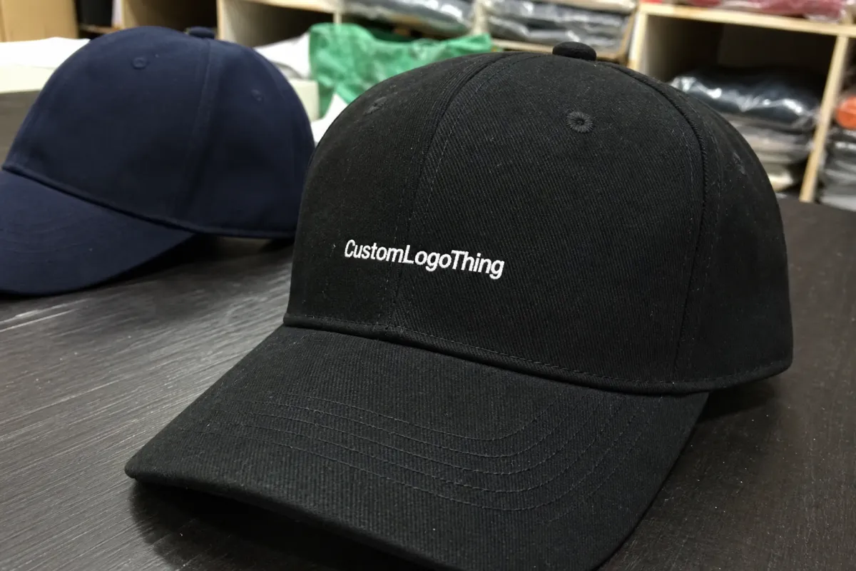
That is why fitness Embroidered Baseball Caps logo placement deserves more attention than many buyers expect. Gym retail caps, race-day giveaways, coach hats, and wellness merch all need quick recognition. Nobody pauses to study every stitch. They register silhouette, contrast, and balance in a second or less. If the placement works, the cap reads clearly from across a room and still looks deliberate in photos.
A logo that seems modest in a digital proof can look oversized on the crown, while a design that feels safe on screen can vanish once the cap is worn.
From a production standpoint, the best placement respects the shape of the cap. The front panel is curved, the seam can interrupt a design, and the fabric may stretch or collapse depending on the construction. Fitness brands care because the hat has to feel active, not like leftover promotional stock. That usually means clean front presence, not a design squeezed in wherever space happens to exist.
There is also a resale issue. A balanced cap can sit beside performance tees, shaker bottles, and training outerwear without dragging the collection down. An awkward cap can make the whole line feel cheaper. The hidden cost of poor placement is not limited to one item; it weakens the perceived quality of everything around it.
How Embroidery Follows the Crown
It helps to think of a cap as a shaped object rather than a flat blank. The front panel is the main decoration zone, but the center seam, panel joins, and crown height all change how thread lands. Structured six-panel caps usually give the cleanest result because the stiff backing holds the panel upright while the machine runs. Unstructured caps can work too, but they are less forgiving. If the design is too dense, the fabric can ripple or sink.
The visor changes the equation as well. When the logo sits too low, the brim steals attention. Many decorators begin by keeping the design high enough to clear the visor by about an inch, then adjusting for the cap style. That is not a rigid rule; it is a practical starting point. A low-profile cap often needs the mark placed a little higher because there is less vertical room before the visor starts to dominate the view.
Centered front placement is common because the eye goes there first. Still, centered is not always equal to balanced. A wide wordmark can feel cramped if it straddles the seam. A narrow icon may look stronger slightly higher, especially on a shallow crown. With embroidery, the difference between centered and visually balanced is sometimes a matter of a few millimeters.
Digitizing changes things again. The artwork is not stitched like a print; it is translated into a stitch map. Stitch direction, underlay, pull compensation, and density all affect how the logo behaves. A bold icon with solid fills can take a tighter stitch path. Thin lettering cannot. In some cases, a smaller but cleaner placement beats a larger one that forces the machine to fight the shape of the cap.
Useful rule: if the logo crosses a seam, keep the art simple enough to survive the break in the fabric. Fine lines, tiny counters, and decorative detail often lose the argument with thread.
What Changes Size, Position, and Readability
Three logos can use the same stitch count and still behave very differently on the same cap. Shape matters. So does scale. So does the audience. A circular icon usually reads well at a smaller size because the form is simple. A wordmark needs more width to keep letters open. A stacked logo can work on a mid-crown cap, but only if the lines are spaced enough that embroidery does not close the gaps.
Color count affects both the look and the cost. A one-color logo with strong contrast often appears cleaner than a four-color design that tries to preserve every detail. Stitch density matters too. Dense fills can make a logo feel premium, but too much density stiffens the panel and can create puckering. On lightweight performance fabric or mesh-backed caps, that tension shows faster because the base material flexes more.
Cap profile changes the answer as well. A high-profile cap offers more vertical room, which can help a logo breathe. A low-profile cap often looks better with a slightly smaller design placed a bit higher. Structured fronts are forgiving. Unstructured fronts are not. They expose weakness quickly.
Audience matters just as much as geometry. A gym staff cap may need a larger, more legible logo because people have to identify employees fast. A running club cap can lean lighter and more technical. A wellness promo cap handed out at an event may need stronger front-facing recognition than a retail piece sold to brand fans. The right placement depends on who sees it first and how far away they are.
Material finish changes the result too. Polyester performance caps, cotton twill, brushed canvas, and mesh-backed truckers all accept embroidery differently. Smooth fabric usually supports sharper edges. Textured fabric can blur the outline unless the digitizing is tuned carefully. If the design uses puff embroidery or raised elements, the logo needs even more clearance because the added height changes the side profile.
Typical logo widths for front embroidery on fitness caps often fall somewhere around 2.25 to 3.5 inches, though the right number depends on the cap shape and the artwork itself. Letter height is usually less forgiving than icon size; fine text below roughly 0.18 to 0.20 inches tall can become hard to read once stitching fills in. Those are practical ranges, not absolutes, and they shift with thread type, font weight, and backing.
The main point is simple: fit is not enough. The logo has to survive wear, movement, packing, shipping, and the way the crown settles once it is on a head.
Production Process and Timeline
A clean order usually moves through the same sequence: artwork review, digitizing, placement mockup, sample approval, bulk stitching, inspection, and pack-out. Each step sounds minor. Together, they decide whether the job lands on time. The fastest orders are the ones where the logo is clean, the placement is obvious, and the approval loop stays short.
Artwork review often takes one business day if the file is ready. Digitizing commonly adds one to two more days, depending on complexity. If the first placement proof is simple, approval may happen quickly. If the logo is wide, thin, or too close to the seam, expect at least one revision. That is normal.
Sample approval is where many schedules slip. A buyer may like the logo size on screen but want it moved up a quarter inch after seeing it on the actual crown. That tiny adjustment is easy in theory and expensive if it arrives late. The safer move is to compare two mockups early: one centered, one slightly higher or slightly narrower. That gives everyone something real to judge.
Bulk stitching is usually the most visible part of the timeline, but it is not always the slowest. Approval time can hold up the whole order more than machine time does. If the shipment needs better packing as well, that should be planned early. Caps that need to hold their crown shape often benefit from transit testing methods used in packaging programs, including the standards published by ISTA.
If the order includes inserts, hang tags, or printed belly bands, paper stock matters too. FSC-certified paper is a practical choice when the sourcing story needs to stay clean, and it is easy to confirm through FSC.
For planning, a standard timeline often looks like this:
- Artwork review and digitizing: 2-4 business days
- Placement proof and revisions: 1-3 business days
- Production on a standard quantity run: 5-10 business days after approval
- Inspection and outbound packing: 1-2 business days
Those ranges change with order size, stitch complexity, cap construction, and factory load. Even so, they are realistic enough to build a schedule without guessing. If placement is still undecided, production has not really started.
Pricing, MOQ, and Cost Drivers
Placement affects price indirectly more often than directly. A simple centered logo on a structured cap is usually the least expensive route because hooping and stitch order are straightforward. A design that needs extra digitizing, an additional sample, or a more complex stitch structure can raise cost even if the finished logo looks only slightly different.
The biggest pricing drivers are cap style, stitch count, color count, decoration area, and order quantity. MOQ matters because setup charges are spread across fewer units in a small run. A 72-piece order and a 1,000-piece order may use the same artwork, but the unit price will not feel the same. Smaller runs often carry a setup premium; larger runs usually benefit from efficiency.
| Option | Typical Use | Price Impact | What It Changes |
|---|---|---|---|
| Centered flat embroidery | Most fitness brand caps | Lowest add-on cost after setup | Simple hooping, clean front read |
| Raised puff front logo | Bolder icons and short wordmarks | Moderate uplift, often +$0.75-$2.00 per cap | Higher thread build and tighter artwork limits |
| Wide wordmark placement | Retail caps and team merch | Can add $1.00-$3.50 per cap if stitch count rises | More digitizing, more stitches, more seam risk |
| Second location on back or side | Coach caps, event crews, club apparel | Usually adds a second setup step and extra labor | Additional hooping and placement alignment |
For budget planning, many buyers see decorated cap pricing land somewhere around $3-$6 per unit on larger orders and $6-$12 per unit on smaller runs, before shipping, depending on the cap body and design complexity. Setup and digitizing may add another $35-$120 total. That range is not universal, but it is close enough to help with planning. The point is to work from a real quote, not a fantasy number.
Ask for pricing that separates setup, digitizing, embroidery, and shipping. If those pieces are bundled into one vague figure, the unit cost is not really clear. That matters with fitness Embroidered Baseball Caps logo placement because a cheaper-looking placement can sometimes cost more if it needs special handling. Clear pricing usually reveals whether the savings are real or just hidden in the proof process.
Mistakes That Hurt Readability
The most common mistake is placing the logo too low. Once the visor enters the visual field, the design feels compressed even if the measurements are technically correct. A cap can have enough stitch room and still look wrong if the art sits too close to the brim.
Another frequent problem is forcing a wide wordmark onto a front panel that is simply not wide enough. The logo may cross a seam, flatten the letters, or crowd the edges. That is especially risky on low-profile caps, where the visible front area is smaller than buyers expect. A slightly reduced design usually beats an oversized one that looks trapped.
Approving only a flat screen proof is another easy miss. A logo centered on a rectangle does not always stay visually centered on a dome. The curved crown changes the visual weight. What looks mathematically correct can still feel off once it sits on the cap.
Thread is less forgiving than ink. Tiny text, thin strokes, and delicate outlines are the first things to disappear when the needle starts laying down stitches. In many cap runs, letters under roughly 0.18 to 0.20 inches tall start to lose clarity unless the typeface is very simple and the digitizing is tuned carefully.
Overcomplicating the artwork is the final trap. Gradient effects, tiny taglines, and decorative linework may work on a screen print, but not always on an embroidered crown. Fitness Embroidered Baseball Caps logo placement works best when the design respects the medium. A strong silhouette often reads better than a detailed illustration because the cap already contributes shape and presence.
One more subtle issue: stitching too close to the edge of the panel can cause puckering, especially on lighter fabrics. Leaving a little breathing room around the logo gives the thread a better chance to sit flat. That margin is often the difference between crisp and overworked.
Practical Checklist Before Approval
The cleanest way to avoid trouble is to work from the cap first, then the artwork. A structured mid-crown cap, a low-profile rope cap, and a mesh-backed trucker all behave differently. Once the cap is chosen, the front panel dimensions define the real limits. That is the safest way to avoid approving a logo that only works on paper.
If the logo is borderline wide, ask for two mockups. One centered. One adjusted slightly higher or slightly narrower. The difference may be tiny on a ruler and dramatic on the actual cap. In practice, the stronger version is often not the larger one, but the one that gives the embroidery more room to breathe.
If the logo contains fine detail, request a stitch sample or at least a photo proof before the full run is approved. That extra step can save an order from turning into an expensive lesson. It is especially useful for small text, thin outlines, and multi-color marks. Fitness brands often move toward simpler marks for a reason: simplicity survives production better.
- Measure the decoration area on the actual cap style.
- Confirm whether the logo should sit center-front, slightly higher, or slightly smaller.
- Review the digitized proof, not just the artwork file.
- Approve a sample or photo proof if the mark is detailed.
- Check the final carton and packing method before release.
If those steps stay tight, the order usually lands cleanly. The cap looks balanced, the stitches read clearly, and the brand gets the performance feel it wanted in the first place. For teams comparing placement across multiple cap styles, the best choice is the one that stays legible from three feet away and still looks intentional when the wearer turns.
Where should fitness embroidered baseball caps logo placement usually sit for the best front-facing view?
Most brands start with centered front-panel placement because it gives the fastest read from a distance. If the logo is wide or includes text, a slightly smaller or slightly higher placement may keep it from looking squeezed by the visor. The best position is the one that stays readable on the actual cap shape, not just on a flat mockup.
How big should an embroidered logo be on a fitness baseball cap?
There is no single size that works for every cap, but front embroidery usually lands within a range that leaves room for the crown curve and the seam. Icons can often sit smaller than wordmarks because they carry more recognition per inch. If the logo needs tiny text, widening the design is usually safer than making the lettering microscopic.
What affects the cost of fitness embroidered baseball caps logo placement?
The biggest cost drivers are stitch count, digitizing complexity, cap style, and order quantity. Placement can increase cost if it requires extra setup, a sample revision, or a more complex stitch path across panel seams. Ask whether the quote includes setup, digitizing, and proofing so the unit cost is clear before approval.
How long does production usually take after placement is approved?
Timing depends on how fast artwork and mockups are approved, because production cannot start until placement is signed off. Simple designs on standard caps move faster than detailed logos or unusual cap constructions. If timing matters, ask for the full process upfront, including proofing, stitching, inspection, and shipping.
What is the most common mistake with logo placement on fitness caps?
The most common mistake is approving the design on-screen without checking how it sits on the curved front panel. The next biggest issue is trying to force too much detail into too small an embroidery area. A clean placement usually beats a larger placement if the larger version hurts readability.


