Most buyers notice the bag first, but the beauty Frosted Zipper Bags Packaging Insert checklist often does more selling than the pouch itself. The insert is the first branded surface a customer reads after opening the package, and in beauty packaging that tiny rectangle has to explain the product, reassure the buyer, and make the brand feel deliberate in a matter of seconds.
That matters because Frosted Zipper Bags usually show up in practical, high-pressure situations: sample sets, influencer kits, retail fulfillment, subscription boxes, or small-batch launches where the contents look similar from SKU to SKU. If the insert is vague, the order feels generic. If it is too dense, the message disappears. A good checklist keeps the work grounded in product packaging reality, not in guesswork.
From a packaging buyer's point of view, the checklist is really a risk-reduction tool. It cuts down art corrections, keeps regulatory language from slipping through the cracks, and prevents the familiar problem of approving a design that looks fine on a monitor but arrives with the wrong size, the wrong finish, or the wrong copy. That is why the beauty Frosted Zipper Bags Packaging Insert checklist should sit beside every quote, every proof, and every reorder note.
Why a beauty frosted zipper bags packaging insert checklist matters
The small insert has a strange amount of power. In retail packaging, the bag is the container; the insert is the first explanation. It tells the customer what the set is, what to do with it, and why the brand should be trusted. If the bag is frosted and the contents are partly hidden, the insert becomes even more important because it has to replace visual certainty with clear language and strong package branding.
That is especially true for beauty lines that bundle several items together. A frosted zipper pouch holding cleanser, toner, and a sample card may look tidy from the outside, but inside the customer needs a guide. The insert can name shades, describe routine order, flag warnings, or point to reorder information. In practice, that single card can reduce customer service questions more effectively than a longer email or a crowded product page.
A smart checklist also helps the design team make faster calls. If the buyer already knows the finished insert size, fold style, paper stock, and print method, there is less back-and-forth during packaging design. That matters because revisions are rarely free. A missing bleed, a wrong dieline, or a late ingredient edit can trigger a fresh proof round and push the job back several days.
Rule of thumb: if the insert cannot be read in three seconds at arm's length, it is too dense for a frosted pouch.
For brands that are building branded packaging on a controlled budget, this checklist is also where the economics become visible. It is easier to compare a simple one-color insert with a premium soft-touch piece when the specs are written down before production starts. That kind of discipline is boring in the best way. It keeps the run moving and it keeps the finished bag from feeling improvised.
How the insert works inside frosted zipper bags
The insert has three jobs at the point of use: welcome, explain, and direct. It welcomes the buyer with a brand mark or a short message. It explains what is inside when multiple SKUs look similar. It directs attention to the next action, which could be a QR code, a care step, a reorder cue, or a shade guide. That is a lot of work for a card that may be only 3.5 by 5 inches.
Size affects everything. A 4 by 6 inch insert can carry more hierarchy than a smaller tent card, while a folded piece can give you twice the copy area without changing the external footprint. But fold style matters. A half-fold, tri-fold, or simple flat card each behaves differently inside a pouch, and the wrong one can curl, slide, or block the zipper area. That is why the beauty Frosted Zipper Bags Packaging Insert checklist should always ask how the insert will sit next to the product, not just what it will look like on press.
Material choice matters just as much. A 14pt C1S card feels sturdy and prints cleanly for color-forward product packaging. A 100lb or 120lb text stock can be lighter and cheaper, but it may not hold its shape as well if the pouch is handled a lot. If the bag is packed tightly, a stiff insert may even bow against the front panel. That is not a print issue; it is a placement issue.
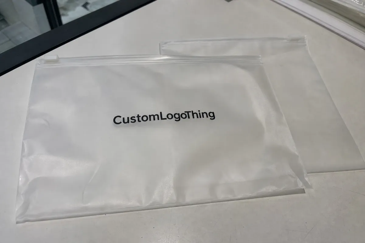
Readability is where frosted material changes the game. Frosted Zipper Bags soften what sits behind them, so dark text, pale backgrounds, and low-contrast logos can disappear more easily than they would in a clear pouch. If the insert shows through the front panel, white space and strong typography are not decoration. They are functional design choices.
Good inserts also help unboxing feel intentional without turning into clutter. A QR code can point to routine instructions, a refill page, or a shade-matching video. A short reorder line can nudge repeat sales without looking pushy. The best versions use visual hierarchy, not copy volume, to do the heavy lifting.
If the outer bag is part of a larger kit, it can help to keep the insert language general and move SKU-specific details into a second card or sticker. For teams ordering through Custom Packaging Products, that distinction often saves time because one master template can work across multiple bag sizes and filling plans.
Spec details that change the checklist
This is the section where clean branding either holds together or falls apart. The checklist should lock down insert dimensions, bleed, safe area, color mode, finish, paper weight, and whether the artwork is being built for a flat sheet or a folded format. A file can look polished in Adobe Illustrator and still fail if the trim area is off by a fraction of an inch.
For most beauty projects, the standard prepress basics still apply: 0.125 inch bleed, safe copy kept well inside the trim, and CMYK artwork unless a special ink system is confirmed in advance. If a premium finish is involved, such as soft-touch lamination or foil, the buyer needs to know whether that finish applies to one side or both. Even a tiny finish change can alter unit cost and proof timing.
Regulatory content is where beauty packaging gets more complicated than generic inserts. Depending on the product, the insert may need ingredient lists, warnings, storage guidance, lot references, barcode placement, or a short line about patch testing. If social handles or a QR code are also required, the layout may need to give up decorative space so the compliance copy can stay readable. A crowded insert may look stylish, but it is a weak choice if the line is going into retail packaging.
That is also the right time to think about sustainability claims. If the brand wants FSC-certified paper or board, the source and claim language need to match the artwork and the production paperwork. The same is true for claims about recycled content. For brands that care about verified standards, resources like FSC are useful because they help keep the claim aligned with the supply chain, not just the design file.
The bag itself changes the insert spec. A frosted pouch has a different visual behavior than a clear one, and that affects contrast, ink density, and whitespace. A semi-opaque front panel can soften small text enough that a buyer thinks the printer made an error, when the real problem is simply poor visual planning. That is why the checklist should connect insert design to the actual bag substrate, not treat them as separate jobs.
For a brand running multiple beauty lines, there is another decision to make: one insert for all SKUs, or one version per shade or formula. One master file keeps the workflow simpler. Multiple versions reduce confusion and improve accuracy. The right answer depends on how often ingredients, warnings, or shade names change.
Process and turnaround: from proof to packed bags
The cleanest production run starts before artwork is finished. A good sequence looks like this: content draft, dieline review, artwork setup, proof approval, print production, finishing, and final packing into the zipper bags. Miss one of those steps, and the rest of the schedule starts to wobble. The beauty frosted zipper bags packaging insert checklist should sit inside that sequence, not beside it.
Content is usually the first bottleneck. Ingredient copy may still be under legal review. A product claim may be waiting on substantiation. A QR code destination may not be live. Photography may arrive late, or the creative team may still be choosing between two taglines. One missing asset can delay the entire run by several business days, which is why buyers who approve content early tend to protect their launch dates better than buyers who only focus on the mockup.
After content comes proofing, and proofing is where people often lose time without realizing it. If the insert is small, every line break matters. A proof should be checked at actual size, not just on a screen. If the job is being kitted into bags, ask whether the printer can confirm insert count, pack order, and carton labeling at the same stage. That helps prevent the common mismatch where the insert is right, but the kit flow is wrong.
When the finished bagged kit must travel through distribution, transit testing becomes worth discussing. For protective expectations and packaging performance language, the methods published by ISTA are a useful reference point, especially for mail-order beauty and subscription fulfillment. The insert itself may be simple, but the whole package still needs to survive handling.
Lead time can often be shortened in three practical ways. First, lock the checklist before quoting so the printer is not estimating from assumptions. Second, approve one master template whenever possible. Third, leave a small buffer for revisions and prepress corrections. That buffer is not wasted time; it is the difference between a calm handoff and a last-minute scramble.
For teams that also need the outer mailer, shelf carton, or companion card, it helps to line up the insert with the rest of the system. A matching set from Custom Packaging Products makes the workflow easier because the insert, bag, and secondary packaging can be reviewed together instead of one at a time.
Cost, pricing, MOQ, and unit-cost tradeoffs
Pricing for insert printing is shaped by the same forces that shape most packaging work: quantity, stock, print coverage, finishing, and version count. A simple card may be inexpensive in isolation, but once special coatings, multiple colors, or SKU-specific artwork are added, the unit price can move quickly. The beauty frosted zipper bags packaging insert checklist should identify those variables before the quote goes out.
MOQ logic is straightforward even if buyers dislike it. Lower quantities are convenient for launches, limited editions, and test runs, but the setup cost gets spread over fewer pieces, so the price per insert rises. Larger runs usually lower the unit cost because press setup, cutting, and packing are amortized across more pieces. Digital print can help at smaller quantities, while offset printing often becomes more attractive as volume increases.
| Insert option | Typical use | Approx. unit cost at 5,000 pcs | Main tradeoff |
|---|---|---|---|
| One-color text insert | Simple instructions, care notes, QR code | $0.16-$0.28 | Lowest cost, limited visual impact |
| Full-color 14pt C1S card | Brand story, product directions, retail packaging | $0.24-$0.44 | Stronger branding, moderate setup cost |
| Soft-touch or specialty finish | Premium launch kits, gift sets | $0.40-$0.72 | Higher tactile appeal, longer production chain |
| Variable-data or multi-version insert | Shade sets, compliance-by-SKU, regional copy | $0.55-$0.95 | Better accuracy, more file control and proofs |
Those numbers are not fixed prices, and they should not be treated like them. Stock choice, print size, finishing, and kitting all affect the final quote. A buyer asking for a matte insert with foil, spot UV, and three versions will pay more than a buyer asking for a basic one-sided card. That is normal. The expensive part is usually not the paper; it is the setup complexity.
Hidden cost drivers deserve attention because they are easy to overlook. Color changes between versions can increase make-ready time. Special coatings can add lead time. Extra proof rounds can create admin cost even when the art itself barely changes. If the insert is tied to a launch calendar, those small items matter more than they look like they should.
For brands comparing product packaging options, a tight spec sheet often does more to control cost than aggressive price negotiation. Clear dimensions, a locked copy deck, and one agreed finish can remove enough uncertainty to make pricing more competitive. That is the quiet advantage of disciplined packaging design.
Common mistakes that trigger reprints and delays
Most reprints are not dramatic failures. They are small misses that compound. A typo in the ingredient list. A barcode in the wrong format. Missing bleed. Artwork that looks balanced on a laptop but loses legibility at print size. These problems are common because people review beauty content as if it were a brochure, not a production item.
- Wrong product name or shade range on the insert
- Missing bleed or safe area violations
- Too much copy for the available trim size
- Barcode or QR code placed too close to the edge
- Using on-screen colors that print too light on frosted packaging
- Skipping a physical sample check before full production
Mismatch errors are especially painful. A brand with several beauty lines may accidentally pair the wrong call-to-action with the wrong formula, or use an insert that names the incorrect shade family. Those errors are easy to miss in a shared folder. They are much harder to miss after 10,000 inserts are packed and shipped.
Another common mistake is approving a proof without measuring the fold or checking the finished trim against the actual pouch. The insert may fit in theory and still sit awkwardly inside the bag, covering a closure or buckling at the edges. That is why a physical sample, even a rough one, is worth far more than a polished PDF in many packaging workflows.
Legal review is the last place people try to save time, and the place where they often lose the most. If ingredient language, claims, or warnings are still changing after layout approval, rework is almost guaranteed. A clean approval chain protects both the printer and the brand.
Honestly, this is where the checklist earns its keep. The beauty frosted zipper bags packaging insert checklist keeps the project focused on the details that actually trigger reprints. It is not glamorous, but it is cheaper than restarting a run because one line of copy was never locked.
Next steps for approving inserts before production
Start with a content audit. Confirm the product name, brand mark, usage instructions, contact path, and any required beauty language. Then check the insert dimensions against the actual bag size, not a guessed size. If the pouch is frosted, review contrast and white space with the bag material in mind. If the package includes multiple SKUs, decide whether one master insert can hold the system or whether separate versions are safer.
The next step is a clean approval sequence. Lock content first. Lock layout second. Review the proof at full scale. Check a sample if one is available. Then leave a reorder note that preserves the same specs, trim, and finishing instructions so the next run does not start from zero. That approach is faster, and it is less likely to create surprises for the production team.
For many buyers, the simplest way to keep this process under control is to treat the insert as part of the full package system, not a small add-on. The bag, the card, the compliance text, and the shipping setup should all point in the same direction. That is how branded packaging looks intentional instead of assembled.
If the project is still in the buying stage, it helps to compare one basic setup against a premium one before placing the order. A clear checklist makes those tradeoffs obvious. It also makes the conversation with your printer, designer, or fulfillment partner much cleaner, which usually saves time on the back end.
Used well, the beauty frosted zipper bags packaging insert checklist becomes a repeatable approval tool, not just a one-time planning aid. Before every quote, proof, and reorder, it keeps the launch moving, the copy tight, and the finished bag aligned with the brand.
What should be included in a beauty frosted zipper bags packaging insert?
Start with the essentials: product name, brand mark, usage or care instructions, and a clear contact path such as a website or QR code. If the insert is carrying compliance content, add the required ingredients, warnings, lot references, or storage guidance before you send it to print.
How do I size a beauty frosted zipper bags insert correctly?
Measure the usable interior area of the pouch, then leave room for the zipper, any folds, and insertion clearance. It is smart to test the insert at actual scale so type does not drift too close to the edge or disappear behind the contents.
What affects pricing for custom insert printing in frosted zipper bags?
The biggest cost drivers are quantity, paper stock, number of ink colors, and whether you need finishing or versioned artwork. Extra setup steps, proof rounds, and regulatory edits can also increase cost even when the insert seems simple on paper.
How long does the insert production process usually take?
Most of the schedule is consumed before print: gathering copy, checking the dieline, and approving the proof without changes. After approval, the remaining time depends on print scheduling, finishing, packing, and whether the inserts are being kitted into bags.
Can one insert work for multiple beauty frosted zipper bag SKUs?
Yes, if the messaging stays generic enough and the regulatory details do not change from SKU to SKU. If each product needs different ingredients, warnings, or shade-specific copy, a variable-data or multi-version system is usually the safer option.


