Beer Frosted Zipper Bags Packaging Insert Checklist is the kind of spec review that prevents expensive rework later, because the insert often does more visual work than the bag itself. A frosted finish softens edges, mutes contrast, and turns small decisions into visible ones. A sheet that looks fine on a monitor can read as cramped, pale, or misaligned once it is dropped behind the film. For packaging teams, the real task is not to make the insert busy. It is to make it legible, sized correctly, and credible inside a package that customers will handle in seconds.
Why the Beer Frosted Zipper Bags Packaging Insert Checklist Matters
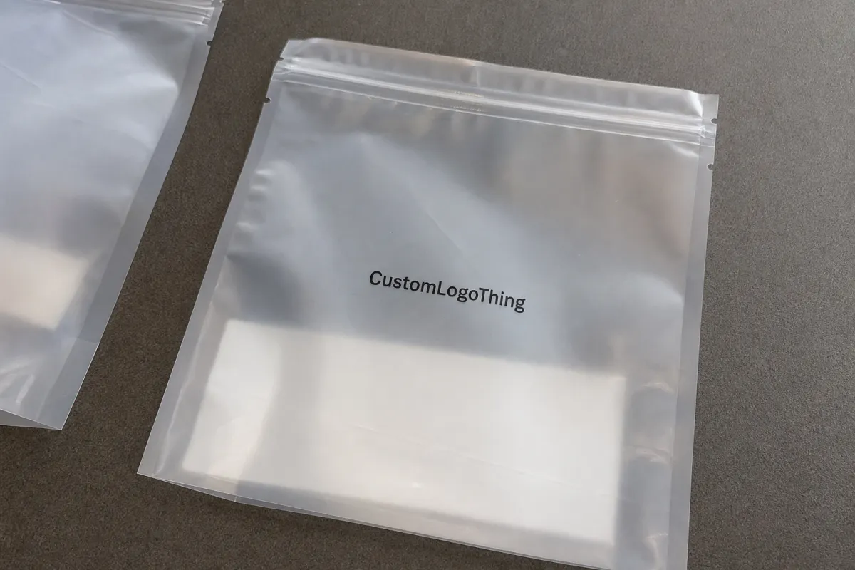
The first thing many buyers miss is how much the insert shapes the perceived quality of the whole pack. Frosted film acts like a filter. It does not hide print, but it does soften it enough that weak hierarchy, narrow type, and crowded layouts become obvious. A clean insert can make a modest pouch feel deliberate and retail-ready. A sloppy one can make the product look assembled in a hurry.
That is why the beer Frosted Zipper Bags Packaging Insert checklist should begin with the physical package, not the artwork file. The insert may need to carry branding, usage instructions, ingredient details, QR codes, flavor notes, or a short sales message. If the sheet is too large, too dense, or folded without room for the zipper and product thickness, the message starts fighting the bag instead of supporting it.
Frosted Zipper Bags also behave differently from clear pouches and standard mailers. Light passes through unevenly, which means subtle color palettes can disappear and fine strokes can blur faster than expected. Strong black copy, thicker sans serif type, and clear spacing usually outperform decorative details. That is not a style preference. It is a visibility issue.
For breweries, beverage merch brands, and retail packers, the other pressure point is assembly. The insert has to fit the bag, survive handling, and still look intentional after it is loaded with the product. If the insert is part of a broader branded system, it helps to keep the spec aligned with your Custom Packaging Products so the presentation feels unified instead of improvised.
A frosted pouch can elevate a well-built insert, but it also exposes a bad one faster than many teams expect.
The checklist mindset matters because packaging rarely fails in one dramatic moment. It usually slips. The size is off by a few millimeters. The fold cuts through a barcode. The paper stock curls in humidity. None of those issues looks serious on its own, yet together they create a pack that feels less finished than the buyer intended.
How the Insert Works Inside the Bag
The assembly path is simple in theory: fill the bag, prepare the insert, then place it so the visible panel reads correctly through the frosted film. In practice, the art team is usually designing for a flat sheet while the operations team is working with a live package that has a zipper, seals, headspace, and product thickness. Those are not the same thing.
Fold style changes the entire experience. A half-fold gives a broad front panel and is easy to orient. A tri-fold compresses more content into a smaller footprint, which helps in tighter zipper bags, but it also creates extra fold lines that can interrupt readability. A z-fold works well for layered information or step-by-step notes. A card-style insert feels more rigid and usually looks more premium, though it also costs more to print and may take longer to pack by hand.
Visibility through frosted film is not a minor detail. The insert is often seen at an angle, under store lighting, or through a bag that already contains another object. That means large headlines, strong contrast, and well-spaced elements matter more than ornamental touches. A pale gray subtitle that looks elegant on screen may vanish in the finished pack.
Clearance is another practical constraint that shows up fast in production. The insert cannot be sized only from the artboard. It needs room for the zipper zone, any seal area, side gusset, and the actual thickness of what goes inside the pouch. A sheet that seems correct at 4 x 6 inches on a PDF may need to be trimmed or reformatted so it slides in without curling at the corners.
Hand insertion also changes the spec. If workers are placing each sheet one by one, the insert needs to be easy to orient and simple to verify at a glance. If the package is part of a mixed kit, the paper weight and fold direction should help the sheet sit flat instead of twisting inside the bag. Production teams rarely say this in branding meetings, but the best-looking package is usually the one that is easiest to assemble consistently.
Key Specs That Control Fit, Print, and Readability
Any serious beer frosted zipper bags Packaging Insert Checklist starts with dimensions. The bag width, usable interior height, seal area, zipper allowance, and insert trim size should all be measured together. A few millimeters can decide whether the insert drops in cleanly or needs to be forced. When a piece is forced into a pouch, the edges usually show it. So does the fold.
Material choice comes next, and the differences are more practical than cosmetic. Lightweight coated paper is economical and folds easily, but it can curl in humid conditions. A heavier text stock offers a softer feel and can keep costs down on larger runs. A 14 pt C2S cover gives more body, holds color better, and usually reads as more premium through frosted film. Synthetic sheets are the most durable option for moisture-prone or high-handling packs, though they cost more and can feel less like traditional print.
Color and contrast deserve the same discipline. Frosted film dulls delicate palettes, so thin lines, soft pastels, and low-contrast type are risky. Black text on white or off-white stock is still the safest option for legal copy, QR codes, and other content that has to be read quickly. If the brand wants richer color, deep navy, charcoal, burgundy, or a strong accent often survive the film better than light tints. This is one place where restraint usually beats decoration.
Finishing affects readability too. Matte coatings reduce glare and help the insert sit calmly behind the bag. Gloss can add energy, but it can also pick up store lighting in a way that makes the content harder to scan. Soft-touch feels upscale, though it marks more easily and is usually better suited to higher-value programs. Aqueous coating is a practical middle ground for many runs because it adds protection without pushing cost too high.
If the insert includes a barcode, compliance line, or QR code, leave real breathing room around those elements. Crowded codes scan poorly, and crowded layouts look even more compressed once they are viewed through frosted plastic. A useful rule is simple: the front-facing side should say what the product is, why it matters, and what the customer should do next. The rest belongs lower on the sheet or on the back.
Repeatability is underrated. A spec that is easy to reproduce reduces confusion during reorders and hand packing. If the insert is part of a broader package family, compare it against your other custom printed boxes and inserts so the paper feel, finish, and proportions stay consistent across the line.
| Insert Option | Typical Use | Strengths | Typical Unit Range |
|---|---|---|---|
| 80 lb text / uncoated paper | Short-run info sheets, simple promos | Low cost, easy folding, quick proofs | $0.08-$0.18 |
| 100 lb text / coated paper | Retail inserts, branded messaging | Better color hold, cleaner look through frosted film | $0.12-$0.28 |
| 14 pt C2S cover | Heavier presentation cards, premium kits | Stiffer feel, stronger shelf presence | $0.18-$0.38 |
| Synthetic sheet | Moisture-prone or high-handling packs | Scuff resistance, better durability | $0.24-$0.45 |
Those ranges move with quantity, coverage, and finishing. Still, they give buyers a realistic starting point. A well-built spec keeps the packaging team from chasing surprises after the first sample arrives.
Cost, Pricing, MOQ, and Quote Drivers
Insert pricing follows a few familiar levers: size, stock, print colors, fold style, finishing, and whether the job is a test run or a repeat program. The shorter the run, the more the setup cost shows up in each piece. That is why 1,000 units can look expensive next to 5,000 even when the artwork barely changes. Buyers sometimes read that as padding. More often it is math.
Minimum order quantity matters because prepress, make-ready, proofing, and press setup do not scale down very far for small runs. Digital printing usually makes more sense for short or variable orders, while offset becomes more efficient once the quantity climbs. If the insert needs a special fold, a die-cut edge, or a coating change, expect the MOQ to rise or the unit cost to move upward. That is normal.
There are also quote items that show up late if nobody asks about them early. Revision rounds, extra proof cycles, specialty inks, rush freight, and manual insertion can all move the final budget. If the supplier is quoting only the insert, confirm whether folding, overage, and packing format are included. If the insert is being produced as part of a larger package build, separate the printing cost from the fulfillment cost so the comparison stays honest.
A useful buying tactic is to request three numbers: the base price at your target quantity, the price at the next tier up, and the cost for a prototype or sample pack. Those three figures usually reveal whether the pricing curve is smooth or whether one extra thousand units unlocks a meaningful drop. That matters because many teams can save more by moving up a tier than by trimming a few details out of the design.
Branding rarely improves from cheap compromises that distort the final package. A lower-cost insert that warps, scratches, or misreads through the bag is usually more expensive in the long run than a slightly better stock with cleaner print. If the package is meant to sell on first glance, the insert has to look like it belongs there.
Process and Timeline: From Proof to Packed Samples
The production sequence is usually straightforward: brief intake, size confirmation, artwork review, proof approval, material sourcing, printing, finishing, folding, and final QC before shipment. The catch is that each step depends on the one before it. If the fold changes after proofing or the artwork arrives with missing information, even a simple insert can slip by several business days.
Artwork issues are the most common source of delay. Missing barcode specs, low-resolution logos, unbuilt dielines, and vague fold instructions all create back-and-forth that slows the order before print even starts. For beer and beverage programs, ingredient statements and legal copy often need a second check. That review should happen before the job is released, not after the file is already moving.
Lead time depends on complexity. A single-color insert on stock paper generally moves faster than a coated, multi-color, die-cut version. In many production environments, a simple run can ship in about 7-12 business days after proof approval. More involved work often needs 12-18 business days, sometimes more if the order includes custom finishing or hand assembly. Rush schedules are possible, but they usually require cleaner specs and faster sign-off.
Sample validation is the step that protects the budget. A flat PDF is useful, but a folded sample inside a bag mockup tells you much more. You can see whether the headline lands in the visible window, whether the fold cuts through a barcode, and whether the insert feels too loose or too stiff for the pouch. If the package will move through retail or distribution, that mockup also shows how the insert behaves after repeated handling.
For mixed-product kits or heavier packs, a basic transit check is worthwhile. Packaging teams often borrow logic from ISTA testing standards because drops, vibration, and compression can expose weak insert choices before a large rollout ships. A formal lab test is not always necessary, but the principle is sound: if the package cannot survive handling, the print job is only half finished.
Plan for packing coordination too. If the inserts are being loaded by hand, the team needs to know orientation, stack order, and count verification. That matters more than many buyers realize, especially when a single delayed component can stall a full SKU set. The schedule is usually strongest when design, print, and fulfillment agree on the spec before the first sample is approved.
Common Mistakes That Make the Insert Fail
The most common mistake is overdesigning the sheet. Too much text, too many logos, and too little contrast can make the insert feel cluttered through frosted film, even if it looks lively on screen. A package gets only a few seconds of attention in hand, so the front panel needs room to breathe. Dense copy has a place, but it should not compete with the first impression.
Size mismatch is another frequent issue. If the insert is even slightly too wide, it may buckle when folded or refuse to sit flat once it is inside the pouch. If it is too small, it drifts around and looks unfinished. Both problems are avoidable with a physical sample and a real bag measurement. Measure the usable interior height, not the outer height, because seals and zippers take up space fast.
Fold placement can also ruin the package. If a fold line runs through the product name, barcode, or key instruction, readability drops immediately and the sheet feels less intentional. In a clean retail package, folds should support the information flow. They should not cut through it. That is especially true for inserts carrying brewing notes, ingredient details, or usage instructions.
Material fatigue shows up more often than people expect. Brittle paper, weak stock, and heavy coatings can crack at the fold line or scuff during insertion, particularly on faster lines. Once that happens, the package can look worn before it ever reaches a customer. If the insert travels with a sample can, bottle, or similar product, a little extra stiffness usually pays for itself.
Designs that look perfect on a monitor can fail under store lighting. Gloss glare, weak contrast, or a crowded QR code often become obvious only after the sheet is printed and slipped behind the film. That is why one physical sample is worth more than a long chain of email approvals. The sample tells the truth quickly.
There is a more subtle failure too: teams approve the bag and the insert separately, then assume the final pack will sort itself out. It usually does not. Frosted film changes how the insert reads, so the two parts have to be judged together from the start.
Practical Tips Before You Order
The most useful habit is to review the insert and the bag as one system. Ask for one printed insert and one assembled bag mockup, then view them under the lighting your customer will actually see. That simple step catches more problems than a stack of annotated PDFs because it shows readability, fit, and visual balance in the real package.
Keep your approval checklist short but complete. Confirm dimensions, fold direction, artwork version, barcode quality, legal copy, quantity, finish, and delivery window. If even one of those items is loose, the order can still run, but the chance of correction climbs. A brief approval sheet is often more useful than a long internal memo because it forces everyone to agree on the same variables.
Hierarchy should stay strict. The front-facing message needs to answer three questions quickly: what the product is, why it matters, and what the customer should do next. Secondary details belong lower on the insert or on the reverse side. That approach works across retail packaging, product packaging, and promotional kits because people scan packages far faster than brands usually expect.
Coordinate print and packing early if the inserts will be handled by a fulfillment team. The person doing the insertion should not have to guess orientation or sort through multiple versions of the same sheet. Standardizing the fold and stack order reduces errors and keeps the package clean through the full run. It also makes reorders easier, which matters once a program moves from pilot to repeat production.
If budget is tight, simplify the spec before you cut quantity too aggressively. A clear, well-made insert usually does more for package branding than a crowded sheet that tries to say too much. The best-looking packs are often the ones that remove a few weak ideas and keep the essential ones visible.
Use this beer Frosted Zipper Bags Packaging Insert checklist to lock down the essentials before release: measure the bag, define the insert format, compare quotes at two quantities, review a folded sample, and only then approve production. That sequence keeps the final pack clean, intentional, and ready for shelf handling instead of looking like a last-minute add-on.
FAQ
What should a beer frosted zipper bags packaging insert checklist include?
It should cover bag dimensions, usable interior space, zipper clearance, insert trim size, fold style, stock choice, print content, barcode placement, legal copy, and the sample approval step. If the insert will be packed by a fulfillment team, add orientation notes and packing format as well.
How do I choose the right insert size for frosted zipper bags?
Measure the bag after seals and zipper allowances are accounted for, not just the outer flat size. Leave room for product thickness, especially if the pouch holds a can-shaped item, a sample pack, or a folded set of cards. Then test a folded sample so you can see how the insert sits behind the frosted film.
Why does pricing change so much between insert quotes?
Quantity, print complexity, fold style, and finish usually drive the biggest differences. Short runs carry more setup cost per piece, while larger runs spread those costs out more efficiently. Extra proofing, rush timing, and manual insertion can also change the final number.
How much lead time should I expect for packaging inserts?
Simple inserts usually move faster than coated, die-cut, or multi-step versions. A straightforward run may ship in about 7-12 business days after proof approval, while more involved work often needs 12-18 business days or more. The biggest delays usually come from artwork changes and content approvals.
What is the most common mistake with beer frosted zipper bags inserts?
The most common mistake is approving a design that looks good on screen but loses clarity through frosted film. Tight sizing and skipped sample checks come right behind that. A physical mockup catches most of those issues before the full run starts.


