Beer Logo Patch Beanies Digital Proof Checklist Tips
If you are approving a beer Logo Patch Beanies digital proof checklist, slow down and inspect the unglamorous parts first: placement, scale, contrast, stitch behavior, and how the knit will hold the patch once the beanie is worn and stretched. On a screen, almost any logo can look centered and tidy. On a rib-knit cuff or a soft slouch body, the same artwork can sit too high, crowd a seam, or lose legibility faster than people expect.
The best proof process is not about admiring the mockup. It is about catching expensive problems before production starts. How wide is the patch? How thick is the border? Will the logo still read from a few feet away? Is the patch method actually suited to the artwork, or is it forcing a design that needs more detail than the material can handle? Those answers usually save more money than shaving a few cents off the unit price.
Beer Logo Patch Beanies Digital Proof Checklist: What to Catch First
Most proof problems show up at the edges, not the center. That is why a solid beer logo patch beanies Digital Proof Checklist should begin with placement and scale, not with whether the artwork looks pretty in a file. A logo that works in vector form can still sit too close to the cuff seam, float awkwardly on the crown, or appear oversized once it meets knit fabric that naturally pulls and relaxes.
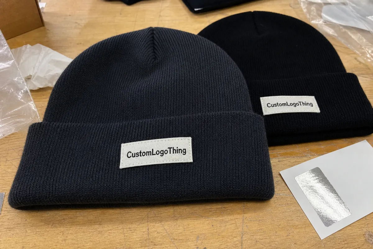
Start with the patch shape, border thickness, and finished size. A round woven patch at 55 mm behaves differently from a square embroidered patch at the same width because the border, stitch direction, and edge treatment change how the eye reads the mark. If the artwork includes a brewery emblem, small type, or a fine line illustration, the proof should show whether those details survive at the actual size or need to be simplified for thread, woven construction, or print.
A proof is not decoration. It is the working instruction for placement, construction, and approval, and smaller artwork makes that instruction matter more.
From a buyer’s side, the first pass should answer three questions: does the logo fit the hat, does it read clearly, and does the decoration method support the design? If any answer is fuzzy, stop there. A careful supplier will usually give two or three placement options, and that extra minute on the mockup can prevent a full run of beanies from landing with a cramped or awkward look.
It also helps to define the blank before the proof gets too far. Cuffed acrylic, recycled polyester blends, rib-knit styles, and slouch silhouettes all present different surfaces. A beanie with a deep cuff gives more room for a centered patch, while a low-profile crown may force the decoration higher than expected. If you are working with multiple colors or sizes, keep the placement spec consistent so the proof does not drift between versions.
For teams that need more structure on the sourcing side, pair the proof review with internal Manufacturing Capabilities notes so the same size, patch method, and finishing expectations are used across reorder cycles. That simple discipline keeps the approved visual from drifting when a new buyer steps into the process.
How Patch Type and Beanie Knit Change the Final Look
The beanie blank is half the design. Smooth jersey knits, rib knits, and heavier cuffed styles all present patch beanies differently because each surface gives the decoration a different amount of visual space and a different amount of stretch. A 50 mm woven patch can look crisp on a dense, flat knit, then feel crowded on a thick rib where yarn texture steals attention from the logo. Soft slouch styles can have the opposite problem: plenty of fabric, not much structure.
Patch type matters just as much. Woven patches are usually the best choice for small text and tighter line work. Embroidered patches add texture and can feel premium, but they do not love microscopic detail. Leather patches work well for rustic or heritage branding, though they are not ideal if the logo depends on color separation. PVC patches bring strong shape definition and a molded look. Sublimated patches can carry fine color gradients and full-color art more easily. None of those is automatically better; the right answer depends on how much detail the beer logo needs to keep.
| Patch style | Best for | Typical budget impact | What to check on proof |
|---|---|---|---|
| Woven | Fine text, clean logos, small emblems | Low to moderate | Thread density, border width, tiny copy clarity |
| Embroidered | Bold marks, textured branding | Moderate | Stitch direction, raised areas, edge shape |
| Leather | Simple icons, vintage looks | Moderate to higher | Deboss depth, color contrast, logo simplification |
| PVC | Strong shapes, outdoor feel | Higher | Mold clarity, small detail retention, thickness |
| Sublimated | Full-color art, gradients, photo-style graphics | Moderate | Color match, edge finish, print sharpness |
Color behavior on knit is easy to underestimate. Heathered yarns, dark charcoal blanks, and melange fibers can mute subtle colors or make a bright patch feel more subdued than it looked in the proof file. If the brand relies on contrast, ask the supplier to show the patch against the exact beanie color, not just on a white digital canvas. That one change catches a lot of missed expectations before they turn into a production complaint.
There is also a material tradeoff hiding in the patch itself. Thicker constructions feel durable, but they can look heavy on a lightweight beanie. Very thin patch builds sit flatter, which is good for comfort, but they may not have enough visual punch if the logo is meant to read like a bold retail item. The proof should show not just the artwork, but the visual weight of the decoration on the actual blank.
Proof Process and Turnaround: What Happens After Upload
The normal flow is straightforward, but buyers save time when they know where the clock actually runs. Artwork upload comes first, then the mockup or digital proof is built, followed by internal checks for printability, sizing, and construction. After that, the customer reviews the file, asks for revisions if needed, and only then does the order move into production release. If a proof sits in an inbox for two days, production does not catch up later; the whole timeline shifts.
Vector artwork speeds things up. So do Pantone references, exact patch dimensions, and a clear statement about whether the beanie should be cuffed, slouch, or structured. If the buyer only sends a JPEG and says “make it look close,” the proof stage expands because the supplier has to clean lines, guess sizes, and confirm what level of detail the chosen patch method can support.
That is also where revisions can become expensive. A change that sounds small, like moving a patch down 5 mm or tightening a border, can affect the balance of the whole front panel. A good proof should show the revised version against the original so the buyer can compare what actually changed. Tiny shifts are easy to miss when people only look at the latest image.
Typical proof timing is often 1-2 business days for a simple mockup and a little longer if multiple patch options or placement views are requested. Once approved, production for custom logo beanies often lands in the 12-18 business day range for stocked blanks. Specialty patches, custom dye lots, or blank shortages can stretch that further. Rush orders are possible in some cases, but only if inventory is already in place and the approval arrives clean the first time.
For shipping and carton planning, some buyers connect the proof stage to packaging checks, especially if the goods will move through retail channels or mixed parcels. If that is part of the order, ask whether the outer cartons will be built and tested with shipping in mind, and whether the pack-out should follow a recognized transport standard such as ISTA guidance for parcel handling.
Buyers working through a larger rollout often pair the proof with a broader sourcing review from custom logo production services so the approved mockup, blank selection, and packaging notes stay aligned across teams. That matters more than people realize once reorder season starts.
Cost, MOQ, and Unit Price Drivers You Should Compare
Price for patch beanies is usually a stack of small choices, not one big number. The blank beanie, patch construction, patch size, quantity, sewing or application method, and setup work all influence the final quote. A simple woven patch on a basic acrylic cuffed beanie at 500 pieces may land in a very different range than a PVC patch on a heavier knit with custom woven labels and individual polybagging.
MOQ matters because setup cost gets spread across fewer units at lower quantities. In practice, many suppliers are comfortable around 100-300 pieces for custom patch beanies, but the unit price often drops meaningfully once you reach 500, 1,000, or more. That is not greed; it is the math of production setup, patch creation, and labor allocation. If the run is small, a premium patch can make the whole item feel expensive because the fixed costs do not have enough units to dilute them.
A realistic quote comparison for a standard custom logo beanie order might look like this:
| Option | Typical unit impact | Best fit | Main tradeoff |
|---|---|---|---|
| Basic woven patch | $0.30-$0.70 added to blank cost | Clean logos, moderate detail | Best value, but less texture |
| Embroidered patch | $0.40-$0.90 added to blank cost | Bold branding | Raised texture can soften fine detail |
| Leather patch | $0.50-$1.10 added to blank cost | Simple marks, rustic branding | Limited color and small-copy clarity |
| PVC patch | $0.70-$1.50 added to blank cost | Strong shape, durable look | Higher tooling and a heavier feel |
Also compare the landed cost, not just the unit cost. Freight, sampling, extra revision time, individual bagging, hang tags, and carton labeling can change the real budget picture fast. If your order includes branded hang tags or retail inserts, ask whether the paper stock should be sourced with responsible forestry in mind; for that piece, FSC certification can be worth checking. Small details like that do not always change the look, but they do change the way the order fits into a retail program.
There is one more cost trap: over-specifying. Buyers sometimes request a premium patch material, a dense knit blank, custom packaging, and multiple revision rounds for a run that does not need all of that. The result is a solid product with a price that no longer matches the audience. Good proof work keeps the order honest. It should show what the budget actually supports, not what would look impressive on a mood board.
A Practical Review Sequence Before You Approve
Start with dimensions. Confirm patch width, logo height, and total placement against the actual beanie size, not the original art file. A 70 mm patch on a large cuff can look balanced, while the same patch on a compact youth-style beanie can dominate the front panel and make the crown feel visually crowded.
Then check readability. Ask whether the smallest text is still legible at retail distance or from a casual conversation distance. Thin strokes, small registration marks, and tight icon spacing are usually the first things to fail when a design gets translated into thread or woven yarn. If the design uses a brewery name, tagline, or subtle icon, the proof should show enough separation for the details to hold.
Next, review material notes and attachment method. Sew-on patches feel secure and usually give the best long-term hold. Iron-on versions are convenient for some applications, but they depend on adhesive quality and fabric tolerance. Adhesive-backed options can help with temporary placement, though they are not usually the best final answer for repeat wear. If the buyer wants a softer hand feel, the proof should note whether the backing will add stiffness at the front panel.
Then check the alignment against the hat construction. A centered patch on a flat mockup can hide the fact that the real blank has a seam, a fold line, or a rib transition in the same area. That seam can change how the front panel sits when worn. If the supplier can show the patch relative to the actual panel layout, not just a generic hat outline, take that version seriously. It is the closer one to production reality.
Finally, verify the brand details that people often skim: color names, spelling, SKU, fold direction, barcode placement, and packaging instructions. Those are the mistakes that hide behind a good-looking mockup. If the proof shows the logo in the correct spot but the trim color is off by a shade, or the SKU is missing a suffix, the production line will still build to the file in front of it.
Simple review order:
- Measure the patch and compare it to the actual beanie blank.
- Check logo readability, especially small text and thin strokes.
- Confirm patch method, backing, and attachment details.
- Verify color names, spelling, packaging, and SKU data.
- Save the approved proof with the quote and purchase order.
That sequence sounds basic, but it catches most avoidable problems. The best beer Logo Patch Beanies Digital Proof checklist is the one that forces a human to verify what a mockup cannot fully predict.
Common Mistakes That Trigger Rework or Delays
The most common mistake is approving a proof before checking how the knit stretches in real life. A centered patch can drift slightly once the beanie is worn, folded, or pulled over a head, especially on softer blanks that do not hold shape tightly. What looked perfectly centered in the file can end up feeling visually off once the fabric relaxes.
Another frequent miss is assuming screen color equals finished color. It does not. Thread has sheen, woven yarn has its own light scatter, leather absorbs color differently, and knit blanks can cast warmth or coolness onto the final look. Dark fabric can make navy look blacker, while bright yarn can dull a subtle green or gray. If brand color precision matters, ask for Pantone references where possible, but remember that material, ink, and thread all influence the final read.
Seam placement and cuff fold direction also matter more than buyers expect. If a patch sits too close to a seam or rib transition, the logo can buckle, twist, or land in a spot that feels less comfortable against the forehead. A good proof should show the patch relative to the actual panel layout, not just centered on a flat illustration of a hat.
Skipping a second review after revisions is another easy way to create avoidable rework. Small updates, like nudging a patch 8 mm lower or changing the border color, can ripple into other details. The proof that gets approved should be the one that actually goes to production, and any later update needs the same eyes on it again. A clean approval step is cheaper than a correction after stitching starts.
There is also the problem of vague approval language. “Looks good” is not enough if the proof contains multiple revisions, alternate patch methods, or more than one placement option. Approval should be tied to the exact file version, not to a memory of what the buyer thinks was agreed upon. Otherwise, the order can move ahead with one person picturing version A and another person expecting version B.
From a process standpoint, disciplined buyers stay ahead of the curve by comparing the revised mockup with the first one rather than assuming the changes are only cosmetic. That habit protects schedule, budget, and the final appearance of the order.
Next Steps After Approval and Before Production Starts
Once the proof is approved, save everything in one place: the mockup, the quotation, the purchase order, and the notes that define patch size, placement, color, packaging, and ship date. That folder becomes the working truth for production, customer service, and reorders. If one document says 60 mm and another says 65 mm, somebody will have to stop and sort it out later, and that usually slows the line.
Confirm the ship-to address, in-hands date, and any special carton labeling before release. If the order needs folding, polybagging, sticker placement, or retail packing, say so now rather than after goods are already in motion. For buyers who need labeling to match a retail system, ask whether the outer packaging should use paperboard inserts, hang tags, or item stickers that match the approved brand presentation.
Reorders deserve the same attention as the first run. That is especially true when a production team changes a blank supplier, updates the patch material, or substitutes a different thread shade. Even a small supply chain change can shift the hand feel or the visual balance of the beanie. The safest habit is to treat the approved proof as the baseline and compare every reorder against it before giving the green light.
Keep the approved file version, not just the image, because revisions often happen quickly and the wrong attachment gets reused later. If a supplier has multiple rounds of mockups, the final proof should be labeled clearly with date, version, and sign-off status. That tiny bit of admin work prevents more production mistakes than most teams expect.
Use the same beer Logo Patch Beanies Digital Proof checklist on future orders and you will catch drift early, before a small change becomes a visible problem. The point is not to make approval slower. It is to make it final.
What should be included in a beer logo patch beanies digital proof checklist?
Patch size, placement, and orientation should be shown clearly on the beanie mockup. The proof should also list material type, backing method, thread or print colors, and any special notes about the knit blank. Spelling, logo proportions, and packaging instructions should be confirmed before approval.
How long does digital proof approval usually take for patch beanies?
Simple proofs can move quickly when artwork is vector-ready and the design is already sized for the chosen beanie style. Revision time increases if the logo needs cleanup, the patch method changes, or the buyer wants to compare multiple placement options. Approval speed matters because production usually cannot begin until the proof is signed off.
What affects the cost of custom patch beanies the most?
Patch construction, quantity, and the blank beanie style usually have the biggest effect on unit cost. Extra decoration colors, specialty materials, and packaging upgrades can raise the quote as well. Low quantities often increase the per-piece price because setup work is spread across fewer units.
Can I change the patch size after I approve the proof?
Usually not without affecting production timing, because the approved proof is the working specification for the order. A size change can alter placement, stitch detail, and how the design fits the beanie panel or cuff. If you need a change, request it before approval so the supplier can update the mockup and quote correctly.
What is the most common mistake buyers make with patch beanie proofs?
The most common mistake is approving the visual without checking scale and placement on the actual beanie shape. Buyers also miss small text issues, color contrast problems, and the way knit stretch changes the final look. A careful proof review prevents most of the rework that slows production later.


