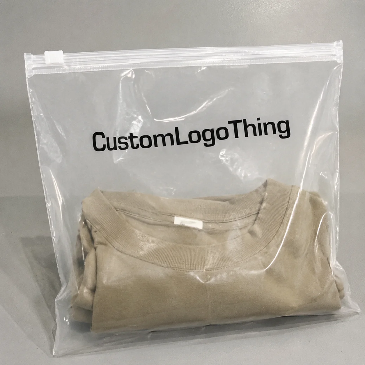
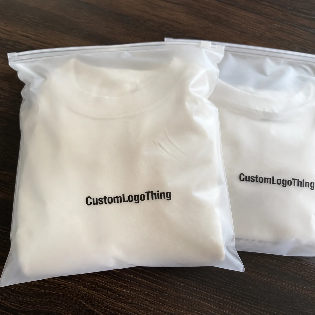
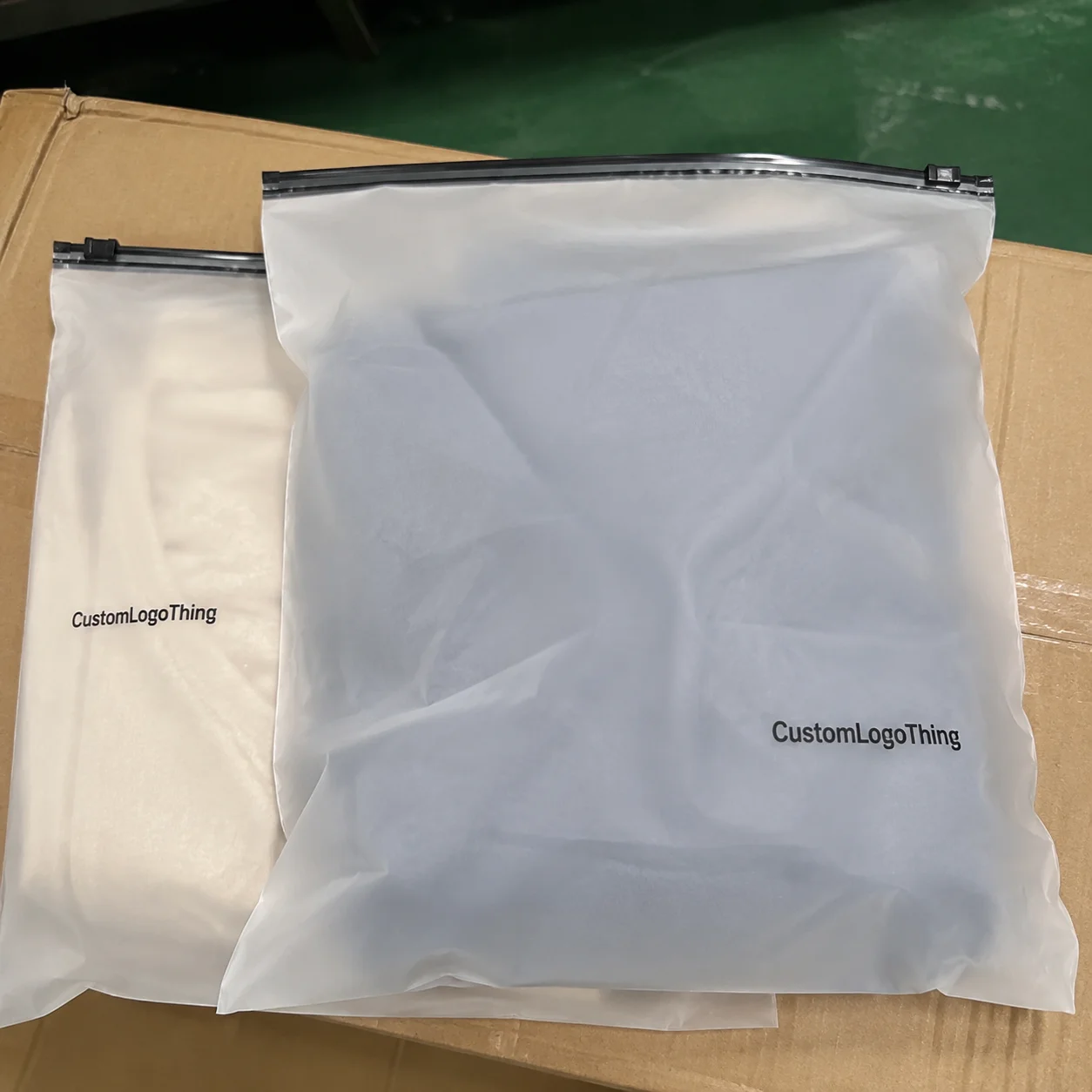
The book Frosted Zipper Bags Packaging Insert checklist only looks straightforward until a sample reaches the bench and the problems show up at once. The card curls inside the bag, the type loses contrast through the frosted film, and the packing team discovers the insert is just stiff enough to slow the zipper. None of those issues is dramatic on its own. Together, they turn a simple insert into a production headache.
The real job of an insert is not decoration. It is to hold the package together visually and operationally. A good insert supports product packaging, keeps the pack line moving, and strengthens package branding without adding unnecessary cost or clutter. If the spec is clean, the insert disappears into the workflow. If the spec is loose, the insert becomes the first thing everyone blames.
That is why a buyer checklist matters. It forces the team to answer the practical questions before artwork, proofing, and quoting start drifting in different directions. Bag size, insert size, stock, finish, print method, and pack method all need to be decided together. Separating them is how people end up redoing art after approval or paying for a revision that should have been avoided.
What the book frosted zipper bags packaging insert checklist needs to cover
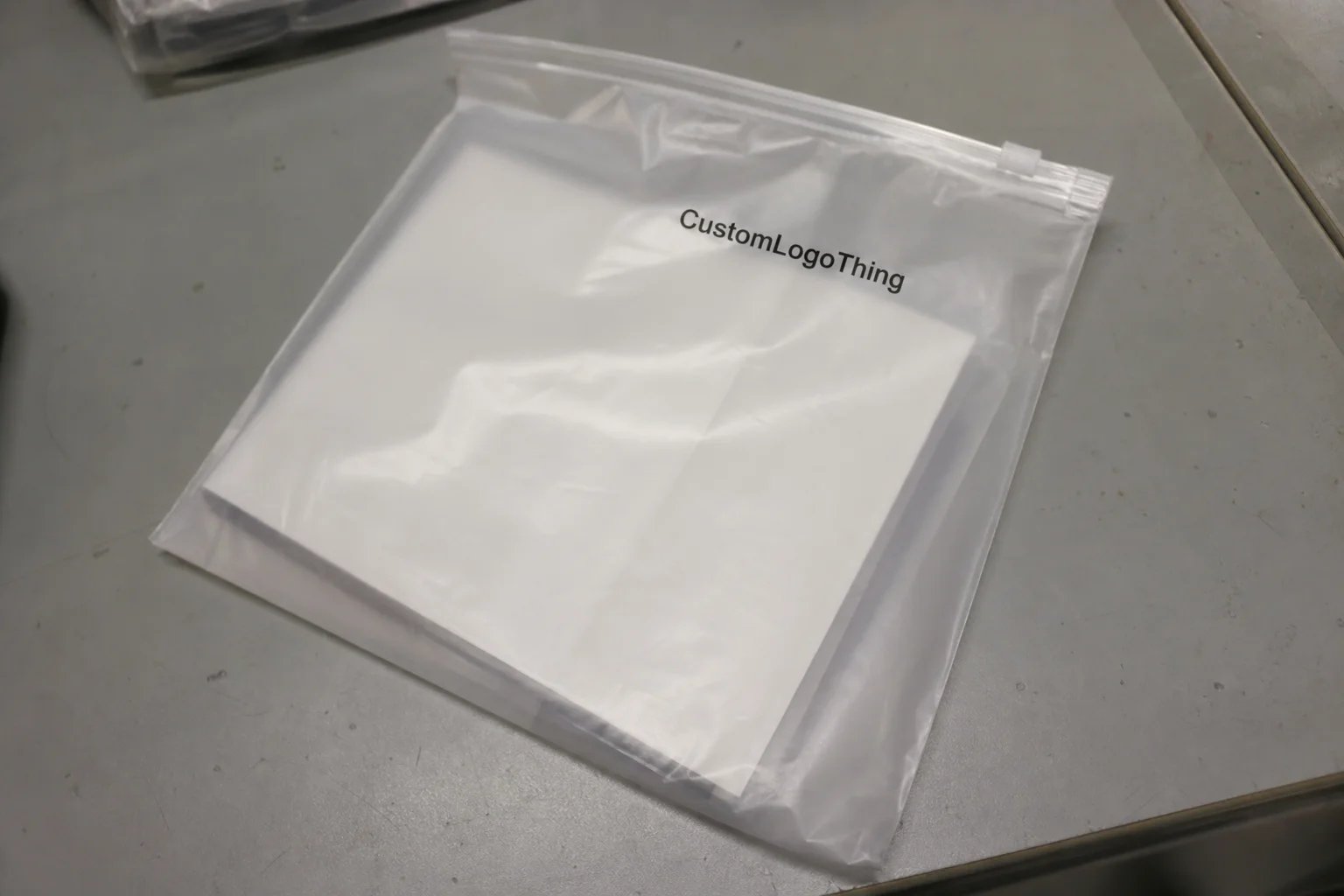
Frosted Zipper Bags already bring a soft, premium look. That is useful, but it also raises the bar for the insert. If the card looks generic, the whole pack feels cheaper. If the insert is too busy, the bag starts to look crowded. The goal is a controlled, readable piece that works with the bag rather than competing with it.
The first item on the book Frosted Zipper Bags Packaging Insert checklist should be the insert’s purpose. A brand story card needs a different layout from a care card or compliance insert. A promo card can carry a stronger visual message, while a small instruction card needs larger type and more generous margins. That decision drives the rest of the spec, so it should be settled before design starts.
Frosted film changes how color behaves. Pale text, fine rules, and low-contrast graphics often look acceptable on a screen and weak in the bag. A white or light gray design can wash out quickly once it sits behind semi-transparent plastic. The fix is usually simple: stronger contrast, fewer delicate details, and more attention to type size than the screen mockup might suggest.
For a buyer-facing checklist, the useful fields are practical rather than ornamental:
- Insert purpose: branding, instructions, promo, compliance, or retail display.
- Bag size: finished width, height, gusset, zipper position, and opening clearance.
- Insert size: trim, bleed, safe area, and orientation in the bag.
- Stock: paper weight, coating, brightness, recycled content, and stiffness.
- Print method: CMYK, spot color, white ink, foil, or no special finish.
- Pack method: hand insert, machine-fill, or third-party fulfillment.
Those points seem basic because they are. Basic specs prevent expensive misunderstandings. A quote built on assumptions is not a quote for the same job. It is a rough guess with a price attached.
“A proof that only works on a white monitor page is not a proof of the final package. Check it in the bag, with the actual material, under normal light.”
For broader branded packaging programs, the insert also has to match the rest of the system. A matte frosted bag with a glossy, high-saturation insert can feel like two different brands sharing the same pouch. That mismatch happens often when teams source each component separately and never compare the visual behavior of the materials. It also shows up when Custom Packaging Products are ordered from different suppliers without a shared spec sheet.
How the insert works inside frosted zipper packaging
An insert can live in several places: behind the product, folded around it, attached with a label, slipped under a header, or packed separately for later insertion. Each method changes what the card needs to do. A backer card behind a flat item can be larger and more image-driven. A folded insert inside a tight zipper bag has to behave like a working component, not a flyer.
Product shape matters more than most teams expect. A tall item may block the top half of the card. A thick product can bow the insert. A narrow product in a wide bag can make the card look undersized. The packaging looks off even when every individual piece is technically correct. That is why the checklist should always include the product profile, not just the bag dimensions.
Readability is the other issue. Frosted packaging softens edges and lowers apparent contrast. Bold typography usually survives. Thin typefaces, light weights, and intricate linework are far more likely to vanish at a glance. If the design depends on fine detail, a physical sample is mandatory. A flat PDF cannot show how the card will read through the film.
The physical side matters too. Too much stiffness can interfere with the zipper track or create drag during insertion. Too little stiffness can make the card flop around and look cheap. Both problems are avoidable if the material is selected for the actual packing method. A hand-packed insert can tolerate a little more rigidity than a high-speed workflow, but even then, the card should slide in cleanly and stay flat.
Most inserts serve one or more of these functions:
- Branding: logo, product story, or campaign message.
- Instruction: care notes, assembly steps, usage tips, or safety reminders.
- Conversion support: QR code, reorder prompt, offer code, or social handle.
- Compliance: warnings, ingredient details, SKU data, or regulatory text.
- Retail presentation: shelf clarity, hanger support, or display consistency.
If the package has to survive shipping abuse, ask whether the broader system needs any related test standard, such as an ISTA method for transit handling. That does not mean every insert needs a formal lab program. It does mean the buyer should know whether the card only needs to look good in a calm hand-pack environment or whether it has to survive compression, vibration, or repeated handling.
Sustainability claims need the same discipline. If the packaging story mentions recycled paper or FSC sourcing, the stock and paperwork should support that claim. The FSC system exists to keep those claims from drifting into marketing language that the materials cannot back up.
Key specs, materials, and design choices that affect results
Most of the cost and performance differences come from a few choices made early. Stock weight, coating, finish, and print coverage determine how the insert looks, how it feels, and how easily it fits inside the bag. If those choices are made casually, the later production steps can only improve the result so much.
Stock weight is usually the first decision. For a light insert that will be hand-packed and handled gently, 130gsm to 170gsm paper can work. For a more substantial insert or retail-facing card, 14pt to 16pt cover stock is more common. At the high end, 18pt stock gives a strong premium feel, but it also adds stiffness and can make insertion more awkward.
Coated stock is often the safer option for inserts that need crisp color, QR codes, or fine typography. It holds detail well and keeps dark areas clean. Uncoated stock gives a softer, more natural look and is better if the insert needs to be written on. The tradeoff is that uncoated paper usually absorbs ink a little more and can reduce sharpness. There is no universal winner. The right choice depends on the message and the pack method.
Finish is where many buyers overspend. Matte coating can make a card feel calm and intentional. Gloss can increase color pop, but it can also create glare through frosted plastic. Soft-touch can feel premium in hand and dull the visual noise, yet it is not always worth the extra cost for a card that will only be seen briefly. Spot UV and foil can help specific elements stand out, but both need testing because the bag surface can change how they read.
Here is a practical range that buyers often see for mid-volume runs:
| Option | Best For | Typical Unit Cost | Tradeoff |
|---|---|---|---|
| 130gsm coated insert | Light branding and short promotions | $0.05-$0.10 | Lower cost, less rigidity |
| 14pt C1S cover | Most retail packaging inserts | $0.08-$0.16 | Balanced feel, moderate stiffness |
| 16pt SBS cover | Cleaner print detail and premium presentation | $0.11-$0.20 | Higher cost, firmer fit |
| 18pt stock with specialty finish | Display-heavy branded packaging | $0.16-$0.30 | Strong feel, slower packing, higher setup cost |
Dimensions deserve more attention than they often get. The insert should match the usable space inside the bag, not just the outer size of the pouch. If the card is too wide, corners catch. If it is too tall, the top edge can disappear behind the product. If it is too close to the bag size, even small cutting variation becomes visible. That is how a neat design turns into a production tolerance problem.
Keep the specification sheet explicit:
- Trim size in millimeters or inches.
- Bleed, usually 0.125 in for standard offset work.
- Safe area for logos, QR codes, and legal copy.
- Front and back content map.
- Finish: matte, gloss, soft-touch, foil, spot UV, or none.
- Print method and color target.
If the insert is part of a larger line that includes custom printed boxes, keep the typography and color hierarchy aligned. The card should not feel like an off-brand accessory. That kind of mismatch is common when inserts are approved separately from the primary carton or outer package.
Step-by-step production process and lead time
Production goes faster when the brief is complete before the first proof is made. A vague request usually creates three extra emails, one wrong assumption, and at least one art revision. A good spec avoids all three.
Step 1: gather the core details. Bag dimensions, zipper style, insert purpose, quantity, pack method, and any compliance text all belong in the brief. If the insert has to fit a machine-fill workflow, say so immediately. If the team inserts by hand, say that too. The tolerance is different in each case.
Step 2: request a dieline or template. The printer or converter should provide the working size before layout begins. That template should include trim, bleed, and safe area. If design starts without it, corrections later are almost guaranteed.
Step 3: review a digital proof, then ask for a physical sample if the project depends on color, contrast, or fit. Screen proofs are useful for checking copy and layout. They do not tell the truth about how the insert sits behind frosted plastic. A physical sample shows whether the card feels too glossy, too thin, or too stiff for the bag.
Step 4: move into printing, cutting, and finishing. Standard inserts move relatively quickly. Specialty finishes, unusual die shapes, white ink, and tight color control add time. If the artwork uses multiple elements that need registration, expect at least one proof round before print release.
Step 5: leave room for revisions. Small changes can still trigger a fresh proof or push the schedule if they affect layout, barcode sizing, or legal text. That is why the book Frosted Zipper Bags Packaging Insert checklist should be locked before production starts. Every late change becomes a schedule tax.
Lead times vary by complexity. A simple paper insert may take about 5 to 10 business days after proof approval. A custom size with specialty finish usually lands closer to 10 to 15 business days. If the job includes design revisions, multiple proofs, or a rush slot, the timeline stretches again. The print schedule is only part of the lead time. Packing and fulfillment can add another layer, especially if inserts are being kitted into bags before shipment.
That last point matters for retail packaging buyers. A supplier may finish the cards on time, but the internal team or 3PL may still become the slowest step if the packing method was never mapped. The card is rarely the only moving part.
Cost, pricing, MOQ, and quote factors buyers should compare
Quote comparison gets messy when the specs are not matched line for line. Two suppliers can submit prices that look close while quoting different stocks, different finishes, or different tolerances. The lowest number is not useful unless the job behind it is the same.
The largest price drivers are quantity, size, stock weight, print coverage, finish, and setup. Higher volume lowers unit cost, but it also increases inventory risk. Lower volume reduces exposure and gives more room for iteration, but unit cost climbs. Buyers have to decide which side of that tradeoff matters more for the launch.
For a rough planning range, it helps to think in these terms:
| Quote Factor | Low-Cost Choice | Mid-Range Choice | Premium Choice |
|---|---|---|---|
| Quantity | 1,000-2,000 | 5,000-10,000 | 25,000+ |
| Stock | 130gsm paper | 14pt cover | 16pt-18pt cover |
| 1-color or 2-color | CMYK, single side | CMYK, double side, specialty finish | |
| Typical setup cost | Lower | Moderate | Higher |
| Per-unit cost trend | $0.12-$0.24 | $0.08-$0.18 | $0.16-$0.32 |
Use those numbers as planning ranges, not guarantees. Exact pricing depends on paper market movement, print coverage, die-cut complexity, and whether the supplier is quoting the actual spec or a simplified version of it. A quote that removes proofing, downgrades the stock, or excludes packing labor is not a better deal. It is a different scope.
There are real ways to save without damaging the result. Standard trim sizes reduce setup friction. Simpler finishes reduce risk. Clear, two-sided layouts often work better than dense designs that try to say too much. A well-built matte insert can look more premium than a card packed with effects just because the budget allowed them.
Ask whether the supplier can pack the inserts into the frosted zipper bags as part of the job. That service usually adds labor, but it may remove a burden from your internal team and cut handling risk. For some buyers, paying for that step is cheaper than tying up staff in manual assembly.
Common packaging insert mistakes that waste time and money
Most insert problems are predictable. That is useful because it means they can be prevented before production starts.
Designing for the screen instead of the bag is the first mistake. A layout that looks balanced in a PDF can become muddy behind frosted film. The only reliable check is a sample placed in the real bag under normal light. Studio lighting hides too much.
Skipping fit testing is another frequent error. A card can be 1 to 2 mm too wide and still look fine in the proof. Once production starts, that tiny difference can slow packing or cause corner damage. The package still goes together, but the line pays for every extra second.
Choosing the wrong stock causes a different kind of trouble. Thin stock wrinkles and feels underbuilt. Heavy stock can catch in the zipper track. Glossy stock can reflect too much through the frosted film. The right sheet depends on the product weight, the bag style, and the handling method.
Leaving critical copy too late is especially risky. Barcode placement, QR code size, legal text, ingredient details, and warnings all need enough space and enough contrast. If those items are added in the final round, the layout usually suffers and nobody has time for a careful reset.
Forgetting the pack-out scale is the hidden cost. A card that adds one extra motion per unit does not add one extra motion. It adds hours over a large run. That is where a small design choice becomes a labor problem.
For teams managing broader custom printed boxes and insert programs, the best defense is a shared spec sheet. Keep the dieline logic aligned, keep the typography consistent, and make sure the insert feels like part of the package family. A set of components that do not visually agree will always look more expensive than it should.
Most of these errors happen because the checklist is treated as paperwork instead of production control. That is the wrong way around. The checklist is the control point.
Expert tips and next steps for a cleaner buyer checklist
A useful checklist is short, specific, and tied to the actual packaging structure. Long lists full of vague language create the illusion of control without protecting the job. The strongest version is the one that can be reviewed in a few minutes and still prevent expensive mistakes.
Use these fields every time:
- Bag dimensions and zipper placement.
- Insert dimensions, bleed, and safe area.
- Paper stock, weight, and coating.
- Ink colors, white ink needs, and finish.
- Quantity and target MOQ.
- Packing method and destination.
- Proofing method and approval owner.
Ask for a proof that shows the insert against the actual frosted material, not just on white paper. If the design uses pale colors, thin type, or a soft palette, contrast testing matters more than aesthetics alone. A beautiful insert that cannot be read is a packaging problem, not a design win.
Think through fulfillment early. Decide whether the cards will be packed by the printer, the manufacturer, or your own team. That choice affects card thickness, edge tolerance, and sometimes whether the corners should be slightly rounded to reduce snagging. It also changes landed cost in a way buyers often overlook until the budget is already set.
Use the same spec sheet for every quote. Same size. Same stock. Same finish. Same quantity. Same delivery terms. Then ask each supplier what they changed, if anything, and why. If the cheaper quote is cheaper because the stock is lighter or proofing is excluded, that is not savings. It is deferred cost.
The book frosted zipper Bags Packaging Insert Checklist works best as a working tool, not a document that lives in a folder and never comes back out. Keep it close to the bag, keep it tied to the real production method, and keep the proof honest. That is what keeps the insert useful instead of memorable for the wrong reasons.
What should be on a book frosted zipper bags packaging insert checklist?
Include bag dimensions, insert dimensions, stock choice, print colors, finish, quantity, and whether the insert needs QR codes, care information, or branding. Also confirm proofing, packing method, and whether the insert must fit a machine-fill or hand-pack workflow.
What paper stock works best for frosted zipper bag inserts?
A medium-weight coated or uncoated stock usually works well, depending on whether you want crisp graphics or a softer, more natural look. Heavier stock feels more substantial, but too much stiffness can slow packing or make the insert catch during insertion.
How do I keep the insert readable through frosted packaging?
Use strong contrast, avoid tiny light text, and test the layout against the frosted bag material before production. If the design depends on delicate typography or subtle color, ask for a sample that shows the effect in actual light.
What affects pricing the most for custom inserts?
Quantity, size, stock weight, print coverage, finishing, and setup fees usually drive the biggest price changes. Rush jobs and multiple proof revisions can also raise the total faster than buyers expect.
How long does production usually take for bag inserts?
Simple inserts can move quickly, while custom sizes, premium finishes, or design revisions add time. Ask for the full lead time from proof approval to shipment, not just press time, because those are different parts of the schedule.