Boutique Retail Drop Guide for Custom Embroidered Baseball Caps
Learn how custom Embroidered Baseball Caps for boutique retail drops are priced, produced, and timed so your next launch lands clean, on budget, and on schedule.
If you are planning custom Embroidered Baseball Caps for boutique retail drops, the category makes more sense once you look at the economics instead of the aesthetics. A cap can retail for less than a hoodie and still feel more premium than a printed tee because the perceived value is built into the object itself: shape, structure, embroidery, and the fact that people wear it in public. It shows up in photos, carries the logo farther than a shelf display, and tends to stay in rotation longer than most impulse buys.
That matters for boutique retail. A good cap is small enough to keep inventory tight, but visible enough to act like a moving brand marker. It can sit beside candles, denim, or graphic tees without fighting the rest of the assortment. If the drop is limited, the cap also gives you an easy way to create tension without overproducing. Three colorways can feel edited. Fifteen usually feels like a clearance rack with better lighting.
There is another reason boutiques keep returning to embroidered headwear: the product is forgiving on margin if the spec is disciplined. A logo that would look plain on a shirt can feel tactile and deliberate on a cap. The trick is not adding more decoration. It is choosing the right blank, the right stitch count, and the right quantity so the final unit economics still work.
A cap is not just inventory. It is a small billboard, a margin driver, and a brand cue that leaves the store with the customer.
Why custom embroidered baseball caps for boutique retail drops sell out fast
Boutique drops work because they are edited. That sounds almost too obvious, but the market rewards restraint more consistently than novelty. A restrained cap program tells shoppers the team made choices instead of ordering everything that could possibly fit on a factory line. Three colorways, one primary logo, and one or two placement options are often enough. The cap feels special without drifting into costume territory.
There is also a retail behavior issue here. Shoppers may not buy a cap because they need one; they buy it because it confirms a point of view. A hat is a lower-commitment item than outerwear, but more public than a tote that lives at home. That makes it useful for boutiques trying to create a fast first purchase or a companion item with a higher-margin tee. A $34 tee and a $42 cap can be sold together without asking the customer to adopt a larger ticket.
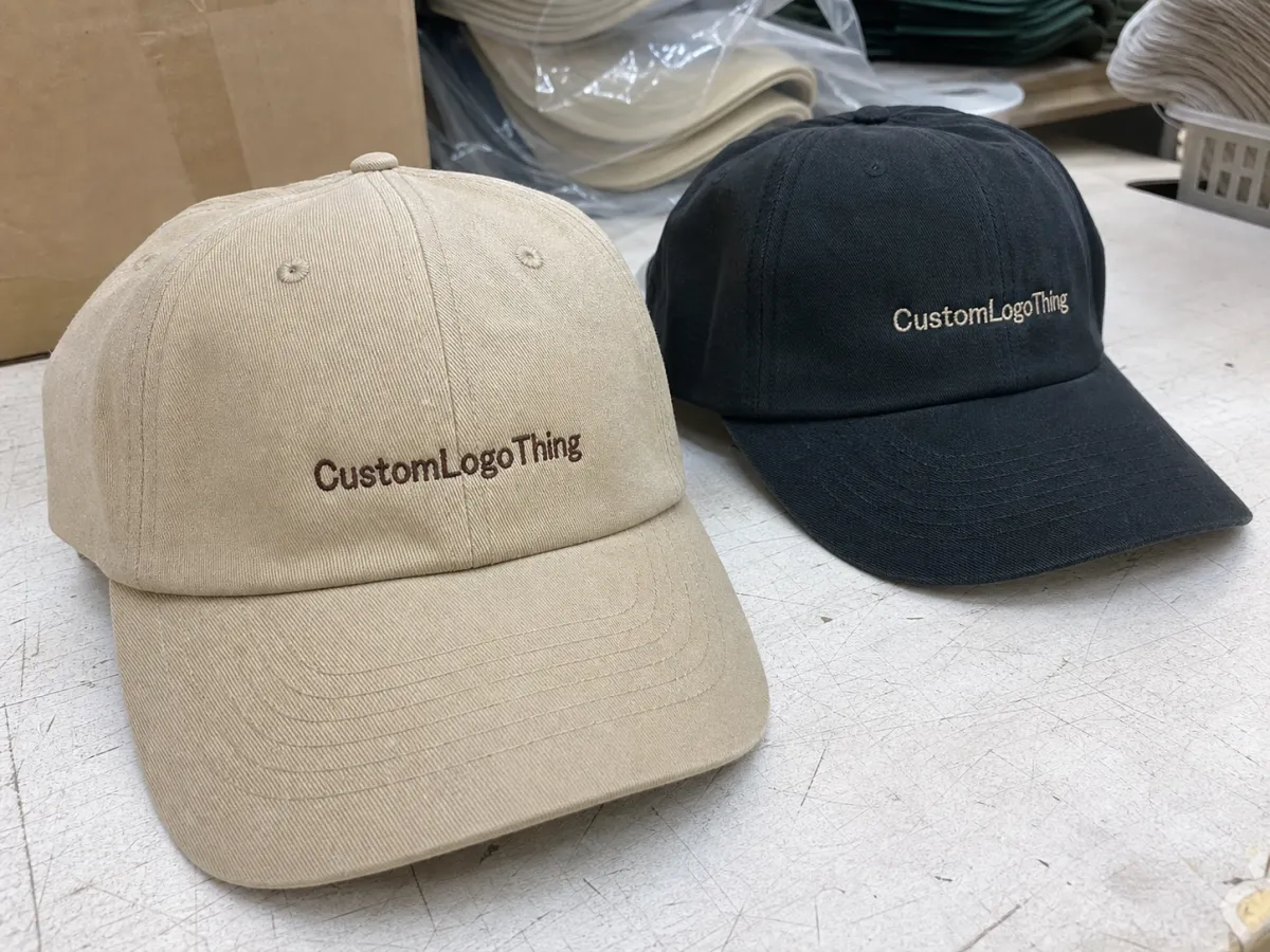
The best-performing caps usually have one thing in common: they read from a distance. Front embroidery, a modest side hit, or a back detail is enough. Once the eye has to work, the product starts losing retail clarity. The difference between a premium-looking cap and a crowded one is rarely budget alone. More often it is discipline. A logo that sits at the right scale on the crown will do more than a design stuffed with thread colors and unnecessary placements.
- Premium feel: embroidery adds texture, and texture tends to outperform flat decoration on small accessories.
- Higher recall: a worn cap keeps advertising the brand after the purchase is over.
- Lower visual risk: a compact logo usually looks more deliberate than a large, loud graphic.
- Simple assortment: two or three colorways are enough for a boutique launch without bloating stock.
That combination is why the format keeps working. It is not mysterious. It is practical retail math dressed up as style.
The production process from digitizing to final QC
Embroidery quality starts long before the first cap hits a machine. The first critical step is digitizing, which converts the art into stitch instructions. That file controls direction, density, underlay, pull compensation, and how the design sits on the curved front panel. A good logo can still look off if the digitizing is too dense, too loose, or built as if the art were going on paper instead of fabric.
A standard workflow runs in a fairly predictable order: artwork review, digitizing, stitch-out sample, approval, bulk production, final inspection, and packing. If the caps are being sourced as stock blanks, the process is straightforward. If you are changing closures, requesting a special wash, or adding branded packaging, the timeline gets less forgiving because each new variable creates another handoff.
- Logo review: confirm artwork format, placement, and target size.
- Digitizing: convert the logo into stitch paths and density settings.
- Sample stitch-out: test the design on the actual cap or a close match.
- Approval: check placement, thread color, and balance on the crown.
- Bulk run: produce the full order once the sample is signed off.
- Final QC: inspect loose threads, puckering, broken stitches, and count accuracy.
Approval should happen on the sample, not in a comment thread after bulk has started. Ask for close-up photos and at least one image that shows the cap on head form or a real fit stand, because the crown shape changes the way the embroidery reads. If branded packaging is part of the launch, approve that at the same time. Otherwise the product can look finished in one stage and oddly improvised in the next.
Packaging also needs practical checks. If the caps are shipping in cartons, shipment testing such as ISTA methods help identify whether the box structure can survive transit without crushed crowns or bent bills. And if you are using hangtags, sleeves, or insert cards, FSC-certified stock keeps the paper component aligned with a more considered retail story.
Choosing the right blank, fit, and embroidery spec
The blank cap determines the product's personality before the logo is even discussed. A structured cap gives the front panel more lift and supports a classic retail look. An unstructured cap sits softer, usually with a more relaxed or fashion-led feel. Neither is inherently better. The choice depends on whether the drop should read sporty, heritage, streetwear, or quietly premium.
Closure changes the buying experience too. Snapbacks are easy to size and easy to understand on a shelf. Strapbacks feel a bit more refined and can suit higher-priced assortments. Fitted caps are less forgiving because sizing adds risk and returns can climb quickly if the customer base is not well known. Metal closures usually feel more premium than plastic ones, but they cost more and are not always worth the increase for a small launch.
Fabric matters more than many buyers expect. Cotton twill is the safest default because it holds structure well, accepts embroidery cleanly, and survives ordinary retail handling. Washed cotton softens the mood and gives the cap a lived-in look. Nylon and performance blends work if the brief is athletic or outdoor-adjacent, but they should be tested carefully because stitch behavior shifts on slicker surfaces.
For the embroidery itself, scale is everything. A front logo in the 2.25 to 2.75 inch range is common for small retail runs, though the exact size depends on the cap profile and the complexity of the mark. Dense artwork with too many thread changes raises labor and can make the front panel stiff. If the design has thin type, tiny details, or overlapping shapes, it often needs simplification before production. Stitch files are not forgiving the way vector art on a screen is.
| Cap option | Best use | Typical retail feel | Production note |
|---|---|---|---|
| Structured cotton twill | Classic boutique drop | Clean, sharp, easy to merch | Good for bold front embroidery |
| Unstructured washed cotton | Soft fashion-led launch | Relaxed, worn-in, casual | Works best with simpler logos |
| Nylon or performance blend | Sport or outdoor angle | Lighter and more technical | Ask for stitch testing on the fabric |
| Premium package-ready build | Giftable drop or bundle | Higher perceived value | Adds cost through packaging design and packing steps |
For most boutiques, the safest specification is a midweight cotton twill cap with one front logo and, if needed, a subtle back hit. That gives the customer enough detail to feel considered without making the hat look overworked. A crowded crown is a fast way to make a small run feel promotional instead of retail.
What pricing, MOQ, and quote drivers actually change the unit cost
Price is never just the blank plus embroidery. It is quantity, setup, stitch complexity, packaging, labor, and how much handwork the order requires before it ships. MOQ, or minimum order quantity, is where the economics become visible. Small runs are useful for testing, but the unit cost rises quickly because fixed costs are spread across fewer pieces.
That is why the lowest quote can be misleading. A quote that excludes digitizing, sampling, packaging, rush charges, or split shipment costs may look competitive at first glance and still end up expensive by the time the order lands. The more the product is meant to feel retail-ready, the more the quote should spell out what is actually included.
| Order profile | Typical setup | Approx. unit range | What pushes cost up |
|---|---|---|---|
| 50-100 caps | 1 logo, 1 color, standard blank | $9-$18 each | Digitizing, small MOQ, sample fees |
| 250-500 caps | 1-2 placements, midweight twill | $5-$10 each | Thread changes, quality level, packing add-ons |
| 1,000+ caps | Simple front embroidery, repeatable order | $3.50-$6.50 each | Freight, color counts, label and tag changes |
| Retail-ready kit | Cap, insert card, swing tag, box or sleeve | + $1.50-$4.00 each | Package branding, extra handwork, custom printed boxes |
Typical setup charges are often modest but real. Digitizing can land around $25-$75 per logo, sample stitch-outs may run $30-$120, and rush production often adds 10%-20% depending on the schedule and the factory's capacity. If the design is simple, one logo and one placement will usually stay in a better price band than a multi-panel composition with several colors and repeated edits.
Buyers sometimes focus only on the cap price and forget the hidden friction in the order. A fair quote tells you what happens if the sample needs a revision, what packaging is included, and whether the MOQ is tied to a colorway or to the total order. That level of detail is not overkill. It prevents surprises.
Lead time and turnaround for a boutique drop calendar
The calendar should run backward from launch day. That simple rule prevents the most common failure in small retail launches: approving the product too late to absorb an unexpected delay. A cap order has several steps that can each move the schedule by days, especially if the sample needs adjustment or the blank is not sitting in stock.
Fast domestic production can sometimes move in a few weeks if the art is ready, the blank is available, and the sample is approved quickly. Offshore production needs more breathing room, not only because of manufacturing time but because each decision has to be locked earlier. A day lost at the art stage becomes a week lost once freight and customs are added.
The practical bottlenecks are predictable. Sample revisions are the obvious one, but color confirmation delays, holiday factory slowdowns, and shipping congestion are just as common. If the order is going to retail shelves, add time for unpacking, tagging, folding, sleeve insertion, and receiving. A product that arrives three days before launch is not a schedule. It is a warning sign.
Set a hard approval deadline and stick to it. If the sample is not acceptable by that point, production should pause. That sounds strict, but it protects both budget and brand consistency. It is cheaper to delay a launch by a week than to accept a hat that feels almost right and then live with a full run that is slightly off in color, placement, or crown shape.
A practical boutique calendar often looks like this:
- Week 1: art finalization and quote sign-off.
- Week 2: digitizing and sample stitch-out.
- Week 3: approval and bulk release.
- Weeks 4-5: production, QC, and packing.
- Weeks 5-6: transit, receiving, and launch prep.
That is only a baseline, but it is a realistic one. Smaller boutique teams often underestimate how long it takes to go from approved art to product that is actually ready for display. Caps look simple. Production schedules are not.
Artwork and approval checkpoints that save money
Embroidery has a bias toward simplicity. Fine lines can vanish, gradients do not translate, and tiny type can become unreadable once it is converted into thread. The artwork should be prepared for that reality before it reaches digitizing. Strong vector art, simplified color counts, and clear proportions will save more money than a late-stage rescue attempt.
There are four approval points worth protecting: stitch test, color match, logo scale, and placement on the actual cap panel. These are the moments where a small issue can become expensive if it is ignored. A logo that is one-quarter inch too low or a thread color that runs darker than expected can make a whole batch feel off even if the production quality is technically fine.
Send source files, not screenshots. Include Pantone references or at least a close match, plus exact placement notes. If the supplier has to infer the intent from a low-resolution image, the first sample will be doing too much guesswork. That adds time and usually adds cost. Detailed instructions are not bureaucratic; they are cheaper than rework.
The same rule applies to packaging. A cap with strong embroidery can still feel unfinished if the swing tag, insert card, or sleeve is generic or misaligned with the rest of the launch. The product and its packaging should speak the same visual language. One should not look expensive while the other looks like a placeholder.
- Source art: send vector, not a screenshot.
- Size target: state the exact width in inches or millimeters.
- Color target: list Pantone or close-match references.
- Placement: mark front center, side, back, or mixed hits.
If a stitch proof already looks crowded on a neutral background, it will not look better on fabric. Fixing that before approval is the cheapest correction in the whole process.
Common mistakes that make small runs look cheap
The fastest way to damage a boutique cap drop is to overdesign it. Too many thread colors, too many placements, or a logo that has been stretched to fill every possible inch usually makes the product feel louder, not better. Retail customers rarely reward effort if the result looks crowded.
Color choice can work against the product as well. A low-contrast logo on a similar-colored cap may look elegant on a mood board and nearly disappear in real life. That is a problem because retail is visual at speed. Shoppers notice shape and contrast before they notice nuance. Unless the concept is intentionally tonal, stronger contrast tends to photograph and sell better.
Skipping samples is another expensive shortcut. Renderings are useful for direction, but they cannot show crown height, stiffness, stitch density, or how a logo behaves on the actual panel. On a run of 50 or 100 caps, a mistake is hard to hide. There is no large inventory buffer to absorb it.
Finishing details are where cheapness shows up most clearly. Loose threads, uneven backing, weak structure, poorly trimmed seams, crushed crowns, and flimsy packaging are all visible to buyers. They may not be able to name the issue, but they can usually feel it. That perception matters more than people expect. In boutique retail, the customer is often buying taste as much as the product.
Inventory balance is the last common miss. One colorway gets over-ordered because it looks safe, and the others are underbuilt because the buyer is nervous. The result is a launch that feels lopsided. Two or three colorways usually create enough tension without adding dead stock. More than that, and the assortment begins to behave like a wholesale line rather than a drop.
If the cap needs a paragraph to explain it, the cap is doing too much.
Next steps: build a retail-ready cap brief and request quotes
Start with the product position, not the factory search. Decide on the target retail price, the quantity by colorway, and the tone of the collection. Premium, sporty, giftable, and workwear-adjacent all lead to different cap specs. That one decision changes the blank, the finish, the packaging, and the price ceiling.
Then assemble a brief that removes ambiguity. Include vector artwork, placement notes, cap style preferences, quantity by color, color references, packaging needs, and the in-hand deadline. If the product needs hangtags, sleeves, tissue, or Custom Packaging Products, say so in the same document. The fewer assumptions the supplier has to make, the fewer ways the order can drift.
It is worth requesting at least two comparable quotes. Compare the setup fees, sample costs, MOQ, production time, and what each supplier includes as standard. A quote that hides work in small print is not cheaper. It is just less honest about the cost structure.
Retail packaging deserves the same discipline. A cap in a plain polybag may be perfectly acceptable for one channel, but a boutique launch often benefits from a more deliberate presentation: a sleeve, a better hangtag, or a box if the product is gift-led. For bundle programs, custom printed boxes can make the release feel like a complete retail system instead of a loose assortment of parts.
My practical recommendation is simple: approve one sample round, lock the design, and set a reorder trigger before the first shipment lands. That is how custom Embroidered Baseball Caps for boutique retail drops stop being one-off experiments and become a repeatable part of a broader product packaging and package branding plan.
How many custom embroidered baseball caps should a boutique drop order?
For a test drop, start with a small quantity per colorway so you can measure sell-through without tying up too much cash in slow inventory. If the first release moves quickly, the next run can scale up with better information and often a lower unit cost.
What changes the quote most for boutique embroidered cap orders?
Quantity, stitch count, cap style, and the number of thread colors usually move pricing more than anything else. Rush timing, packaging, labels, and sample revisions can also add real cost, so those line items should be visible before you approve the order.
How long do custom embroidered baseball caps take to produce?
Fast domestic programs can move in a few weeks, but they still need time for digitizing, sample approval, and final inspection. Offshore production usually needs a wider buffer, plus shipping time, so the safer approach is to work backward from the drop date.
Are embroidered caps better than printed caps for boutique retail drops?
Embroidery usually feels more premium and tends to hold up better for retail, especially when the logo is simple and bold. Printing can work for detailed art or very tight budgets, but it often reads less elevated on a boutique shelf.
What should I send to get accurate quotes fast?
Send vector artwork, cap style preference, quantity by colorway, placement notes, target retail price, and your in-hand deadline. If you already know the packaging or hangtag requirements, include those too so the quote reflects the finished product rather than a partial version of it.
Done well, custom Embroidered Baseball Caps for boutique retail drops are easy to merch, easy to photograph, and easier to repeat than most apparel items. Give the supplier clear art, a realistic timeline, and a proper packaging brief, and the launch usually gets much less complicated.

