Chocolate Woven Label Beanies Thickness Guide for Buyers
For a dark beanie, label thickness is not a small detail. It decides whether the logo reads cleanly, whether the cuff stays soft, and whether the finished piece looks considered or slightly off. That is why the chocolate woven label Beanies Material Thickness guide matters more than most buyers expect.
Chocolate yarn hides weak points. It also hides bad mockups. A loose digital proof can look perfect, then the sewn sample lands with a ridge at the seam, a label edge that disappears into the knit, or a front panel that feels stiffer than it should. The mistake usually shows up late, which is why people end up paying for a second sample, a rework, or a batch they should never have approved.
Why Thickness Changes the Result
Thickness affects more than hand feel. On a beanie, it changes how the label sits against stretch knit, how the cuff drapes, and how much the logo stands off the surface. If the label is too thin, it can sink into the fabric and lose definition. If it is too thick, the beanie starts to behave like it has a patch of cardboard under the knit. Nobody wants that.
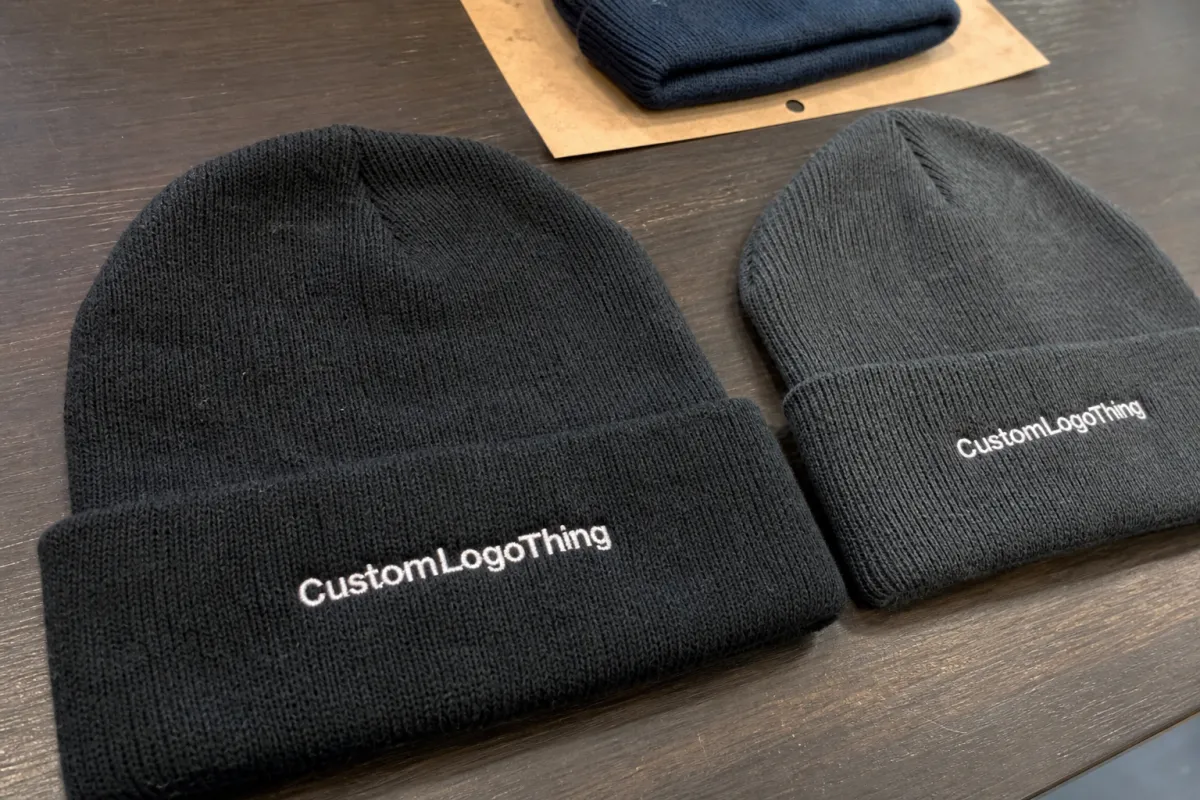
Chocolate beanies create a specific problem: dark base color lowers contrast. That means buyers cannot rely on the eye to rescue a weak spec. A borderline label can look acceptable on a sample card and unreadable on the finished product. The issue is not only color. It is also weave density, edge finish, and seam tension after stitching.
There is a reason buyers get caught by flat mockups. A loose label is not under stress. A sewn label is. Once the cuff stretches, the weave opens slightly, the borders shift, and the thickness reads differently. That difference is small in theory and very obvious in production.
For chocolate knit, the safest approach is to treat thickness as part of the garment, not as a separate decoration. The label should follow the beanie, not fight it. If the label is demanding attention for the wrong reasons, the product already lost the argument.
Practical Thickness Ranges for Chocolate Beanies
The phrase chocolate Woven Label Beanies Material thickness guide gets used loosely, but thickness is easier to manage when buyers break it into three working profiles. These are not legal standards. They are production ranges that help avoid bad surprises.
| Label profile | Approx. finished thickness | Hand feel | Best fit on chocolate beanies | Typical label price at 1,000 pcs |
|---|---|---|---|---|
| Soft weave | 0.3-0.45 mm | Light, flexible, low bulk | Brushed knits, comfort-first retail, gift sets | $0.08-$0.14 |
| Medium weave | 0.45-0.65 mm | Balanced, clean, stable | Most cuffed beanies and general branded stock | $0.12-$0.22 |
| Firm weave or backed label | 0.65-1.0+ mm | Structured, badge-like, more rigid | Workwear, structured retail drops, bold logo placement | $0.18-$0.32 |
Soft weave works best when comfort is the point and the logo is clean enough to survive a thinner build. Medium weave is the safe middle ground for most chocolate beanies. Firm labels are useful, but they need discipline. They can sit beautifully on a sturdier cuff and look terrible on a soft stretch knit.
That last bit matters. A label can be technically correct and still be wrong for the garment. A stiff badge on a soft rib knit often creates a visible hump. A too-light label on a heavy cuff can disappear into the surface and make the brand look underdeveloped. The sewing line does not care about the mood board.
Quick rule: if the beanie fabric is soft and stretchy, start thinner. If the knit has more body, you can move up a step. Start with the garment, not the logo file.
What Changes Fit, Feel, and Readability
Fabric weight is the first variable. A heavier rib knit can hold a firmer label without wrinkling. A lighter jersey-style beanie usually needs a softer profile so the front panel still falls naturally. The same woven label can behave like a neat accent on one style and an awkward lump on another.
Label size is the second variable, and this is where buyers often overcomplicate things. Small labels with too much detail are a headache on chocolate knit. Fine text, thin borders, and tiny icons all lose definition once the piece is sewn and stretched. If the art needs microscopic precision, a woven label may not be the right tool for that spot.
Fold style changes thickness perception too. A center fold, end fold, or flat sew-on label each carries a different amount of bulk into the seam. A cuff placement can usually tolerate more structure because the fold stabilizes the area. Body placement is less forgiving. On the body, even a small amount of extra stiffness can change how the beanie hangs.
Backing and edge finish matter more than many spec sheets admit. A heat-cut edge can feel slimmer than a stitched border. Adhesive backing may improve stability, but it can also introduce stiffness that shows up after repeated wear. If the sample feels great before sewing and not great after, the backing is often part of the problem.
Color contrast deserves a separate mention. Chocolate fabric compresses the visual margin between the label and the garment. If the border color is too close to the knit, the logo can sink visually. If the border is too bright, the label can look pasted on. The best result usually lands in the middle: enough contrast to read fast, not so much that the label dominates the hat.
The practical take is simple: judge clarity, softness, and stability together. Do not isolate one and pretend the others will sort themselves out. They will not.
"A loose label on a desk is a sample ingredient. The sewn version is the product."
Another detail that gets missed: thread density changes more than appearance. Dense weaving can sharpen text, but it also increases body. That is useful for crisp graphics and a nuisance on a very soft knit. A lower-density weave may feel nicer, yet it will blur fine type. There is no free lunch here. Just a smarter compromise.
Sample Process, Timeline, and QC Checks
A clean order starts with a short spec sheet. Keep it plain and specific: beanie material, knit type, target thickness feel, label dimensions, placement, color count, fold style, and whether the label should sit flat or have more body. If any of that is left vague, someone will guess. Guessing is expensive.
Ask for a digital proof first. That lets you inspect logo proportions, border width, and contrast against chocolate fabric before any weaving starts. Then request a sewn sample. A flat proof can hide the real issue. Sewing tension, cuff stretch, and seam placement only show up on a finished garment. That is the part buyers need to see before they approve production.
Good QC on Woven Label Beanies is not complicated, but it does need to be consistent. Check the sample under normal indoor light, not only under studio lighting. Pull the cuff gently to see whether the label distorts. Run a finger across the edge to feel for snag risk. Look at the label from arm’s length, because that is roughly how most buyers and end users will see it.
There is also a packaging and shipping side to this. If the beanies are packed in corrugated cardboard cartons, the carton spec should match the route and stacking pressure. A box that looks fine on paper can collapse in transit if the route is rough. If FSC-certified paper or kraft inserts are part of the order, specify them early so the supplier sources the right stock before the schedule starts slipping.
A realistic lead-time breakdown usually looks like this:
- Digital proof: 1-3 business days if artwork is clean.
- Sewn sample: 5-10 business days, longer for detailed weaves or extra revisions.
- Production: 12-18 business days after approval for standard runs.
- Packing and dispatch: 2-5 business days depending on quantity and carton setup.
Those dates can move if the artwork is messy or the label spec changes halfway through. They can also move if the buyer keeps reworking the logo size after sample approval. That kind of drift is common, and it is usually self-inflicted.
One more useful QC check: confirm the label on the actual beanie after sewing, not before. A label may pass in isolation and fail on the garment because the cuff compresses it differently. That is why production teams care so much about sewn approvals. It is not a ritual. It is the point where the product becomes real.
Cost, MOQ, and Pricing Tradeoffs
Pricing for woven labels is driven by simple things: size, color count, weave density, folding method, edge finish, and whether backing is added. Bigger labels use more material. Tighter weave uses more setup. More colors mean more weaving complexity. Special folds and stitched edges add labor. None of this is mysterious, and none of it is free.
MOQ changes the math fast. A small run looks cheap until setup and digitizing get spread across a tiny quantity. Then the per-unit price rises and everyone acts surprised. The factory is not being dramatic. It is just charging for real work.
For a standard woven label on chocolate beanies, these are common buying ranges:
| Order size | Best thickness target | Typical unit price range | Why it works |
|---|---|---|---|
| 100 pcs | Soft or medium | $0.35-$0.75 per label | Setup cost matters more than raw material cost |
| 300 pcs | Medium | $0.18-$0.38 per label | Good balance for small brands and test runs |
| 500 pcs+ | Medium or firm | $0.10-$0.28 per label | Better spread on digitizing, weaving, and prep |
Ask for quotes at several quantity breaks if you can. The gap between 100, 300, and 500 pieces can be wide enough to change the whole order structure. If you are also sourcing hang tags, sew-in size labels, or packaging inserts, get those quoted together. Otherwise the real cost stays hidden until the packing list arrives.
Do not chase the lowest price if the label spec is wrong. A thin label that vanishes into the knit is not a bargain. A firm label that causes puckering is not premium. Rework, delays, and complaints cost more than the cents you thought you saved.
There is a practical buyer trick here: compare the sample cost against the full order cost, not just the unit label price. A slightly better label profile can reduce rejection risk, especially on dark beanies where visual defects are harder to spot before shipping. That is a much more useful lens than hunting the absolute lowest quote.
Common Mistakes Buyers Make
The biggest mistake is choosing the thickest sample because it feels substantial in the hand. That instinct is understandable and often wrong. A heavy label can look premium on a sample card and awkward once stitched onto a soft cuff. The beanie ends up looking busier than intended.
Second mistake: ignoring placement. A label near a dense seam or a tight fold can bunch up even if the weave itself is good. Move the same label to a flatter section and it may look excellent. Placement changes behavior. Pretending otherwise wastes time.
Third mistake: overloading a small label with detail. Woven labels have limits. Thin lines, tiny text, and crowded borders degrade fast on dark chocolate knit. If the design depends on high-resolution artwork, the woven format may need to be simplified or resized. Brute-forcing detail into a small patch usually ends badly.
Fourth mistake: approving a loose label instead of a sewn sample. That is the one that stings. The loose version can look perfect because it is not being stretched, folded, or compressed. The sewn version is where the truth lives.
Fifth mistake: forgetting that packaging and garment spec need to match. A soft, understated beanie in recycled paper packaging reads differently from a stiff label paired with glossy synthetic inserts. If the brand story claims restraint and eco-conscious sourcing, the trim choices should not fight that message.
To keep the order sane, use a short internal check before approval:
- Confirm the final beanie color and knit type, not a generic brown reference.
- Set the label feel first: soft, medium, or firm.
- Check label size against the actual cuff or front panel.
- Review sewn samples under normal light and after a stretch test.
- Lock packaging only after the garment spec is settled.
That sequence saves money and avoids the awkward moment where a “premium” label looks like a stiff afterthought.
Practical Buying Checklist
If the goal is a clean, usable order, keep the decision tree short. Start with the beanie itself. A heavy rib knit can support more structure. A lighter knit needs a thinner, softer label. Then look at the brand mark. If the logo is simple, you have more room to move toward a softer profile. If the logo is detailed, the weave may need more density, but only up to the point where the beanie still feels like a beanie.
The chocolate woven label Beanies Material Thickness guide really comes down to a few practical choices: how much body the knit can carry, how much contrast the dark fabric can support, and how much stiffness the wearer will tolerate. Buyers often try to solve all three with one vague “make it premium” note. That note is not a spec. It is a headache in waiting.
Before approving production, ask for these exact items:
- A digital proof that shows the label on chocolate fabric.
- A sewn sample on the actual beanie style, not a generic test swatch.
- A quantity-based price ladder so MOQ effects are visible.
- A timeline split between proof, sample, production, and packing.
- A carton and packaging note if shipping method or branding inserts matter.
That is enough to avoid most of the usual mistakes. It is also enough to keep the label from becoming the loudest problem in the order.
One final point: if the beanie is meant to feel soft and wearable, do not let the label overcorrect the product into stiffness. A well-chosen woven label should finish the garment, not announce itself from across the room. On chocolate knit, that balance matters more than flashy detail.
FAQ
How thick should a woven label feel on a chocolate beanie?
For most chocolate beanies, a medium profile around 0.45-0.65 mm is the safest starting point. It gives enough structure for clean logo reading without making the cuff feel rigid. If the knit is very soft or stretchy, moving slightly thinner usually performs better.
Does a thicker woven label always look better?
No. Thicker labels can look premium in isolation, then feel awkward once sewn into a soft knit. The label has to work with the beanie fabric, not against it. Good contrast, clean edges, and a sensible size usually matter more than raw bulk.
What drives price the most in chocolate woven label beanies?
Label size, color count, weave density, fold style, and backing are the main cost drivers. MOQ changes the unit price quickly because setup gets spread across fewer pieces on small runs. If you want a realistic number, ask for quotes at 100, 300, and 500 units.
How long does sampling and production usually take?
Digital proofing often takes 1-3 business days, while a sewn sample can take 5-10 business days depending on detail. Production after approval often lands in the 12-18 business day range for standard orders. Complex artwork or repeated changes will stretch that schedule.
What should I send to get an accurate quote?
Send the beanie material, knit type, label dimensions, placement, color count, fold style, and the thickness feel you want: soft, medium, or firm. Include quantity and any packaging requirements as well. If you have a photo or reference sample, that helps a lot more than a vague “premium” instruction.


