With Pom Pom Beanies logo placement, the real decision is rarely about decoration alone. It is about where the eye lands once the hat has been stretched, folded, worn, photographed, and packed. A logo that looks centered on a flat proof can drift visually when the pom adds volume above it or when the cuff rolls slightly higher than expected.
That sounds minor until you are approving a run of 1,000 pieces and every millimeter starts to matter. Buyers want visibility, but they also want the beanie to feel comfortable and deliberate, not crowded by the mark. On a textured knit, a smaller, better-placed logo often reads cleaner than a larger one pushed into the wrong zone.
The practical challenge is simple to describe and harder to execute. Cuff height, crown stretch, stitch density, pom size, and decoration method all affect how the artwork sits. Once those variables are considered together, placement stops being a design preference and becomes a production decision.
Why Placement Changes the Sweet Spot
A pom pom changes the visual balance of the entire hat. It raises the top silhouette, shifts attention upward, and can make a logo feel too high even when it is technically centered. On a flat mockup, a mark can look perfectly proportioned. On a head, under retail lighting, it may read differently by a surprising margin.
That happens because Pom Pom Beanies are not static surfaces. The knit relaxes, the cuff folds, and the crown does not behave like a rigid panel. A logo placed too close to the crown seam can get pulled into the top volume. A logo placed too low can disappear into the fold line. The sweet spot is usually the place that still looks intentional after the hat is worn for a few minutes, not only at the sample table.
This is where Pom Pom Beanies logo placement often goes wrong in wholesale programs. Teams approve a layout that looks fine in isolation, then the sample comes back and the design feels crowded against the pom or too small for the surface. In retail, that can weaken shelf impact. In teamwear, it can make a branded piece look improvised.
The best placement is the one that still looks centered when the beanie is on a head, not just when it is laid flat.
That rule is practical, not aesthetic. If the hat will be seen from six feet away, the placement has to survive distance, motion, and imperfect folding. A careful buyer treats the logo zone as part of the garment structure, not as a blank canvas.
Decoration Zones That Hold Up on Knit Crowns and Cuffs
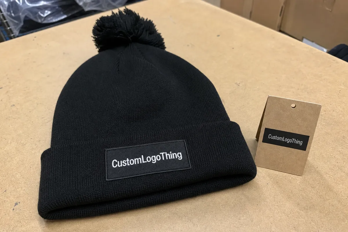
There are a few zones that consistently work on Pom Pom Beanies, and each one has a different effect. The front cuff is usually the safest option. It gives the decoration a flatter surface, keeps the mark away from the pom, and provides enough structure for embroidery, patches, or woven labels. Lower crown placement can work too, especially for simple logos or small wordmarks. Side placement is more fashion-led and less conventional, while woven labels and applique patches are useful when the artwork needs more control than direct stitching can provide.
The right zone depends on who needs to see the logo first. If the wearer is the audience, a subtle side mark can feel premium. If the hat needs to read quickly on a shelf or in group photos, the front cuff usually wins. In wholesale, that audience question matters more than many brands expect.
| Placement zone | Best use | Typical visual effect | Practical caution |
|---|---|---|---|
| Front cuff | Retail programs, team gear, broad visibility | Clean, balanced, easy to read | Keep margin away from the fold line |
| Lower crown | Simple logos, understated branding | Modern, slightly elevated look | Can shift visually if the knit stretches |
| Side panel | Fashion-led assortments, secondary marks | Distinct and less expected | Weak choice for dense text or fine detail |
| Woven label | Small logos, fine detail, brand storytelling | Sharp and controlled | Needs careful sizing so it does not look tacked on |
| Patch or applique | Branded programs, outdoor looks, stronger contrast | Structured and dimensional | Can feel bulky if oversized |
Knit surfaces reward simplicity. Thin strokes, tight letter spacing, and tiny details soften once the fabric stretches. A one-color icon often survives better than a full wordmark. If the logo must be read quickly, in poor lighting, or from across a retail aisle, less detail usually gives a better result.
Material, Stitch, and Color Factors That Shift Placement
The same artwork can behave differently from one beanie to the next. Yarn thickness changes how much the surface compresses under stitching. A rib knit with a firmer hand can hold a logo neatly, while a looser acrylic knit may spread more than expected. A taller cuff gives the decoration more room, but a short cuff forces the artwork closer to seams and fold lines.
That is why placement should never be decided in isolation from the fabric. If the beanie is a heavy gauge knit, embroidery may sit differently than it would on a lighter gauge version. If the crown is soft and slouchy, a logo near the upper portion may need extra breathing room. In other words, the same art file can need two different placement strategies depending on the construction.
Color is just as important. High-contrast combinations usually hold up best, but textured yarn can mute contrast more than a screen proof suggests. A pale thread on a medium-tone beanie may disappear a little once it is stitched into the knit. A dark logo on a dark beanie may look elegant in a mockup and nearly invisible on the finished hat if the lighting is flat. Buyers should review thread colors in real samples, not only on digital proofs.
Stitch count and backing choice matter too. Dense embroidery can keep a logo crisp, but too much fill in a tight area can make the knit pucker. A patch can protect detail and improve contrast, but it also changes the silhouette of the decoration. Woven labels preserve sharp edges at small sizes, though they work best when the design is simplified. Every method pushes the logo into a different visual language, so the placement should match the method rather than fight it.
For quality-sensitive programs, placement tolerance should be discussed before production starts. On premium retail orders, buyers often expect placement to land within roughly 2 to 4 mm of the approved sample, with consistent visual centering across the run. Lower-cost giveaway programs can accept more variation, but there is still a line. Once that line is crossed, the hat starts to look inconsistent instead of handmade.
If packaging is part of the brief, plan for it early. Recycled paperboard, FSC-certified cartons, and shelf-ready labels can all affect how the hat is presented and how much pressure it sees in transit. For shipping assumptions, suppliers sometimes reference ISTA methods when thinking through pack-out and damage risk. See FSC and ISTA for the standards language behind those terms.
Cost, Pricing, and MOQ Variables Buyers Should Compare
Placement has a direct effect on price because it changes how the hat is made. A simple front-cuff logo may use a straightforward embroidery setup and low stitch counts. A more difficult location can require extra digitizing, a special hooping method, a patch, or a second proof round. That is how two projects with the same art file end up with different quotes.
For moderate wholesale quantities, a simple decoration on a workable placement may fall around $0.65 to $1.20 per unit in decoration cost, depending on the method and complexity. Patches, applique, or more involved edge finishing usually push the number higher. At smaller quantities, the setup fees matter even more. A $35 digitizing charge or a $50 patch tool fee does not feel large until the order is only a few hundred units.
MOQ drivers are usually predictable: number of colors, number of placements, artwork complexity, and whether each colorway needs a different thread match or approval. If black beanies use one thread combination and heather gray requires another, the project may function like two production paths. Buyers sometimes compare those quotes as if they were interchangeable. They are not.
Here is the short list I would want before comparing vendors or factories:
- Sample fee and whether it is credited after approval.
- Digitizing or art prep fee for embroidery and patch work.
- Run charge by placement, especially for multiple logo zones.
- Packaging costs for hangtags, belly bands, inserts, or cartons.
- Colorway pricing if the assortment is split across several beanie shades.
The cheapest quote is often cheap for a reason. If the placement is cramped, the logo is too detailed, or the supplier is quietly assuming a simpler decoration method, the lower unit price can turn into delays or rework later. A cleaner placement usually protects margin better than a squeezed logo with a slightly lower quote.
Production Steps and Timeline From Artwork to Shipment
Most knit programs move through the same sequence: artwork intake, logo size confirmation, placement selection, proof creation, sample approval, production, and shipment. The order sounds ordinary. The risk sits in the handoffs. If one of those steps is vague, the schedule starts to slide.
Three issues cause most delays. The first is low-resolution artwork, which forces the supplier to rebuild the file before digitizing or layout work can begin. The second is late placement changes, especially after the first proof is already reviewed. The third is uncertainty about the hat itself: no one confirms cuff height, pom size, or crown depth, so the logo is approved in theory and questioned in the sample.
Embroidery usually moves faster than patch-based branding when the art is simple and the stitch count is modest. But when the design has fine edges or small lettering, a patch can be the better choice because it holds detail more reliably. In those cases, a longer setup can save time later by reducing proof revisions. That tradeoff is easy to miss if you only look at the first quote.
Typical wholesale lead times often land around 12 to 15 business days after proof approval for straightforward knit programs, though quantity, factory load, and decoration complexity can extend that window. Sampling adds time of its own, especially when the placement is not yet settled. If the order includes multiple colorways or different decoration methods, assume the calendar will be tighter than it looks on paper.
One practical habit helps more than most others: approve decisions in sequence. Lock the placement first, then the size, then the decoration method or thread selection. If all three keep changing at once, the sample process becomes a loop. That loop is where a project loses days.
Common Mistakes That Make Logos Look Crooked or Small
The most common mistake is approving a placement on a flat art board and assuming it will hold on the hat. It will not always. The pom changes the top silhouette, the knit stretches, and the cuff can roll differently from sample to sample. A mark that seemed centered in proofing may sit too high once the beanie is worn.
Another frequent issue is crowding the cuff edge. A logo placed too close to the fold can be pulled out of alignment by wear, packaging, or a slightly deeper fold than expected. It may look bold in photos and awkward in actual use. On a knitted surface, margin is not wasted space. It is protection against distortion.
Complex logos create a different kind of problem. Buyers often ask for larger artwork when what they really need is cleaner art. Fine lines, tiny icons, and tight copy can blur or collapse into the knit. If the goal is readability from 10 to 15 feet, simplification is usually the better move. Bigger is only better when the surface can support it.
Proofing errors are expensive because they are easy to avoid. Teams skip sewn samples, ignore thread contrast, or approve the placement without photographing the hat on a head form. Those omissions seem small during review. They are not small once the run is in production. A logo that looks good on a screen can still fail when the hat is angled, stretched, or packed with tags attached.
A solid sample should answer one question clearly: does the logo still feel centered and confident when the hat is worn?
If that answer is uncertain, the placement is not ready. The stitching may be fine and the artwork may be fine, but the hat still does not read correctly. That is a different problem, and a more expensive one.
Expert Tips for Cleaner Proofs and Better Sell-Through
Good proofs show two views: flat and worn. The flat view helps with spacing, stitch count, and precise measurement. The worn view shows how the beanie sits on a real head shape, which is where the pom, cuff, and crown start to tell the truth. If a placement only works in one view, it is not fully solved.
Choose one focal point. Two competing brand marks usually split attention and make the hat feel busy. That does not help sell-through. A single clean mark is easier to photograph, easier to merch, and easier for a buyer to understand at a glance.
Packaging should be checked against the decoration, not treated as an afterthought. A hangtag can cover the logo if it is positioned carelessly. A belly band can distort the way the front cuff is read in the carton. Shelf-ready packaging should support the placement, not compete with it.
Think about the image before you think about the shelf. If the product will be sold online, the logo has to survive cropping, compression, and small thumbnail views. A placement that reads well in person but disappears in a social post or product grid is weaker than it looks. That is especially true for dark beanies, where contrast is already working harder than usual.
It also helps to inspect the finished hat against folding and pack-out conditions. A logo that sits too high can rub against a tag or fold line in transit. That kind of wear is subtle, but it shows up later in returns, rehangs, or rephotography. These are the quiet details that separate a workable program from one that keeps generating little problems.
Next Steps Before You Request Samples or a Quote
Before sampling, measure the cuff height, confirm the approximate pom size, choose the decoration zone, and decide whether the artwork needs simplification. Those four decisions remove most of the uncertainty from pom pom beanie projects. If any of them is still open, the sample will probably answer more questions than it should.
Then send a clean RFQ. Include the logo file, target quantity, color targets, preferred decoration method, split by colorway, and packaging or labeling requirements. If the order needs FSC-certified packaging or special retail labeling, say that early. If the shipment must align with ISTA assumptions for transit, include that too. It is faster to design one clear production path than to revise the same order three times.
Ask for a digital placement proof on a beanie shape, not only on a flat board. If the order is high-value or the placement is sensitive, request a physical sample before production starts. A sample is cheaper than a rework, and rework on knit goods is where margins disappear quickly.
For buyers working through pom pom Beanies Logo Placement, the best results usually come from a small amount of restraint. Keep the art readable. Leave room for the fold. Let the hat breathe. A placement that respects the structure of the beanie tends to produce cleaner approvals, fewer revisions, and better-looking stock on arrival.
Where should a logo sit on pom pom beanies for the cleanest look?
The front cuff is usually the most reliable starting point because it gives the logo a flatter area and keeps it clear of the pom. Lower crown placement can work when the artwork is simple and the beanie has enough structure above the cuff. Always check the placement on a worn mockup, since a flat proof does not show how the hat will actually sit.
What logo size works best on pom pom beanies with knit cuffs?
Use the largest size that still leaves enough space around seams, fold lines, and stitch transitions. Simple icons can usually go a little larger than detailed wordmarks because they stay readable as the knit stretches. If the logo includes text, test it at arm’s length and at retail distance, not only in close-up.
How does pom pom beanies logo placement affect pricing?
Pricing changes when placement requires extra setup, a different decoration method, or another round of sampling. A clean front-cuff design is often cheaper to produce than a placement that demands a patch or special hooping. Ask whether the quote changes by zone, because moving the logo can change both labor and material costs.
Can embroidery, patches, and labels all work on pom pom beanies?
Yes, but each method behaves differently on textured knit. Embroidery is strong for simple logos and moderate detail. Patches and woven labels help preserve finer artwork, though they introduce their own size and thickness limits. The right choice depends on the brand look, budget, and how much surface area the hat offers.
What should I include in a quote request for pom pom beanies logo placement?
Send the logo file, quantity, colorway breakdown, preferred placement, and any packaging or labeling requirements. Ask for a proof that shows scale on a real beanie shape instead of only on flat artwork. Include your needed ship date so the supplier can confirm whether sampling, approval, and production fit the schedule.


