For a corporate gifting Frosted Zipper Plastic Bags Print Method Comparison, the real question is not which process looks best in a mockup. It is which one still looks controlled after the bag is filled, carried, stacked, and opened ten times by people who do not treat it gently. Frosted film already gives the bag a softer, more elevated base. The print method has to add clarity, not noise.
This is where a lot of packaging decisions go sideways. Buyers compare these bags the way they compare brochure finishes, as if the print sits in isolation. It does not. A Frosted Zipper Bag is a functional object with a brand job to do. It has to hold event kits, onboarding items, small apparel, chargers, skincare sets, or welcome materials, then still look presentable on a desk or in transit. The best result comes from matching the artwork to the material, not forcing a favorite effect onto the wrong surface.
Frosted bags also expose weak design faster than many people expect. The matte haze softens the base, but it does not hide poor line weight, awkward placement, or overcomplicated art. If the logo is too fine, too tall, or too dependent on color blending, the bag will look more budget than branded. That is why this comparison should focus on readability, opacity, setup cost, and production constraints, not just on whichever sample looked nicest under showroom lighting.
Practical rule: if the logo is not legible at arm's length, the bag is not premium. It is just branded packaging with a higher price tag.
One more wrinkle: frosted bags are not the same as clear bags with a matte coating. The film itself changes how white ink, metallic accents, and dark contents appear. A logo that feels crisp on paper can look a little soft on plastic, especially if the bag is filled with dark items or viewed under cool indoor light. That is why a real corporate gifting frosted zipper plastic bags print method comparison needs to include the substrate, not just the artwork.
Why frosted zipper bags look premium even before printing
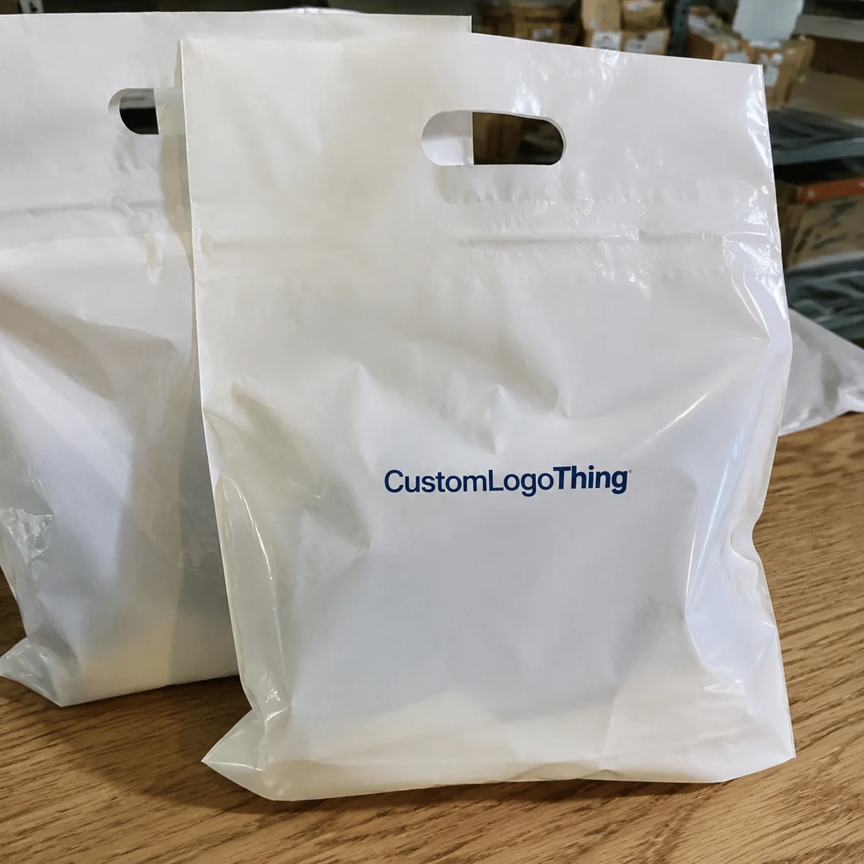
Frosted polyethylene has a quiet advantage: it hides fingerprints, surface scuffs, and minor handling marks far better than clear plastic. That matters because the buyer usually sees the bag before they ever hold the contents. The soft translucency makes the pouch feel considered, almost designed around the gift instead of being an afterthought from the packaging aisle.
Most suppliers quote Frosted Zipper Bags in a range of film thicknesses, often around 120-180 micron for lightweight to mid-weight gift use. Thicker film does not automatically mean better. It can improve structure and reduce that flimsy crinkle, but it also raises cost and may change how the zipper closes. For corporate kits, the sweet spot is usually the point where the bag stands up visually without becoming stiff or bulky.
Buyers often underestimate how much the zipper affects perception. A clean seal, consistent tooth alignment, and a zipper that closes without snagging all make the print feel more expensive. If the zipper fights the hand, the logo has to work harder. If the closure feels smooth, even a simple one-color mark can look more intentional than a busy design on a weaker bag.
That is why a polished sample photo can be misleading. A mockup can hide a lot: a print area that is too small, a logo placed too close to the seam, or an ink choice that washes out once the pouch is filled. Frosted film rewards bold, simple branding. It punishes overdesigned artwork with almost comic efficiency.
There is a practical comparison hiding in plain sight. A frosted bag with a strong, two-color logo can often feel more premium than a clear bag with a more expensive finish, simply because the frosted surface gives the eye somewhere to rest. The background acts like a built-in diffuser. That makes crisp typography and restrained graphics more effective than dense illustration, especially for corporate gifting.
Corporate gifting frosted zipper plastic bags print method comparison
The three methods most buyers compare are screen print, digital printing, and hot stamp. Each can work on frosted film. Each can also fail in a different way if the artwork is wrong for the process.
Screen print is the most dependable choice for bold spot-color logos. It lays down a heavier layer of ink, which helps the mark stand out against the hazy surface. If the brand uses a strong white, black, navy, or red logo and the layout is clean, screen print usually gives the most consistent result for the money. It also tends to hold up well under handling, which matters on bags that will be opened and closed repeatedly during an event or onboarding cycle.
The tradeoff is setup. Every color adds labor, screening, and registration risk. A two-color logo is still manageable. A four-color process build starts to behave more like a small print project than a simple packaging run. On frosted plastic, even a 1 mm shift can be visible because the surface is semi-translucent. That is not a disaster, but it is a real production constraint.
Digital printing is the better fit for short runs, frequent artwork changes, and logos with more than one color family. It handles gradients, mixed imagery, and tight timelines without the screen-building overhead. If you need 150 bags for a launch kit and the design is still evolving, digital often makes the most sense. It reduces prepress friction and gets you to approval faster.
The weak spot is opacity. Some digital inks sit a little softer on frosted film, especially if there is no white underbase or if the bag color has too much haze for the art. That does not mean digital is weak. It means the file has to be built for plastic, not borrowed from a web banner. Designs that depend on subtle tonal shifts can print beautifully on screen but lose authority on the bag.
Hot stamp is the premium accent choice. Metallic gold, silver, copper, or a clean blind effect can make a frosted bag feel more expensive than the rest of the gift set. It works especially well for icons, monograms, and short brand marks. The reflective edge gives contrast that plain ink cannot always match.
The limitation is detail. Tiny text, thin outlines, and busy gradients do not survive hot stamp as well as simpler art. If the logo relies on a delicate internal line or a fine serif, the result can break up or fill in. That makes hot stamp powerful but selective. It is not a universal upgrade; it is a design tool with a narrow, useful range.
| Method | Best for | Typical setup | Typical unit price at 250 / 1,000 / 5,000 | Main risk on frosted film |
|---|---|---|---|---|
| Screen print | Bold spot-color logos, simple layouts, larger runs | $40-$150 per color | $0.45-$0.90 / $0.20-$0.45 / $0.10-$0.22 | Costs rise quickly as colors and corrections increase |
| Digital printing | Short runs, CMYK artwork, fast revisions | $0-$50 | $0.75-$1.40 / $0.35-$0.80 / $0.18-$0.45 | Color can look soft if the ink layer is too light |
| Hot stamp | Premium accents, metallic details, clean icons | $80-$250 for a die | $0.60-$1.20 / $0.30-$0.70 / $0.15-$0.40 | Fine lines and small text can break up or disappear |
The blunt version is simple. Screen print is best for repeatable, bold branding. Digital is best for speed and design flexibility. Hot stamp is best for perceived value. For a real corporate gifting frosted zipper plastic bags print method comparison, the best choice is the one that keeps the logo readable at the right quantity without blowing up the budget.
There are other methods in the packaging universe, but they are usually the wrong answer here. Flexographic printing matters more for high-volume film manufacturing than for modest branded gift kits. Offset printing is useful for outer cartons and inserts, not for the bag itself. Knowing where a process belongs saves money and avoids a lot of awkward vendor conversations.
Cost, MOQ, and unit price tradeoffs by method
This is where buyers either get a fair deal or discover that the quote was only cheap at a quantity they never intended to order. Low setup fees can hide high minimums. High setup fees can still be the right move if the unit price drops enough at scale. The math matters more than the headline number.
For runs under 250 units, digital printing usually offers the cleanest path because the setup is lighter. You pay more per bag, but you avoid tying up cash in excess inventory. Between 250 and 1,000 units, screen print starts to become competitive if the artwork is simple and the print area is stable. Past 1,000 units, screen print often delivers the best unit economics for spot-color branding. Hot stamp can also fit in this range, but only if the premium finish is part of the value proposition rather than a decorative afterthought.
A realistic ordering pattern looks like this:
- Under 250 units: higher per-bag price, lower inventory risk, faster approval cycle.
- 250-1,000 units: better pricing breaks, especially for one-color or two-color art.
- 1,000+ units: stronger unit cost, but less room for frequent artwork changes.
MOQ is not just a supplier rule. It is a cost-spreading mechanism. If a vendor quotes a lower price at 2,000 pieces and you only need 600, the discount is theoretical. You still pay for boxes you may not use. For that reason, a useful quote request should always show pricing at 100, 250, 500, 1,000, and 2,500 units. Those break points reveal whether the supplier is offering real scale savings or just making the first line of the quote look friendly.
It also helps to split the quote into four buckets:
- Setup fees: screens, dies, plates, file cleanup, and color matching.
- Samples: blank samples, printed samples, and shipping costs.
- Unit pricing: the bag itself plus the chosen print method.
- Logistics: packing, carton counts, freight, and any rush fee.
There are hidden costs that do not always appear in a polished PDF. White underbase work, additional curing steps, metallic foil, and extra spoilage allowance can all add cost. If the bag uses a strict brand color, ask whether the supplier is quoting a close visual match or an actual controlled color target. Those are not the same thing, and the difference shows up fast on translucent film.
For jobs that involve secondary paper packaging, an FSC-certified insert or belly band can be a sensible ask, but only if it fits the budget and the timeline. If the shipment has to survive repeated handling, transit testing references from ISTA are useful because they help frame the packaging as a logistics problem, not just a design one. The best packaging decisions tend to be boring in the most profitable way.
Process and turnaround: from artwork to delivery
The production sequence is usually straightforward. Artwork cleanup comes first, then proofing, then color approval. After that, the supplier prints, cures or finishes the bag, packs it, and ships it. The steps are ordinary. The failure points are not.
Digital printing often moves fastest because the setup is lighter and revisions are easier to absorb. A straightforward job can sometimes move through proof approval and production in about 7-12 business days if the file is ready and the quantity is modest. Screen print generally needs more time because screens, color calibration, and drying or curing add labor. Plan on roughly 10-15 business days after proof approval for a standard run. Hot stamp can sit between those ranges, but the timeline depends on die creation and whether the foil or metallic material is in stock.
The most common delays are avoidable:
- Sending a low-resolution logo instead of vector art.
- Forgetting to specify the exact print location on the bag.
- Approving a proof with the wrong zipper color or zipper style.
- Changing the quantity after the quote is already locked.
- Waiting several days to answer a proof question, then wondering why production slipped.
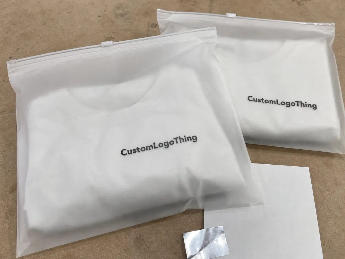
There is also a practical difference between a digital proof and a physical sample. A digital mockup is useful for placement and layout. It is not enough for judging opacity, zipper color, or how the artwork behaves once the bag is filled. If the contents are dark, glossy, or densely packed, request a filled photo or a pre-production sample. That small step catches issues that mockups routinely miss.
For strict brand work, ask whether the supplier can provide a color target or a controlled sample before the run. If the artwork uses a deep brand tone or a highly specific white, say so early. Many production issues are not quality failures; they are mismatches between design assumptions and the way plastic actually prints. Good suppliers will tell you when the artwork needs to be simplified. Weak ones will promise anything and let the proof absorb the damage.
Lead time also depends on freight. A bag order that ships in two weeks can still arrive late if the destination is far from the production point or if the carton count is high enough to push the shipment into a slower lane. Always separate production time from transit time. Buyers mix those up constantly, and the calendar punishes them for it.
Artwork, opacity, and finish factors that change the result
The finished look is not just about the print method. Bag size, print area, zipper color, and the contents inside all change the result. A small logo on a large pouch can feel timid. A logo placed too close to a seam can distort. A dark zipper can interrupt a light mark. The bag is an object with edges and tension points, not a flat canvas.
Opacity is the big technical variable. White ink is not automatically opaque enough on frosted film. Thin white type and hairline outlines can disappear unless the supplier increases stroke weight or uses a white underbase. That becomes even more important when the bag holds dark products or when the final photo is taken under cool indoor lighting. On screen, a design can appear clean and balanced. On plastic, it can look faint and underpowered.
Finish choices matter too. A frosted body creates a soft base that already reads a little premium. Metallic hot stamp adds contrast and a sharper edge. Spot-color inks usually look cleaner than process-color builds when the logo is simple enough to support them. CMYK is useful for more complex graphics, but if the brand only needs one or two signature colors, spot colors often print tighter and cost less to repeat.
There is also a small but important production detail that buyers miss: the print area has a ceiling and a boundary. If the artwork is too large, it can drift toward seams or zipper hardware. If it is too small, it loses impact once the bag is filled. The ideal print area usually gives the logo breathing room without turning the pouch into a billboard.
If you are unsure about the visual density, ask for either a white-backed proof or a pre-production sample. Those two options reveal whether the logo has enough punch. A frosted surface can make subtle art disappear faster than expected. That is why restrained graphics often perform better than ambitious ones. The best print is not always the most elaborate. It is the one people can read without effort.
The finish also changes perceived value in a way that is easy to underestimate. A crisp edge, a controlled metallic accent, or a logo with strong contrast can move the bag from "utility packaging" to "gift presentation." The material is not magic. The details carry the weight.
Common mistakes that make corporate gift bags look cheap
The quickest way to weaken a Frosted Zipper Bag is to crowd it. Tiny text, hairline strokes, dense gradients, and logos that depend on delicate color shifts all tend to look worse on plastic than on a monitor. Plastic is unforgiving in a useful way. It exposes design problems before the final order is shipped.
Here are the repeat offenders:
- Too much detail: if the logo needs zooming in, it is probably too detailed for the bag.
- Thin lines: they can vanish on frosted film or break during printing.
- Wrong method choice: hot stamp is a poor fit for a tiny multicolor mark.
- Ignoring the zipper: a clashing zipper color can ruin an otherwise good layout.
- Trusting only a mockup: a nice render is not a production spec.
Another mistake is selecting the method based only on the sample photo and unit price. That is understandable. The sample looks polished, the quote feels manageable, and the salesperson sounds certain. But if the MOQ is too high, the artwork is not suited to the method, or the turnaround is too long, the apparently good option becomes the expensive one. The comparison only works when it includes the ugly questions.
Before approving anything, confirm these four details:
- File type: vector art is preferred, with fonts outlined if possible.
- Print area: exact dimensions in millimeters or inches, not "roughly centered."
- Zipper color: clear, frosted, black, or matched to brand guidelines.
- Final lead time: proof approval date, production time, and shipping time.
That checklist sounds basic because it is basic. Basic is good. Basic is what keeps reorders from becoming rescue missions.
Expert picks and what to ask for in the quote
If the order is small and the art may still change, digital printing is usually the safest start. If the logo is bold and the quantity is climbing, screen print usually gives the best balance of clarity and cost. If the goal is premium perception and the artwork is minimal, hot stamp is often the sharpest choice. That is the clean decision tree for frosted zipper bag jobs.
To get a quote that is actually useful, ask for the following:
- Bag dimensions and material thickness.
- Exact print area and whether the design is one-color or multi-color.
- Quantity breaks at 100, 250, 500, 1,000, and 2,500.
- Proof type: digital mockup, printed sample, or pre-production sample.
- Turnaround time, shipping method, and destination ZIP or postal code.
- Any setup fees, die charges, screen charges, or rush charges.
If a supplier cannot give those numbers cleanly, the quote is not finished. It is an estimate with a logo on it. Requesting side-by-side samples is worth the extra step when the order has brand sensitivity. Compare the edges, opacity, and how the bag reads once it holds the actual contents. That is the test that matters, not the one that looks good in a pitch deck.
For most corporate gifting projects, the winning combination is not the fanciest method. It is the one that keeps the brand readable, the contents secure, the lead time realistic, and the unit price within the approved range. In a corporate gifting frosted zipper plastic bags print method comparison, that balance matters more than any single decoration trick.
Which print method is best for corporate gifting frosted zipper bags?
Screen print is usually best for bold logos and larger runs. Digital works better for short runs, color-heavy artwork, or fast changes. Hot stamp feels most premium when you want a metallic or high-contrast accent.
Is screen printing cheaper than digital printing on frosted zipper bags?
Usually yes once the quantity moves beyond the smallest runs. Digital often costs less to start because setup is lower, but the unit price can stay higher on bigger orders. Ask for pricing at 100, 250, 500, and 1,000 units so the break point is obvious.
What MOQ should I expect for custom frosted zipper bags?
Lower MOQs are more common with digital printing or stock bag sizes. Screen print and custom finishes often need higher minimums because setup work has to be spread across more units. If the supplier will not quote quantity breaks, you are probably not getting the full pricing picture.
How long does production take after artwork approval?
Simple digital jobs usually move faster than multi-color screen print or hot stamp orders. The timeline depends on proof approval, print method, curing or finishing time, and shipping distance. Late artwork changes are the fastest way to turn a short lead time into a long apology.
Can white ink stay readable on frosted zipper bags?
Yes, but the ink needs enough opacity to stand off the frosted surface. Thin white lines and tiny type can disappear, so stronger shapes and larger text work better. A white underbase or a different print method may be needed if the design is delicate.