The quickest way to burn budget on packaging is to treat logo placement like a cosmetic decision that can be fixed after approval. It rarely can. The Retail Launch Frosted Zipper Plastic Bags Logo Placement guide matters because frosted film changes how a brand mark reads, and the zipper, seals, fill level, and shelf angle all affect what shoppers actually see. A logo that feels balanced in a digital mockup can look too low, too faint, or simply unfinished once it lands on a real pouch.
That gap between screen and shelf is where launches get expensive. A strong bag does three jobs at once: it protects product, reads quickly from a distance, and carries the brand without fighting the packaging structure. On frosted plastic, those jobs are in tension. The material softens contrast, the zipper steals space, and product weight can distort the front panel after filling. A placement plan has to account for all of that before production starts.
For buyers, the practical question is not whether the logo looks pretty. It is whether the bag still works as retail packaging after the press run, after filling, and after a store clerk hangs it or stacks it. That is a much harsher test, and the artwork should be judged against that test first.
A reliable launch bag usually comes down to three things: clear hierarchy, enough clearance from the zipper and seals, and artwork that still reads on frosted film under real lighting.
Why Logo Placement Goes Wrong on Frosted Bags
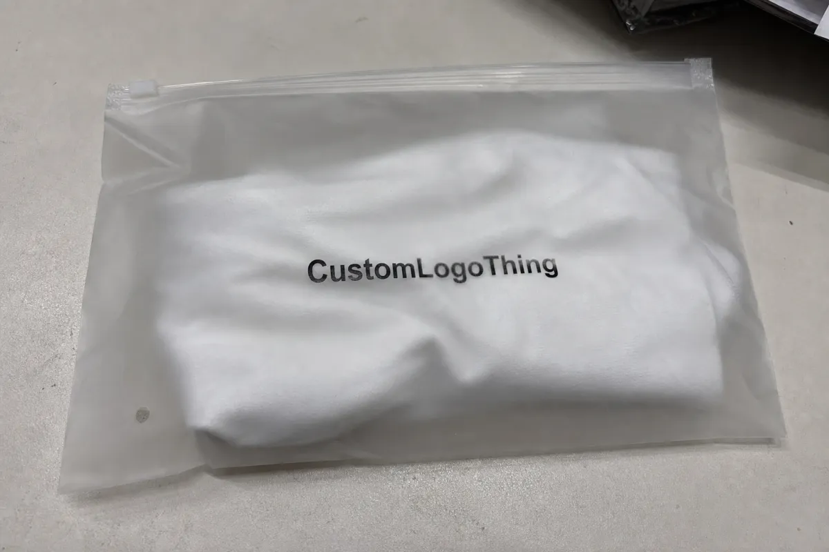
Frosted Zipper Bags are difficult in a very specific way. The finish looks premium, but it also diffuses contrast and hides weak artwork less effectively than many teams expect. A logo with fine serifs, hairline strokes, or pale fills can disappear faster on a frosted surface than on a white carton or glossy label. Even a sharp digital proof can make the mark look more solid than it will in production.
The most common failure is not a bad design; it is a bad relationship between the design and the pouch geometry. Buyers approve a centered layout because the mockup feels balanced, then the finished bag shows the mark too close to the zipper, too low on the panel, or squeezed by a top seal. Once the pouch is filled, that mistake becomes more obvious. The material shifts. The front panel bows. The design no longer has the same breathing room it had on a flat artboard.
Another problem is scale. Packaging is viewed at a distance that is easy to underestimate. A shopper may see the product from three to six feet away on shelf, then closer in hand. If the logo is too small or too subtle, the bag loses brand presence fast. The mark may still be technically present, but it will not do its job. That is why placement is not separate from legibility; they are the same decision.
On a first run, the safest approach is to optimize for readability and production tolerances, not for design cleverness. The layout should be built from the bag outward: zipper location, seal allowance, printable area, fill behavior, then the logo. Starting with the artwork and trying to fit the structure around it usually produces a compromise that shows.
Retail packaging references are useful here. The ISTA standards help teams think about transit stress and package handling, while PMMI and packaging education resources offer a clearer picture of how films, closures, and converting constraints affect the final result. Those references do not design the pouch for you, but they explain why good-looking art can still fail in practice.
How Frosted Film, Seals, and Zippers Affect Print
The printable area on a Frosted Zipper Bag is smaller than most buyers assume. The top heat seal, zipper track, side seals, and gusset folds all eat into usable front-panel space. If the logo crosses any of those boundaries, it can distort, flatten, or look partially cut off when the bag is formed and filled. A perfect PDF does not prevent that. Only a correct die line does.
Material specs matter too. Many custom frosted pouches use layered laminated films in the range of roughly 2.5 mil to 4 mil, depending on product weight and barrier needs. Thicker film can feel more premium and stand up better on shelf, but it may also be stiffer and more expensive to convert. Thinner material can reduce cost, though it may crease more and show print irregularities if the fill is uneven. There is no single correct thickness; the choice depends on product type, shipping stress, and how much structural help the pouch needs from the film itself.
Printing method changes the appearance as well. Flexographic and gravure-style production can hold up well at scale, but they need disciplined file preparation and accurate color separation. White ink underlay can dramatically improve contrast on frosted film, though it adds cost and usually requires another layer of proofing. Metallic effects can look striking, but they magnify spacing problems. If the logo sits too close to neighboring text or seal lines, the design starts to feel crowded instead of premium.
The front panel is usually the strongest home for the logo, but it is not automatically the right one. A centered mark often works for beauty, snack, and gift packaging because it creates symmetry and gives the shopper a quick read. That said, if the product is tall, uneven, or heavily filled, the front panel can bulge and shift the visual center lower than expected. In those cases, a slightly higher placement often performs better than a mathematically centered one.
Orientation also changes the result. A bag hanging from a peg hook is read from a slight upward angle, while a countertop display hides the lower portion of the pouch. In a carton or tray, only the upper section may be visible until the customer picks the product up. That means the logo should be placed in the part of the bag most likely to remain visible in the actual retail setting, not just in a flat presentation.
Logo Placement Factors That Change the Final Look
Three variables shape the final impression more than anything else: bag size, logo scale, and viewing distance. A small sample pouch can carry a large relative logo because the viewer is close and the field is tight. A larger retail pouch may need a wider mark or stronger type weight just to achieve the same shelf presence. The art should scale to the physical object, not just to the brand style guide.
Brand hierarchy is the next pressure point. On launch packaging, the logo cannot fight the product name, flavor, scent, variant, or compliance text. If every element has the same visual weight, the front panel becomes noisy. A good layout gives the logo one clear role, then places supporting information beneath it or beside it with less emphasis. That works especially well on frosted bags, where too many competing marks can make the pouch feel cluttered very quickly.
Color choice can make or break contrast. Dark solid logos usually perform better than delicate gradients. White ink can rescue faint branding, but it is not a free upgrade; it adds setup complexity, affects proofing, and increases the risk of visible misregistration if the press work is rushed. Metallic inks or foil-style effects can be effective for premium positioning, though they demand generous spacing and accurate alignment. If the art is already crowded, adding shine usually makes the problem worse.
Product fill matters more than many teams expect. A flat pouch on screen is a controlled environment; a filled pouch is not. Weight can pull the front panel downward, air pockets can shift the visible area, and the top of the bag can curve differently from one production batch to the next. For that reason, the best placement is not always the most symmetrical one. It is the one that still reads correctly after the pouch is filled and handled.
Launch teams usually benefit from a simple rule set:
- Use bold logos when the bag will be viewed from arm’s length or farther.
- Reduce fine detail if the frosted finish is strong or the artwork includes small type.
- Use white underlay intentionally when contrast matters more than keeping the print build simple.
- Keep gradients limited unless the brand can afford extra proofing and a tighter color conversation.
Option tradeoff at a glance
| Logo approach | Best use | Typical impact on cost | Visual result |
|---|---|---|---|
| Single-color dark logo | Fast launch, strong shelf read | Lowest | Clean, dependable, easy to approve |
| White ink with color print | Need stronger contrast on frosted film | Medium | Brighter mark with better visibility |
| Metallic accent or foil-style effect | Premium positioning | Higher | Attention-grabbing if spacing is controlled |
| Full-color gradient artwork | Brands with complex identity systems | Medium to higher | Can look rich, but proof carefully |
Cost, Pricing, MOQ, and Quote Drivers
Pricing for Frosted Zipper Bags is shaped by more than overall size. The strongest drivers are film structure, zipper type, bag dimensions, number of print colors, white ink coverage, and whether the design requires multiple press passes. A simple one-color logo on a standard pouch is materially easier to produce than a multi-color front panel with dense underlay and special finish work.
MOQ changes the picture fast. Lower volumes usually carry a higher per-unit price because setup costs are spread across fewer bags. That is normal manufacturing math, not a pricing trick. At 3,000 pieces, the unit cost is often noticeably higher than at 10,000 pieces with the same art. Depending on print complexity and film spec, the gap can easily land in the 20% to 45% range.
Reasonable budgeting ranges, assuming standard custom production, usually look something like this:
- Simple frosted pouch with one-color print: about $0.18 to $0.28 per unit at 5,000 pieces.
- Custom bag with white ink and multiple print colors: about $0.26 to $0.48 per unit at 5,000 pieces.
- Premium setup with heavier coverage or special finish work: about $0.40 to $0.70 per unit, sometimes higher if the art requires more correction.
Other quote drivers are easy to overlook. Plate fees, proofing charges, freight, and retail-ready packing can move the total more than the base print price does. If the bags must arrive sorted by variant, bundled to a specific inner count, or packed for a fulfillment center with labeling rules, the manufacturing quote should include that labor. Otherwise the quote looks low until the service add-ons appear.
There is also a tradeoff between finish and schedule. Extra layers, custom ink matching, or full coverage graphics can all extend the approval cycle. If the launch date is fixed, keep the design and print build lean. Spend on the elements that affect shelf read first. Save the premium embellishments for a reorder, when the team has data from the first sell-through instead of just opinions.
Production Process, Proofing, and Turnaround Timing
The standard workflow is straightforward: artwork review, digital proof, approval, production, and shipment. The risk sits inside the handoffs. If the supplier does not have a clean die line or if the brief is vague, the proof may be built from assumptions. Once that happens, even small placement mistakes can survive into production because everyone thinks someone else already checked them.
Strong proofing depends on specific instructions. “Center the logo” is not enough. State where the zipper begins, where the top seal stops, how much clearance is required above the mark, and which panel is the primary retail face. If the bag needs a barcode, compliance text, ingredient copy, or variant naming, those should be in the same file package so the logo placement is reviewed in context rather than in isolation.
For custom printed pouches, a typical turnaround often falls around 12 to 15 business days after proof approval, though factory load, number of colors, material availability, and freight method all change the schedule. Rush production exists, but it only works when the artwork is final and the placement decision is already locked. If the team is still debating where the mark should sit, there is no hidden shortcut that will make the physical work go faster.
Sampling is worth more than many teams budget for. A flat proof can hide the way the pouch behaves when filled. A pre-production sample, or at least a filled mockup, shows whether the front panel bows, whether the zipper line feels crowded, and whether the logo still reads under warehouse lighting. That step usually costs less than a mistake on the first full run.
For brands moving quickly, the cleanest schedule is the one with the fewest revisions. The fastest orders tend to be the ones where the spec sheet is complete on day one and the placement brief includes exact measurements instead of visual language. Precision shortens the back-and-forth. Ambiguity stretches it.
Step-by-Step Placement Check Before You Approve
Start with the bag spec sheet and confirm the dimensions before you open the artwork. Width, height, zipper location, top seal allowance, side seals, and any gusset depth should all be visible. If any of those numbers are missing, pause and ask for them. A logo cannot be placed accurately against a vague shape.
Next, define the retail viewing priority. If the pouch hangs on a peg hook, the eye line sits differently than it does in a counter tray. If the bag will ship inside a carton or be stacked in a display, the upper panel matters more than the lower half. That one decision should guide where the logo sits vertically.
Then check the clearance around the closure and the seals. The logo should not touch the zipper track or ride too close to the top heat seal. That area flexes when the bag is filled and sealed, which can make the art look compressed. Give the logo enough room to breathe. On frosted film, extra margin usually improves the look rather than wasting space.
After that, review the relationship between the logo and the rest of the front panel. Product name, flavor, scent, barcode, and any mandatory copy should not crowd the mark. If the front panel feels full before the product even reaches shelf, the layout is trying to do too much.
- Open the spec sheet and confirm dimensions.
- Place the logo on the primary front panel.
- Keep it clear of zipper tracks and seal lines.
- Check spacing against text, barcode, and required copy.
- View the proof at actual size, not just zoomed in.
- Ask for a revision if the placement feels even slightly off.
That last step is the one buyers hesitate on, usually for the wrong reason. A proof can be technically acceptable and still look wrong. If the logo sits too low, too wide, or too close to the closure, the shelf result will reflect that. The cost of one revision is usually tiny compared with the cost of accepting a layout that looks compromised in production.
Common Mistakes That Make Launch Bags Look Off
The first mistake is obvious once the bag is in hand: the logo is too close to the zipper. That space seems usable on a flat screen, then disappears once the pouch is filled and the top section folds or compresses. The result is a front panel that feels cramped before the shopper has even read the product name.
The second mistake is scale. Small logos on frosted film rarely earn their keep. Thin strokes, light tones, and compact type are the first things to fail at retail distance. If the brand identity is delicate, the packaging version often needs to be simplified. That is not a design loss. It is adaptation to a harder surface and a longer viewing distance.
The third is designing without a filled-bag check. A pouch changes shape once product weight pulls against it. Air pockets, fill tolerance, and film stiffness all affect the final look. A centered logo can drift visually lower. A perfectly aligned mockup can become slightly off once it is filled and standing on its own. If the design only works flat, it is not ready.
Orientation errors create a fourth category of problems. The logo can end up on the wrong panel, upside down, or too close to an edge because the bag construction was not reviewed carefully enough. Those mistakes are preventable, but only if someone checks the print side, fill direction, and retail-facing panel before approval. A three-minute review can save a lot of embarrassment later.
One more issue appears often with premium launches: trying to make the pouch do too much. A frosted surface already adds visual texture. If the logo has shine, the product name is large, the variant block is colorful, and the legal copy is crowded in as well, the bag loses hierarchy. Premium packaging usually looks better when one thing leads and the rest support it.
If a proof only looks right on a perfect flat lay, it is not ready for retail.
Expert Fixes and Next Steps Before You Order
The cleanest fix is often the simplest one: choose the hero side, lock the logo height, then let the supporting copy work around that decision. That order keeps the layout from turning into a visual argument. Packaging looks more expensive when one element is clearly in charge and the others behave.
If the launch depends on shelf performance, order a sample or pre-production proof before you commit to volume. The sample is not a formality. It shows how the frost effect behaves under real light, whether the logo still reads across a store aisle, and whether the seal line crowds the art. Those are the details that decide whether the pouch feels deliberate or improvised.
When you send the final file set, include the logo artwork, exact bag dimensions, retail channel, desired print colors, and placement notes in one package. A complete handoff reduces revision loops and cuts the chance of the logo drifting from where the team intended it to sit. It also gives the converter fewer reasons to guess.
For launches with tight timing, make the approval standard practical: does the logo read quickly, is the seal area clear, and does the pouch still look intentional when viewed at shelf distance? That is the real test. The retail launch frosted zipper plastic bags logo placement guide is not really about a single coordinate on a dieline. It is about whether the bag behaves like good packaging after material, fill, and retail display all get a vote.
If the answer is yes, move forward. If the answer is no, shift the artwork now, while the change is still cheap and the conversation is still about layout instead of production damage.
FAQ
Where should the logo sit on frosted zipper plastic bags for a retail launch?
Place it on the main front panel, high enough to clear the zipper and top seal, but low enough to stay in the shopper’s eye line. The best spot is usually the area that remains visible after filling, stacking, or hanging.
How much blank space should stay around the logo on custom zipper bags?
Leave enough margin so the mark does not compete with the zipper line, product name, barcode, or required copy. On frosted film, extra breathing room usually improves readability and makes the pouch feel more considered.
Does frosted plastic change logo color or contrast?
Yes. Frosted film softens contrast, so thin strokes, pale colors, and subtle gradients can look weaker than they do on screen. Dark logos, white ink support, and simplified forms usually hold up better.
What changes the MOQ and unit cost most on these bags?
Bag size, film thickness, print complexity, number of colors, white ink coverage, and zipper style have the biggest effect on pricing. Lower quantities usually increase unit cost because setup expenses are spread across fewer bags.
How do I speed up approval and production for my order?
Send final artwork, exact dimensions, and placement notes together so the proof does not bounce back for avoidable edits. Approve the mockup only after checking zipper clearance, seal space, and front-panel readability at actual size.


