Embroidered Baseball Caps Print Method Comparison Guide
An Embroidered Baseball Caps print method comparison sounds a little odd because embroidery is not a print process. Buyers still compare it with screen print, direct-to-film, and other transfer methods because all of them compete for the same front panel, and that panel decides the first impression. Texture, color fidelity, edge sharpness, and how the logo sits on a curved crown matter more than the label on the decoration method.
The real question is not which method looks best in a vacuum. It is which one keeps the logo legible, fits the cap construction, stays inside budget, and arrives on time. A cap can look perfect in a mockup and still fail in production because the design crosses a seam, the ink sits too heavy on a curve, or the thread map is too tight for the artwork.
For this comparison, the practical buckets are embroidery, direct print, and heat-transfer or hybrid decoration. Each has strengths. Each has limits. The right choice depends on the artwork, the cap blank, the quantity, and the use case: retail shelf, staff uniform, event giveaway, or sponsor merchandise.
Embroidered Baseball Caps Print Method Comparison: Start With the Real Trade-Off
Embroidery usually wins on perceived value. Raised thread gives a cap dimension that ink cannot copy, and on structured hats that texture reads as durable and intentional. It is especially useful for corporate wear, premium merchandise, and brand programs that need a cleaner, more finished look. A 3D puff logo can push that effect further, but only if the design is bold enough to survive the extra height and the larger stitch footprint.
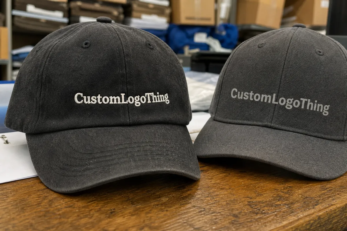
Print wins on detail. If the logo has gradients, tiny type, thin rules, or an illustration with several color shifts, a print route can preserve the art more faithfully than stitching can. That is the first decision point in any embroidered baseball caps Print Method Comparison: do you want tactile depth, or do you want closer reproduction of the original file?
There is also the perception factor. A clean embroidered logo on a firm front panel usually reads as more premium than a flat graphic on the same cap. But a crisp print on the wrong blank can still look sharper than embroidery on a flimsy cap. Decoration method, fabric weight, crown shape, and color all pull on the final result at the same time.
A mockup can hide distortion, loose edges, and color drift. Production usually does not.
Most bad orders do not fail because one method is objectively superior. They fail because the buyer chose by price alone, sent artwork that was never adapted for a cap, or accepted a proof without asking how the design would behave on curved fabric. That is why this comparison focuses on buying conditions, not decoration trivia.
How Each Decoration Method Works on Structured Caps
Embroidery starts with digitizing. The artwork is converted into stitch paths, underlay, pull compensation, and color sequencing. That file is not a print file with a different name; it is a production map that tells the machine where thread should travel, where fabric may shift, and where the design needs reinforcement. Simple logos work best because every extra corner, counter-space, and fine stroke adds risk.
Structured caps make embroidery easier in one sense and harder in another. The front panel usually has buckram or foam backing, which helps the stitches sit flat. But the crown still curves, and seams can interrupt the design. A logo that sits too close to the center seam on a 6-panel cap may distort, break up, or look uneven from one side to the other. On many caps, a safe front decoration zone is roughly 2.25 to 2.75 inches wide, but the exact limit depends on the cap profile and the size of the front panel.
Printing follows a different route. Screen printing uses ink layers and separations. Direct-to-film and other transfer methods often rely on digital art, then heat and pressure to bind the image to the cap. The file must still account for the curve of the crown and the placement of seams. A graphic that looks fine on a flat screen can warp once it is pressed onto a low-profile front panel.
Transfer finishing deserves attention. A transfer can be perfectly made and still fail if the press temperature is off, the dwell time is too short, or the cap material does not accept the adhesive well. On textured fabrics, a transfer may bridge over the weave instead of sinking into it, which can leave a slightly plastic look. That is acceptable for some promo programs. It is not ideal for a premium retail cap.
Color management also changes by method. Embroidery uses thread colors, not CMYK. Print methods may use spot colors, CMYK, or a hybrid approach depending on the art and the equipment. If color accuracy matters, ask whether the supplier is matching PMS, approximating it through thread selection, or building the image from process color. Those are not the same promise.
Material choice affects the result more than most buyers expect. Cotton twill takes embroidery well and usually looks substantial. Polyester twill can hold color better and is common in performance caps. Foam-front trucker styles are different again: the surface is soft, so embroidery may sink more than expected, while certain print methods can show the texture more clearly. A cap that feels cheap in hand often looks cheap after decoration too.
The workflow discipline is closer to packaging production than many people assume. You need clean separations, controlled approvals, repeatability, and an understanding of how the substrate behaves under pressure. If a supplier cannot explain stitch count, minimum line width, or the decoration field, the process is already shaky.
Cost, Pricing, MOQ, and Unit Cost Differences
Price comparisons usually start with the unit cost, but that number alone is misleading. A realistic quote may include digitizing, screen setup, transfer prep, sampling, color matching, packaging, and freight. If the vendor decorates in-house, some of those costs are buried inside the unit price. If the work is split across vendors, the line items show up more clearly.
Embroidery carries a setup cost because the artwork has to be digitized before production starts. A straightforward logo often digitizes for about $25 to $60. More complex marks can cost more if they require multiple stitch directions, tight detail cleanup, or a 3D puff version. After that, the per-cap price tends to improve as the quantity rises because the file can be reused.
That is why embroidery can look expensive on a 50-piece order and efficient on a reorder of 1,000 or more. The math changes again if the logo is very simple. In that case, embroidery may stay competitive even at moderate volumes because the setup is small and the decoration itself is quick.
Print methods usually look cheaper up front for simple artwork, especially on short runs. Screen printing can work well for bold spot-color logos, but setup costs rise with each color. Digital transfers are often easier for multicolor art, small quantities, or designs that change frequently. Buyers who compare only the lowest number may miss remake risk, approval rounds, or color correction time.
| Decoration method | Typical setup cost | Typical unit cost at 100 pcs | Typical unit cost at 1,000 pcs | Best fit |
|---|---|---|---|---|
| Embroidery | $25-$60 digitizing | $2.25-$4.50 | $1.15-$2.10 | Simple logos, premium retail caps, uniforms |
| Screen printing | $35-$90 per color | $1.75-$3.75 | $0.95-$1.75 | Bold artwork, spot-color graphics, promotionals |
| DTF or hybrid transfer | $20-$50 art prep | $2.00-$4.00 | $1.30-$2.40 | Small runs, gradients, fine detail, mixed artwork |
MOQ pressure changes the picture too. Some suppliers set a minimum because the cap style, decoration area, or setup cost makes tiny runs inefficient. Others will quote low quantities, but the unit price climbs enough that the order stops looking economical. If you need a hard ceiling, ask for multiple quantity breaks before selecting the method.
To compare quotes properly, check these items line by line:
- Decoration area: front only, front and side, or front plus back arch.
- File prep: digitizing, vector cleanup, or transfer separation.
- Approval steps: digital proof, stitch sample, or pre-production sample.
- Packaging: bulk packed, polybagged, or retail-ready.
- Freight: domestic, air, or consolidated ocean if the caps are imported.
If the order includes retail packaging, ask whether the supplier can document paper sources or recycled content where that matters to the program. It will not affect the cap decoration itself, but it can affect compliance and shelf presentation.
Production Steps, Timeline, and Lead Time Expectations
Time matters as much as price. A method that looks simple on paper can become slow if it needs extra artwork cleanup, a sample, or color signoff. The production path usually runs through artwork intake, proofing, approval, sample prep, decoration, inspection, and shipping. Every revision adds friction.
Embroidery often begins with digitizing, which may take one to two business days for simple art and longer for dense logos or special effects. Once approved, production itself often takes 7 to 12 business days on a normal run, depending on quantity, machine capacity, and whether the order is split across multiple cap styles. Print and transfer jobs can move faster, but they also slow down if the art needs separations, curing, or adhesion testing.
Blank cap sourcing creates another variable. A common structured cap in stock can move quickly. A specific color, fabric weight, or profile may add waiting time before decoration even starts. Peak-season demand creates a queue even when the blanks are ready. The supplier may have inventory on the shelf and still no machine window for two or three days.
These delay points show up again and again:
- Vector art is missing or too messy to digitize cleanly.
- No PMS reference is supplied for a color-critical logo.
- Changes are requested after proof approval.
- The selected cap style is temporarily out of stock.
- Sample feedback arrives too late for the launch schedule.
A rush order is not the same as a safe order. A supplier can shorten the timeline, but it cannot compress every review step without raising the odds of a mistake. For a tight launch, building in three to five business days of buffer is usually safer than betting on a last-minute correction.
Key Factors That Decide the Best Method for Your Order
Brand position comes first. A retail cap for a premium line usually benefits from embroidery because the finish feels more substantial. A campaign hat or event giveaway may work better with a print or transfer if the goal is speed, color, and quantity rather than texture. Same cap shape, different business logic.
Artwork complexity comes next. Fine lines, gradients, drop shadows, and small lettering push you toward print or transfer methods. Broad shapes, simple icons, and one- to three-color logos usually favor embroidery. If the design has to be stripped down so much that it no longer resembles the brand, that is a sign the method and the art are fighting each other.
Cap construction matters a great deal. A structured 6-panel cap with a firm front panel is far easier to decorate than a soft unstructured cap or a low-profile silhouette that collapses under pressure. Placement near seams, the distance from the brim, and whether the logo wraps toward the side all affect how the decoration lands. A front panel that looks large in a flat template may be surprisingly cramped in production.
Material also affects durability. Cotton twill is friendly to embroidery and gives a classic feel. Polyester blends can handle wear and color exposure well. Mesh-backed caps change the equation again because the front and back fabrics behave differently under heat and pressure. If a transfer method is being considered, the supplier should confirm how the cap fabric reacts to the press and whether any scorch risk exists.
Wear conditions matter too. A cap that will be worn outside, washed often, or handed out in a high-turnover setting needs a method that will hold up to use. Embroidery usually performs well because thread is physically anchored in the fabric. Print can last too, but only if the substrate, curing, and finish are matched correctly. Cheap decoration tends to show wear fast: cracked edges, fuzzy thread, lifted corners, or color fade at the sweat band.
Practical buyers usually narrow the choice with a short checklist:
- Choose embroidery for simple logos, premium branding, and repeat orders.
- Choose print or transfer for gradients, tiny text, or photo-like graphics.
- Choose a hybrid approach if the front needs identity and the side needs extra information.
- Choose the method that fits the cap, not the one that only looks cheapest on paper.
There is no universal winner. The best option is the one that protects legibility, matches the cap blank, and fits the budget without forcing awkward compromises.
Common Mistakes Buyers Make When Comparing Cap Methods
The first mistake is comparing only the unit price. That figure can hide setup, sample work, freight, and remake risk. A quote that is a little cheaper per cap can cost more overall once digitizing, extra proofs, or a rushed shipping upgrade are added.
The second mistake is sending artwork that has not been prepared for the method. Raster files, tiny text, and too many colors create problems before production begins. A logo that looks clean on a monitor may collapse on a cap because the stitch count is too tight or the print detail is too fine for the curved panel. If the supplier does not mention minimum stroke width, line thickness, or letter height, ask directly.
Seam placement causes a lot of preventable issues. A design can look perfect in a flat mockup and then distort once it crosses a seam or sits too close to the crown curve. That is common on structured caps with front seams and heavy buckram. If the logo has to sit high on the front, the decoration field should be confirmed in writing before production starts.
Skipping approval is the last major failure point. Some buyers assume the supplier will fix alignment, color, or placement during production. That is not how the process works. Production is where the money is spent. The design decisions should already be locked. A stitch sample, print proof, or test transfer costs time, but it usually costs less than a remake.
Another mistake is ignoring quality-control checks that are simple and fast. A proper cap review should cover logo placement, thread tension or print coverage, edge finish, and whether the decoration sits cleanly on the crown. For print methods, check for lift, gloss difference, and cure consistency. For embroidery, check for puckering, thread breaks, and whether the stitching crowds the letters. Those are basic checks, not luxury extras.
Think of the process the way a packaging spec is handled: define the file, define the substrate, define the tolerance, then approve before release. That discipline is not exciting. It keeps orders from becoming expensive lessons.
Expert Tips for Cleaner Artwork and Fewer Revisions
Start with vector artwork. Then simplify it. That does not weaken the brand. It makes the artwork fit the production method. Ask the supplier for minimum line thickness, minimum letter height, and a safe placement zone for the exact cap style you plan to order. Those figures are more useful than a broad promise that “we can do it.”
Request a stitch-count estimate for embroidery. Request a breakdown for screen print or transfer work. Those numbers reveal where the cost is sitting. High stitch counts mean more machine time. Heavy CMYK coverage may mean more print complexity. Spot colors can be cheaper, but only if the art supports them cleanly.
Ask for side-by-side mockups on the same cap blank. That keeps the comparison honest. A render can make three methods look identical, but fabric texture, crown height, and panel curve will separate them in production. If the vendor cannot show the same cap from the same angle, the comparison is weaker than it should be.
Keep color choices deliberate. Strong contrast helps legibility, especially on dark caps. Every extra color can raise cost, complicate approvals, or crowd the front panel. In many cases, a two-thread embroidery version reads better than a six-color version with too much detail. The same rule holds for print: clean separations usually beat busy artwork.
Build in a few quality checks before release:
- Confirm the exact logo version and file format.
- Verify decoration size and placement on the cap blank.
- Check whether the quote includes packaging and freight.
- Ask how color substitutions will be handled if materials shift.
- Review a sample for seam alignment, edge finish, and logo clarity.
If the order is retail-facing, add one more layer of control. Make sure packaging, carton labeling, and transit expectations are clear. If the shipment is fragile or high value, ask whether the outer packaging has been tested against an ISTA-style distribution profile. That is basic risk management, not overengineering.
Next Steps: Turn the Comparison Into a Smarter Quote Request
The quickest way to improve an Embroidered Baseball Caps print method comparison is to send a sharper brief. One page is enough. Include cap style, quantity, decoration location, artwork file type, color references, target delivery date, and end use. A gift, a store item, and a staff uniform are not priced the same way, even if the hat looks identical.
Ask for at least two methods side by side. A clean quote should separate setup, unit price, and timeline for embroidery, print, or transfer options. If the supplier recommends a different method after reviewing the artwork, that is usually useful information. They may be reacting to seam placement, line thickness, or a design that simply does not suit stitching.
Before approving the order, confirm these items:
- The final logo version that will be produced.
- The exact decoration size and placement.
- The proof approval deadline.
- Whether freight and packaging are included.
- Any material or color substitutions expected in production.
That last check keeps the order grounded in reality. If the art fits the cap, the timeline fits the launch, and the quote fits the budget, the order is ready to move. That is the practical value of an embroidered baseball caps print method comparison: it turns a loose decoration choice into a decision that can be defended on cost, quality, and schedule.
Is embroidery or printing better for embroidered baseball caps print method comparison?
Embroidery usually wins for a premium look and strong durability on simple logos. Printing or transfers are better when the design has gradients, tiny text, or a photo-like feel. The better choice depends on artwork detail, cap structure, and budget.
How does order quantity change embroidered baseball caps print method comparison pricing?
Low quantities feel setup-heavy because digitizing, screens, or transfer prep are spread across fewer caps. Higher quantities usually improve unit cost, especially for simple embroidery designs. Always compare the full quote, not just the per-cap price.
What is the usual turnaround for embroidered baseball caps print method comparison orders?
Simple orders can move quickly once artwork is approved, but digitizing and proofing still add time. Rush timelines often compress review and correction windows, which raises risk. Peak season, blank-cap sourcing, and sample approval are the biggest timeline variables.
Can I mix embroidery and print on one cap order?
Yes, many buyers use embroidery on the front and print on a side or back panel. Mixing methods can improve brand impact, but it usually increases cost and approval complexity. Ask for a mockup because layered decoration affects spacing and comfort.
What files should I send for an embroidered baseball caps print method comparison quote?
Send vector artwork, quantity, cap style, decoration location, and target delivery date. Include PMS color references and a note about small text or fine detail. If possible, ask for separate quotes for embroidery, print, and transfer so the comparison is clear.


