Buyer Fit Snapshot
| Best fit | Folding Cartons Design for Packaging Results projects where brand print, material claims, artwork control, MOQ, and repeat-order consistency need to be specified before quoting. |
|---|---|
| Quote inputs | Share finished size, material target, print colors, finish, packing count, annual reorder estimate, ship-to region, and any compliance wording. |
| Proofing check | Approve dieline scale, logo placement, barcode or warning zones, color tolerance, closure strength, and carton packing before bulk production. |
| Main risk | Vague material claims, crowded artwork, missing packing details, or unclear freight terms can make a low unit price expensive after revisions. |
Fast answer: Folding Cartons Design for Packaging Results: Board, Finish, Dieline, and Unit Cost should be specified like a repeatable production item. The safest quote records material, print method, finish, artwork proof, packing count, and reorder notes in one written spec.
Production checks before approval
Compare the actual filled-product size with the drawing, then confirm tolerance on folds, seals, hang holes, label areas, and retail display edges. Reserve space for logos, QR codes, warning copy, and material claims before decorative graphics fill the panel.
Quote comparison points
Review material grade, print process, finish, sampling route, tooling charges, carton quantity, and freight assumptions side by side. A quote is only useful when the supplier can repeat the same color, closure quality, and packing count on the next order.
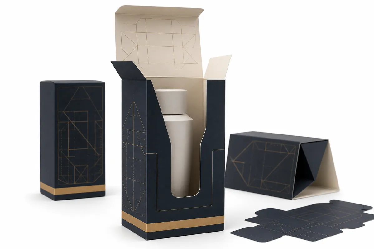
Folding cartons design tips get filed under “design” too often. That sounds neat. It is also incomplete. A carton is structure, retail signal, and production part at the same time. Miss a millimeter on the dieline and the box can open badly, stack badly, or feel cheap before anyone reads the front panel.
The best folding cartons design tips begin with the job the pack has to do. Protect the product. Survive handling. Hold its shape on shelf. Tell the buyer what matters in a few seconds. Artwork comes after that. Not before. A pretty layout cannot rescue a carton that folds badly or ships like a paper rumor.
A carton can look premium and still fail if it crushes in transit, slows packing, or forces last-minute artwork rewrites.
For Custom Logo Things, the cleanest way to think about folding cartons is as a chain of decisions: board grade, dieline, panel hierarchy, finish, compliance copy, and conversion method. Leave one link loose and the whole thing starts wobbling. Put the parts together properly and even a modest carton can look sharp, controlled, and ready for retail.
I have seen teams spend hours debating foil, then discover the product rattles inside the box. That kind of miss is expensive and, honestly, kind of silly. The carton has to earn the finish, not the other way around.
Folding Cartons Design Tips: Start With the Job the Pack Must Do
Good folding cartons design tips begin with the product, not the mockup. A vitamin bottle, a soap bar, a vape accessory, and a cosmetic jar all need different headroom, different inserts, and different opening behavior. The carton should fit the product with enough tolerance that packing staff can move quickly without wrestling the structure. Pretty files do not help if the line grinds to a halt.
In practical terms, a folding carton does three jobs. First, it protects the contents from scuffing, breakage, light, or tampering. Second, it sells the item through hierarchy, type, color, and finish. Third, it supports operations, which means it can be packed, stored, and shipped without creating extra labor. The best folding cartons design tips respect all three at once. Ignore one and the others usually suffer for it.
That balance is why folding cartons sit in such a useful spot in custom packaging. They feel more brand-led than a plain shipper, less expensive than a rigid box, and easier to adapt than molded plastic. They also sit right between marketing and production. A carton is not a label with sides. It has to fold, crease, glue, and survive distribution without turning into a problem someone has to explain later.
From a packaging buyer's point of view, the smartest carton is usually the one that makes fewer people nervous. The designer wants a clean brand face. The converter wants a dieline that behaves. Operations wants something that closes the same way every time. Retail wants a pack that scans fast and reads fast. Strong folding cartons design tips find the middle instead of chasing drama and calling it strategy.
Before artwork starts, a few blunt questions help:
- What is the product size, weight, and fragility?
- Will the carton sit in retail, ship direct to consumer, or do both?
- Does the pack need an insert, a window, a tear strip, or a tamper feature?
- How long will it sit on shelf before someone opens it?
- What is the real budget at the target quantity?
Clear answers make folding cartons design tips more specific and more useful. Vague answers do the opposite. Teams fill the gap with extra finishes, oversized graphics, or late structural changes. That usually adds cost and risk. A tight brief saves more money than a shiny effect ever does.
And yes, the brief can be boring. That is fine. Boring is cheaper than a reprint.
How Folding Cartons Work From Die Line to Finished Box
Every carton starts with a dieline, the flat map that shows folds, cuts, glue areas, and panel boundaries. That file is the blueprint. It tells the printer and converter where the graphics can go, where the score lines land, and how the box will come together after cutting. Without a clean dieline, even solid folding cartons design tips turn into avoidable production pain.
The anatomy is simple. The details are not. A standard folding carton includes front, back, side, top, and bottom panels, plus tuck flaps or glued flaps. Straight tuck and reverse tuck cartons behave differently at the opening end. Auto-bottom styles handle weight better and speed up packing, but they also change the glue pattern and the board requirements. If the carton has to hold something heavy, the structural choice is not a style pick. It is the thing that makes the rest of the design possible.
Here is the usual flow:
- Dieline creation and structural review.
- Artwork layout on the approved panel map.
- Color proofing and content checks.
- Printing on the chosen board.
- Cutting, creasing, and scoring.
- Folding and gluing.
- Packing, casing, and shipment.
That sequence looks neat on paper. Reality is messier. A small file issue can send everyone back to artwork. A board change can alter crease behavior. A coating can improve scuff resistance and still make the carton fold less cleanly than expected. The better folding cartons design tips treat production as one connected system, not a tidy list of unrelated tasks.
Material choice gets misunderstood all the time. A 14pt board may print beautifully and still feel too light for a premium cosmetic line. An 18pt SBS board may feel stiffer and present edges better, then fight back during folding if the crease rule is off. Recycled content boards can support sustainability goals, but they may react differently under heavy ink coverage or fine reverse type. Good folding cartons design tips account for that before the first proof lands on someone's desk.
The opening moment matters too. A carton that tears too easily can feel flimsy. A flap that sticks can be annoying enough to color the whole experience. A structure that re-closes neatly can improve reuse and refill behavior. If the pack is supposed to live on a counter or in a cabinet, that second life belongs in the brief. It is not a nice extra. It is part of the job.
Key Folding Cartons Design Tips for Structure, Branding, and Compliance
Structure first, then surface
The strongest folding cartons design tips start with fit. Measure the product at its widest point, then add realistic clearance for packing speed, inserts, and board caliper. A carton that is too tight can scuff the product or jam the line. A carton that is too loose feels cheap and can collapse awkwardly on shelf. Tolerance planning is what separates a working carton from a carton people complain about later.
For inserts, ask whether the product actually needs one. Plenty of items do not. A custom insert can improve presentation and stability, but it also adds tooling, assembly steps, and cost. Windows, hang tabs, and tear strips deserve the same treatment. Strong folding cartons design tips do not reject features out of habit. They ask whether each one earns its space.
There is one other structural point that gets overlooked: gluing. If the glue area is tiny, awkward, or buried under artwork, the converter has to work around it. That is how a clean-looking carton turns into a production headache. Nobody enjoys explaining why a beautiful box keeps opening in transit.
Branding that can be read in seconds
Shoppers do not study carton graphics for long. Many category decisions happen in a glance, sometimes two or three seconds. That makes hierarchy matter more than decoration. Put the brand name where the eye lands first. Use type that still reads at arm's length. Keep contrast strong enough that the product name and variant can be read under store lighting without squinting like a tired accountant.
One of the better folding cartons design tips is simple: design for the shelf, not the screen. A mockup on a monitor can flatter a layout that turns muddy once it is printed at size. Tiny serif text, low-contrast panels, and overworked textures often look more luxurious online than they do in the aisle. The carton has to win in real life, not in a presentation deck.
Panel selection matters too. The front panel is obvious. The side panels often do the real work. Ingredients, usage directions, warnings, and claims can move to the sides so the front stays clean and fast to read. That is one of the quieter folding cartons design tips that improves both appearance and compliance without making the pack look overloaded.
Sometimes the hardest part is restraint. A pack does not need to shout if the category already has enough noise. A clean front, one strong color choice, and a simple type system can punch harder than three gradients and a spray of icons. Quiet is not weak. It is usually more expensive to execute well, which is why it stands out.
Compliance and print discipline
Regulatory copy should be treated as design content, not baggage. Barcodes need quiet zones. Legal text needs enough size to stay legible. Claims need support. Country-of-origin statements, batch codes, and ingredient lists should be planned before artwork lock because every late change can ripple through proofing and approval.
Printing details matter just as much. Keep bleed where the converter asks for it, usually 0.125 in. Use safe zones so trims do not clip text. Plan spot UV, foil, embossing, and soft-touch coatings with restraint because each effect adds steps, cost, and risk. More finishes do not automatically make a carton better. They can just make it louder. That is why disciplined folding cartons design tips usually favor one strong tactile cue instead of three competing ones.
For sustainability language, keep claims specific. Recyclable board, reduced ink coverage, and FSC-certified paper are clearer than vague green talk. If your board sourcing matters, the chain-of-custody rules at FSC are worth checking early. For transit durability, especially in e-commerce or mixed-channel packs, the test methods published by ISTA are a practical reference point. Those standards do not design the carton for you, but they keep the discussion tied to real performance instead of wishful thinking.
That mix of brand, compliance, and testing is where the strongest folding cartons design tips earn their keep. They reduce debate. They keep the file cleaner. They speed approval because each decision has a job instead of just a mood.
Folding Cartons Design Tips for Cost and Pricing Decisions
Price rarely comes from one lever. It is usually a stack of small decisions. Board grade, carton size, print coverage, finish choices, and quantity all affect the final number. A simple straight-tuck carton in 16pt SBS at 5,000 pieces might land around $0.18-$0.28 per unit, depending on artwork coverage and regional production variables. Add foil, embossing, or a more complex structure and the number moves fast. That is why folding cartons design tips should always include a cost conversation.
Quantity changes the math in a big way. Short runs absorb more setup cost per unit. Longer runs spread those costs across more cartons. If a brand only needs a few thousand units for a launch test, it usually makes sense to simplify the structure and keep finishes under control. If the SKU is proven and likely to repeat, a more premium build can make sense. The best folding cartons design tips do not pretend those scenarios are the same.
| Carton Option | Typical Use | Approx. Price Effect at 5,000 Units | Practical Risk |
|---|---|---|---|
| Straight tuck, 16pt SBS, 4-color print | Light to medium products, retail shelf display | $0.18-$0.28 each | Lower risk, easier make-ready, simpler file prep |
| Reverse tuck, spot coating, barcode and legal copy on side panel | Health, beauty, and small consumer items | $0.22-$0.34 each | Moderate risk if panel hierarchy is weak |
| Auto-bottom, foil, emboss, premium coating | Heavier contents or premium shelf positioning | $0.32-$0.55 each | Higher setup cost, more approval touchpoints |
| Recycled board, minimal print, no special finish | Value-led or sustainability-led programs | $0.16-$0.25 each | Lower cost, but graphics must carry the brand work |
That table is a planning tool, not a quote. Still, it shows a pattern packaging teams see over and over: every added effect adds a decision. Sometimes that is worth it. Sometimes it is just decoration wearing a fancy coat. Strong folding cartons design tips help brands tell the difference before the budget is gone.
Rework is another hidden cost. A late change to the legal panel, an unreadable barcode, or an unapproved sample can burn time and money fast. Reproofing often means another plate check, another sample cycle, and another review round. If the carton is overcomplicated, the schedule risk climbs too. Experienced packaging teams rely on folding cartons design tips because they cut that waste before it starts.
There is also a branding tradeoff worth saying plainly. Premium finishes can support a higher shelf price, but they can also look out of place if the product is meant to feel approachable or everyday. A $12 lotion in a carton with foil, emboss, and soft-touch can feel intentional. The same treatment on a low-priced accessory can feel off. Good folding cartons design tips keep the packaging promise aligned with the product promise.
A practical rule helps here: if the budget only allows one upgrade, choose the one that changes the buyer's first impression. That might be board feel, not foil. It might be print clarity, not a special coating. Spend where the customer actually notices.
Process and Timeline: From Folding Cartons Brief to Delivery
A clean process saves more time than rushed creative ever does. The normal path starts with the brief, then moves to carton specs, dieline creation, artwork layout, proofing, sample approval, production, and shipment. That sounds obvious. It is also where a lot of delays happen, because teams try to skip a step and pretend it will work out. Real-world folding cartons design tips are partly design advice and partly schedule discipline.
The decisions that need to lock early are the ones that affect structure and content. Dimensions, board grade, finish, insert need, barcode placement, and mandatory copy should be settled before artwork reaches final approval. If those details are still moving while the file sits in prepress, the project can lose days. Sometimes weeks. The best folding cartons design tips protect the schedule by freezing the right things first.
Lead time varies, but a straightforward carton often needs around 10-15 business days after proof approval for production, with more time needed for complex finishes or custom structures. If the carton requires tooling changes, multiple sample rounds, or regulatory review, add buffer. Buffer is not waste. It is the thing that stops a launch from turning into a fire drill.
A practical timeline often looks like this:
- Discovery brief and product measurements.
- Structural mockup or sample dieline.
- Artwork placement and content review.
- Digital proof or press proof.
- Physical sample, if needed.
- Final approval and production release.
- Freight planning and receipt scheduling.
Where do projects slip? The same places, almost every time: missing copy, unclear regulatory text, late branding changes, or a sample that never got in front of the right approver. Another common delay is a printer-converter mismatch, where the creative team builds to a structure the manufacturer does not want to run as drawn. That is avoidable. The strongest folding cartons design tips keep the converter involved early enough to catch those issues before they become expensive.
If the product launch is tied to a retailer date, build in extra time for transit and receiving windows. If e-commerce is part of the plan, test the carton through a few shipping scenarios. Packaging buyers often underestimate how much schedule friction comes from the handoff between design and operations. A box can look ready and still miss the calendar because approvals were staged badly. That is why disciplined folding cartons design tips are really launch management tools in disguise.
One more honest point: no timeline survives every surprise. Freight can slip. Approvals can stall. Samples can get stuck in the wrong inbox. The fix is not magical thinking. It is margin. Build enough room that the project can absorb one small miss without collapsing.
Common Folding Cartons Design Mistakes That Cost Time and Money
The most expensive carton mistakes are usually not dramatic. They are small, boring, and avoidable. Crowded copy. Weak contrast. A panel layout that makes the barcode hard to scan. A carton drawn before product tolerance was confirmed. Each one looks minor until it adds up and stalls the project. Good folding cartons design tips are often just disciplined ways to avoid those small misses.
- Oversized artwork that leaves no breathing room around folds or trims.
- Weak contrast that looks elegant on screen but fails on shelf.
- Ignoring board thickness, which changes fit and score behavior.
- Designing without the converter, which often forces rework later.
- Stacking too many finishes, which can make a carton expensive without making it better.
Structural optimism causes plenty of trouble too. A team decides the pack should have a window, a tear strip, a magnetic closure, and a foil seal, all on the same carton. The concept board looks impressive. The manufacturing reality is less charming. Handling gets awkward or the cost structure no longer matches the product price. One of the most practical folding cartons design tips is to remove one feature before adding three.
Late-stage copy changes are especially painful. A legal line moves. An ingredient changes. A retailer asks for a different UPC position. The proof cycle resets and the launch date starts slipping. That is not a design problem in the narrow sense. It is a packaging process problem. Still, smart folding cartons design tips can reduce the damage by creating a stricter approval path and one source of truth for the artwork.
There is also a pricing mistake that shows up more than it should: choosing a premium finish to patch a weak design. If the panel hierarchy is muddy, foil will not fix it. If the carton feels generic, embossing will not rescue it. Finishes help when they reinforce a clear idea. They do not solve confusion. The fastest way to overspend is to use decoration as a substitute for structure. That is exactly where folding cartons design tips protect the budget.
If a carton needs five special effects to get noticed, the brief needs another pass.
Some teams also forget the environment the carton actually lives in. A retail shelf, a warehouse pallet, and a parcel box are not the same place. If a carton is designed only for the first, it may fail the others. Experienced packaging buyers keep asking the same blunt question: how will this pack be handled, stored, and opened? The answer should shape the design, not just the marketing copy.
One thing I keep seeing: people fall in love with the render and stop asking hard questions. The render is not the product. It is a promise. If the promise does not survive production, the whole thing comes apart.
Expert Folding Cartons Design Tips and Next Steps
At a higher level, the best folding cartons design tips are not flashy. They are procedural. Prototype early. Check hand feel. Read the shelf from a distance. Test the carton in an actual case pack and, if needed, in transit. A design can look excellent in a studio and still underperform once the line starts moving. The safest path is to pressure-test the idea before the order is locked.
One useful habit is to keep a single source of truth for the carton spec, dieline, artwork, and approvals. That file should show the latest measurements, material callout, finish notes, and revision status. Too many teams scatter those details across email threads, PDFs, and image files. The result is predictable: someone approves an old version and production gets blamed for a design mistake. Strong folding cartons design tips reduce that confusion by making the file system as disciplined as the carton itself.
If you are deciding where to begin, use this sequence:
- Measure the product and packaging accessories accurately.
- Write a brief that names the channel, target price, and shelf role.
- Confirm the acceptable budget range before adding premium effects.
- Request a structural mockup or sample dieline.
- Review legibility, fit, and opening behavior with real users or internal staff.
That is the part most teams want to skip, because jumping straight into graphics feels faster. Structural decisions do more to control the outcome than a lot of design flourishes ever will. If you want a carton that feels considered, start with the fit. If you want a carton that sells, make the hierarchy clear. If you want a carton that reaches market without drama, apply folding cartons design tips before the artwork gets overworked.
Honestly, the fastest packaging wins usually come from restraint. A carton with a clean dieline, a sensible board choice, one or two well-placed finishes, and text that respects the legal panel often outperforms a busier pack that costs more and communicates less. That is the practical heart of folding cartons design tips: make every decision earn its place.
Start with one live SKU instead of trying to overhaul the whole line. Fix the measurements. Tighten the hierarchy. Simplify the finish stack. Confirm the sample. Then roll those lessons into the next carton. That is how folding cartons design tips turn from theory into Better Packaging Results, lower risk, and fewer surprises during production.
Frequently Asked Questions
What are the best folding cartons design tips for a small brand?
Start with one carton size that fits the product tightly and keeps the panel layout simple. Strong folding cartons design tips for smaller brands usually focus on clear typography, one message hierarchy, and a finish that matches the product's real price point instead of chasing a look that belongs in a different category.
How do folding carton design tips change for retail versus e-commerce?
Retail needs faster shelf recognition, so contrast, brand name placement, and barcode readability matter a lot. E-commerce needs better transit protection, more scuff resistance, and less fragile surface treatment. In shipping programs, strong folding cartons design tips usually point toward sturdier board, better insert support, and cleaner opening behavior.
What affects folding carton pricing the most?
Material grade, carton size, quantity, print coverage, structural complexity, and special finishes usually drive cost most. If a team wants to lower price quickly, simpler geometry and fewer effects are usually the easiest wins. That is one reason folding cartons design tips often start with structure before decoration.
How long does the folding carton process usually take?
Timing depends on artwork readiness, sample approval, and finishing complexity, but most delays come from late revisions. A practical plan allows time for dieline review, proofing, and at least one physical sample before production starts. Clear folding cartons design tips tend to shorten that path by reducing back-and-forth.
What is the most common mistake in folding cartons design?
Teams often design the graphics before confirming structure, tolerances, and print constraints. That usually creates fit issues, wasted approvals, or artwork that looks good on screen but fails in production. The most reliable folding cartons design tips reverse that order and lock the pack architecture first.
How do I know if a carton needs special finishes?
Ask whether the finish solves a real problem. If it improves shelf clarity, adds durable texture, or supports a clear premium cue, it may be worth it. If it only adds shine, it is probably decoration for decoration's sake. That is a good place to save money, not spend it.
Related packaging resources
Use these related guides to compare specs, costs, quality checks, and buyer decisions before making the final call.


