Frosted Zipper Bags can look premium before the artwork even goes on. That matte, translucent surface gives the package a softer finish than a clear glossy pouch, but it also makes printing less forgiving. Thin type fades faster, muted colors can disappear, and a design that looked balanced on a screen can land flat on the actual film. A careful frosted zipper bags Print Method Comparison has to account for all of that, not just the print method name on a quote sheet.
Most buyers are not trying to find the single best process in a vacuum. They are balancing color accuracy, abrasion resistance, minimum order quantity, lead time, and how the bag will be used after packing. A retail-ready pouch, a cosmetic sample bag, and an apparel accessory bag may all use frosted film, yet each one puts different pressure on the print. The right choice is usually the one that keeps the logo readable, the finish clean, and the order moving on schedule.
The other reason this decision matters is cost control. Setup fees, proof rounds, color matching, and print area all shape the final number. A process that looks inexpensive at first can become costly if it needs multiple iterations or if the run is too short to spread out setup. Once those variables are clear, the comparison becomes much easier to judge.
Frosted Zipper Bags Print Method Comparison: What Matters First
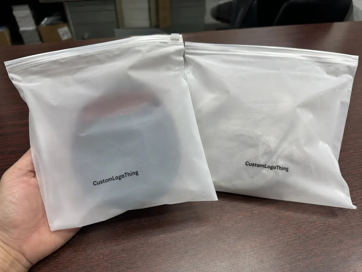
A frosted zipper bag is usually a translucent matte pouch with a zipper closure, and that surface changes how ink behaves. Light scatters across the film instead of sitting on top of it the way it would on a glossy substrate. As a result, colors tend to read softer, dark shades can lose some depth, and very light inks can sink into the background unless they are built carefully.
That is why the first question is not “which process is available?” It is “what does the design need to survive?” If the artwork is a bold logo with one or two colors, several processes can do the job well. If the design includes small reversed type, gradients, metallic accents, or a white base layer, the print method starts to matter much more. On frosted film, a design either feels crisp and intentional or it looks a little underpowered. There is not much middle ground.
Five practical checks usually decide the outcome:
- Visibility: Does the art hold its edge on a translucent matte surface?
- Durability: Will it survive packing, shipping, and retail handling without scuffing?
- Color control: Can the printer stay close to the target shade across the run?
- MOQ: Is the process sensible for a test run, replenishment order, or larger release?
- Timeline: How much setup is needed before the first sellable bag comes off the line?
Those points matter more than a process label. In practice, buyers usually need the method that protects the brand look while avoiding unnecessary setup cost. That is especially true with frosted packaging, because the substrate already carries a lot of the visual effect. The print should reinforce the surface, not fight it.
How Different Print Methods Work on Frosted Film
Screen printing is one of the most dependable choices for Frosted Zipper Bags when the artwork uses solid spot color, thicker strokes, or a limited palette. It lays down more ink, which helps opacity and gives the logo real presence on the matte film. The tradeoff is detail. Very fine text and delicate linework can lose clarity if the mesh, tension, or cure is not controlled well. Too much ink can also make the print feel heavy rather than polished.
Flexographic printing works well for longer runs and repeat orders because once the plates are made and the press is tuned, it moves efficiently. It is a practical fit for simple logos, repeating graphics, and packaging programs that need consistency from one replenishment order to the next. On frosted film, flexo rewards discipline: ink balance, pressure, and registration have to be controlled tightly. Too little ink looks pale; too much can blur edges or flatten the design.
Digital printing is often the most flexible option for short runs, changing artwork, or projects that need a fast approval cycle. It avoids the heavier screen or plate setup in many cases, which is useful when a buyer wants to test a design before committing to a larger order. Digital can reproduce detailed artwork cleanly, but the result depends on the ink system, film compatibility, and drying performance. On frosted bags, the details may look sharp right after print and still need careful handling so the surface does not mark during stacking.
The frosted surface changes the outcome for every method because it softens contrast. A dark logo that looks strong on screen can read almost charcoal on the bag. A pale gray might nearly vanish. White ink can help, but it has to be planned early, since not every printer handles it the same way and not every artwork needs it. That is why a proof on the actual film is worth far more than a paper sample or a PDF mockup.
Ask for a proof on the same frosted film, with the same ink system and print area you intend to approve. Paper proofs can hide contrast problems that show up immediately on translucent plastic.
Curing and drying matter just as much as ink choice. A print may feel dry to the touch and still scuff if it is stacked too soon, packed too tightly, or cured at the wrong speed. That issue shows up often with nested bags or tightly bundled orders. Good print finishing is not just about color; it is about how the surface behaves after the press, after inspection, and after shipment handling.
There are cases where a hybrid approach makes sense. A primary logo may be screen printed on the bag, while cartons, inserts, or outer labels are produced with another process to keep branding consistent across the full package. That is less about mixing methods on one bag and more about planning the whole packout with the same visual discipline. Teams that think that way usually avoid surprises during fulfillment.
Artwork, Color, and Material Factors That Change the Result
The art file has a bigger effect on the final result than many buyers expect. Thin gray text, hairline rules, and tiny reversed lettering are risky on frosted plastic because the finish already softens the image. A logo that looks sharp on a monitor can arrive with less punch if the ink coverage is light or if the print area is crowded. If the design needs a white base, that decision should be made before proofing starts, not after a sample looks dull.
Bag construction matters too. The zipper position, seal area, gusset shape, and usable print zone all limit where the art can live. A layout that pushes too close to the seal can distort. Artwork that stretches across a gusset can look broken when the bag is filled. Film thickness also plays a role. Heavier gauge material tends to look cleaner and hold shape better, while thinner film can show movement or slight distortion, especially in long, narrow print areas.
For that reason, one-color logos are often the safest starting point. They are easier to register, easier to match across repeats, and easier to approve under normal production lighting. Full-color art can work well, but it asks more of the printer and the buyer. CMYK builds on translucent film can be attractive, yet they need tighter color management than a lot of teams budget for. If brand color has to repeat exactly, a spot color is usually easier to control than a mixed process.
A good prepress checklist helps avoid wasted time:
- Submit vector artwork whenever possible.
- Specify Pantone targets if color consistency matters.
- Keep type and logo elements inside the safe print area.
- State clearly whether the print is front, back, or gusset only.
- Confirm whether white ink, an underbase, or a tint shift is needed.
Printers can usually work quickly from a clean file. They spend far more time fixing unclear art, relaying questions, and rechecking placement. That is one reason two projects that look similar on paper can produce very different outcomes. The bag is the same; the print readiness is not.
Cost, MOQ, and Unit Price Tradeoffs by Print Method
Price is where many comparisons get misleading. A method with a lower setup charge can still cost more per piece on a small run, while a process with a higher tooling cost may become the cheapest route once the quantity grows. That is the real tension in any Frosted zipper bags print method comparison: setup cost versus running cost.
Short runs often lean toward digital printing because the front-end work is lighter and approvals can move faster. Larger orders usually favor screen printing or flexographic printing because the setup is spread across more units, which improves unit economics. The crossover point depends on the number of colors, print locations, and how much adjustment the artwork needs.
For planning purposes, buyers often see these patterns:
- Digital: lower setup, higher flexibility, better fit for samples and short production runs.
- Screen printing: stronger opacity and solid spot color, usually better once the run is large enough to absorb setup.
- Flexographic printing: efficient for repeatable production, especially when the artwork is simple and the order is long.
Tooling can vary a lot. A small digital proof run may only need a modest setup cost, while screen or flexo orders can carry screen, plate, or registration charges that range from the low hundreds into the low thousands depending on color count and complexity. That is not a flaw in the process; it is simply how the economics work. The important thing is to compare the same bag, same finish, same print area, and same color target before judging the quote.
There are also hidden cost drivers that show up late if nobody asks early. More colors increase setup. White ink adds work. A second print location adds labor. Tight color matching can trigger extra proof rounds. Even the packing method matters, because bags that need more careful stacking or interleaf protection may add handling time. A quote that looks low at first can climb quickly if those items are discovered after approval.
A practical buying habit is to ask for pricing at several quantities, not just one. A quote at 3,000 pieces, 5,000 pieces, and 10,000 pieces usually shows where the process becomes efficient. That gives a clearer answer than a single number ever will.
For broader packaging context, organizations such as ISTA publish testing guidance that can help teams think beyond artwork alone, and the Packaging Machinery Manufacturers Institute provides process references that are useful when the bag is part of a larger packout. Those resources do not choose the print method for you, but they help frame performance expectations around handling, transport, and shelf presentation.
Production Steps and Timeline From Proof to Shipment
The production path is usually straightforward, but delays tend to happen at the same places. It starts with artwork review, then proof approval, then screen, plate, or file preparation depending on the print method. After that comes printing, drying or curing, inspection, packing, and shipment. If the bag needs special handling, such as extra drying time or protective stacking, that also has to be built into the schedule.
Low-resolution files are a common slowdown. So are missing Pantone references, unclear print placement, and art built for the wrong bag size. A printer can often fix some of those issues, but every correction adds back-and-forth and pushes the timeline. The cleanest jobs usually begin with a spec sheet that tells the production team exactly where the art belongs and how much space it has to breathe.
Lead time depends heavily on the method. Digital printing can move fastest for short runs because setup is lighter. Screen printing and flexographic printing usually need more preparation, but they can reward that setup with better repeatability and lower unit cost at scale. A useful quote should separate production time from transit time so the buyer can see what is actually included.
A realistic planning window often looks like this:
- Digital runs: often the quickest path once artwork is approved and film stock is available.
- Screen print runs: usually need more setup, then run steadily once the press is dialed in.
- Flexographic runs: can be efficient for larger orders, but plates and registration work need more lead time.
Stock availability matters as much as print method. If the exact frosted film, zipper style, and bag size are already in inventory, the order can move faster. If the bag needs to be made to order, the schedule stretches. That is why a quote should cover both the bag construction and the print stage. Otherwise the buyer only sees part of the timeline.
Common Mistakes That Make Frosted Prints Look Dull or Off Color
The most common mistakes are simple enough to prevent. Buyers choose colors that are too light for a translucent matte surface, then wonder why the logo fades into the bag. They use thin gray text. They place dark art without a white base. They approve a file that looked fine on a monitor but was never tested on the actual film. Any one of those choices can flatten the print.
Raster artwork creates another problem. A logo pulled from a low-resolution file may look acceptable on screen and still soften or pixelate in print. Tiny reversed text has the same issue. If the zipper hardware or gusset interrupts the print zone, the art has to be adjusted before production starts. Otherwise the bag can look slightly off even when the printer did everything correctly.
Rushed approvals cause the most expensive mistakes. Once a full run begins, a small color shift becomes a large problem. A placement error that might have been tolerable on one sample becomes obvious across thousands of bags. Careful prepress review is cheaper than rework, scrap, or delayed shipping, and it usually takes less time than fixing a broken run later.
Scuff resistance deserves its own check. A print can look excellent coming off the press and still fail if it rubs during packing or transport. That is where ink selection, cure quality, and handling procedure all connect. Buyers who ask about abrasion resistance during quoting usually avoid unpleasant surprises later, especially on bags that will be handled by customers or retail staff.
One more caution: do not assume the same artwork behaves the same way across different bag thicknesses or frosted finishes. A slightly thicker film may hold color better and reduce distortion, while a softer film may need a different cure or print pressure. Those differences are small on paper and obvious in production.
Expert Tips for Choosing the Right Print Method for Your Run Size
Match the process to the job, not to habit. A short test run for a new product line usually benefits from digital printing because speed and flexibility matter most. A retail launch with a simple logo and a stable forecast may lean toward screen printing or flexographic printing, especially if the order will repeat. A promotional bag with a tight budget may need the artwork simplified so setup does not outrun the value of the order.
Simple graphics tend to age better on frosted bags. One strong logo, one clear color, and enough open space can look more premium than a crowded design trying to say too much. If the art has to be more detailed, keep the critical elements large enough to survive on a matte translucent surface. That is not a compromise. It is a design decision that respects the material.
A practical shortcut is this: if the job needs sharper detail and lower setup, start with digital. If the job needs strong opacity, repeatability, and a simple artwork system, screen or flexo may be the better fit. If the brand color is extremely sensitive, ask for spot matching and review a proof on the actual film before approving anything.
Two sample requests save a lot of trouble:
- A proof image or physical sample showing the actual bag, actual ink, and actual print area.
- A side-by-side comparison of color, feel, and scuff resistance if two methods both seem viable.
That kind of comparison does more than settle the print choice. It also shows what the customer will actually see and touch, which matters for packaging that sits on a shelf or goes straight into someone’s hands.
Next Steps: Build a Better Print Spec and Request Quotes
The fastest way to get useful quotes is to send a clean spec sheet. Include bag size, frosted finish, zipper style, artwork count, target quantity, print location, expected use case, and whether the bag needs white ink or special finishing. One organized page often saves more time than a long chain of back-and-forth emails.
Ask each supplier to show the same basics: print method, setup fees, unit cost at several volumes, proof or plate charges, and estimated turnaround. Once those line items are visible, the comparison becomes much easier because you are judging the same job instead of three different assumptions.
If the design uses delicate type, transparency effects, or white ink, request a proof or sample before full production. That is the quickest way to see how the frosted surface changes the artwork and whether the selected process really delivers the look you want. It is a small step that can prevent a large batch of disappointing bags.
The most useful Frosted Zipper Bags print method comparison is the one that protects brand appearance, fits the budget, and matches the production schedule without forcing you to give up the details that matter on the shelf.
Which print method gives the sharpest result on frosted zipper bags?
Sharpness depends on the artwork, film, and color system, but methods with tighter registration and controlled ink deposit usually handle small type and fine logos best. If the design includes thin lines or reverse text, ask for a proof on the actual frosted film before approving the run.
Is digital printing or screen printing better for short-run frosted zipper bags?
Digital printing often fits shorter runs when you want to avoid heavier setup costs and need more design flexibility. Screen printing can still make sense if the artwork is simple, bold, and repeatable, especially when opacity matters more than variation.
How does the frosted surface affect color in printed zipper bags?
The matte, translucent finish softens light and can make colors look less vivid than they would on a clear or white bag. White ink or a solid underbase can help bright colors stay readable and keep logos from blending into the film.
What should I ask for in a quote when comparing print methods?
Ask for the same bag size, material, print location, color count, and quantity so the pricing is truly comparable. Also request lead time, setup fees, and any proof or plate charges so the total landed cost is easy to evaluate.
How can I reduce mistakes before approving frosted zipper bag artwork?
Use vector artwork, confirm Pantone or color targets, and keep text and logos inside the safe print area. Review a proof for legibility, contrast, and placement before production starts, especially on translucent packaging.


