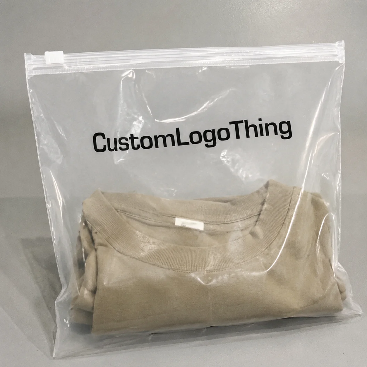
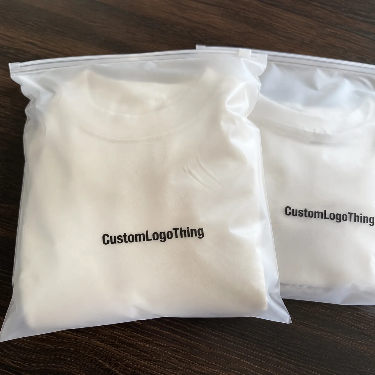
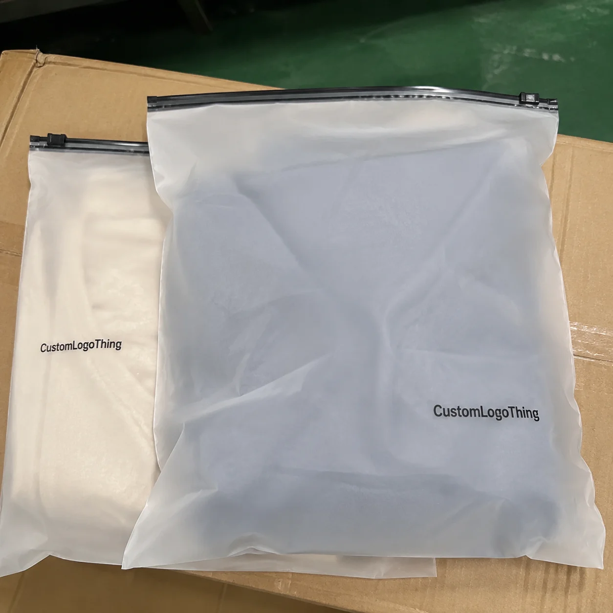
For streetwear brands, Garment Poly Bags for Streetwear labels print placement guide decisions are not minor artwork tweaks. They change how the package reads the second it lands in a buyer’s hand, hits a retail shelf, or shows up in an unboxing clip. A logo that looks centered in a flat mockup can drift into a seal, sit too close to a hang hole, or end up visually low once the shirt is folded and inserted. That is a production issue, not a design preference.
In practice, the bag style, film clarity, print method, and garment fold all work together. Clear bags show every mistake. Frosted bags hide some of it, but they also soften detail. Opaque film gives more privacy and more room for brand control, yet it demands sharper planning for contrast and finish. The point of this Garment Poly Bags for Streetwear labels print placement guide is simple: place the artwork against the finished bag, not against the fantasy version in a design file.
Why a One-Inch Shift Changes the Whole Bag
A one-inch shift can be the difference between a clean premium presentation and a bag that just feels off. Streetwear buyers judge packaging fast. Sometimes they judge it before touching the garment. That makes the printed panel part of the product story, not a wrapper around it. If the logo is too high, it crowds the top seal. Too low, and it reads like an afterthought.
The problem gets worse because a centered design on a flat mockup does not automatically stay centered on a filled bag. Once a tee, hoodie, or accessory is folded, the visible area changes. The panel can bow a little. The top seal steals space. The garment inside pushes the print off its visual axis. On a clear bag, that shift is obvious. On frosted film, it is still there, just harder to spot at a glance.
Film choice matters as much as placement. Clear polyethylene gives the strongest product visibility, but it leaves almost no room for error. Frosted film softens the look and hides handling marks. Tinted or opaque bags can feel more deliberate and brand-led, but they need stronger contrast. If the artwork is too light, it disappears. If ink coverage is weak, it looks washed out. White ink, spot color blocking, and generous spacing are not decoration. They are survival tools.
If the bag structure is not considered early, the artwork is usually the first thing to feel wrong, even when the logo itself is fine.
Most placement questions keep coming back to the same point: the print has to fit the bag structure, the garment fold, and the retail-facing side at the same time. That is why the job has to be handled with a finished-bag mindset, not a generic packaging template.
How Bag Structure Sets the Safe Print Zone
Think of the bag as a set of usable and unusable zones. The front panel is usually the main branding field. The back panel may carry size, compliance copy, or barcodes. Side seals and the bottom edge are usually off-limits because they can distort the print or clip detail. If the bag has a resealable flap, hang hole, or adhesive strip, those features shrink the safe area even further.
What matters is the finished size, not the cut sheet. That is where a lot of teams stumble. Someone approves artwork against the raw film dimensions, then the sealed bag arrives and the logo sits too close to the top because the fold and seal consumed more space than expected. A useful proof should reference the finished width, finished height, and visible panel after insertion.
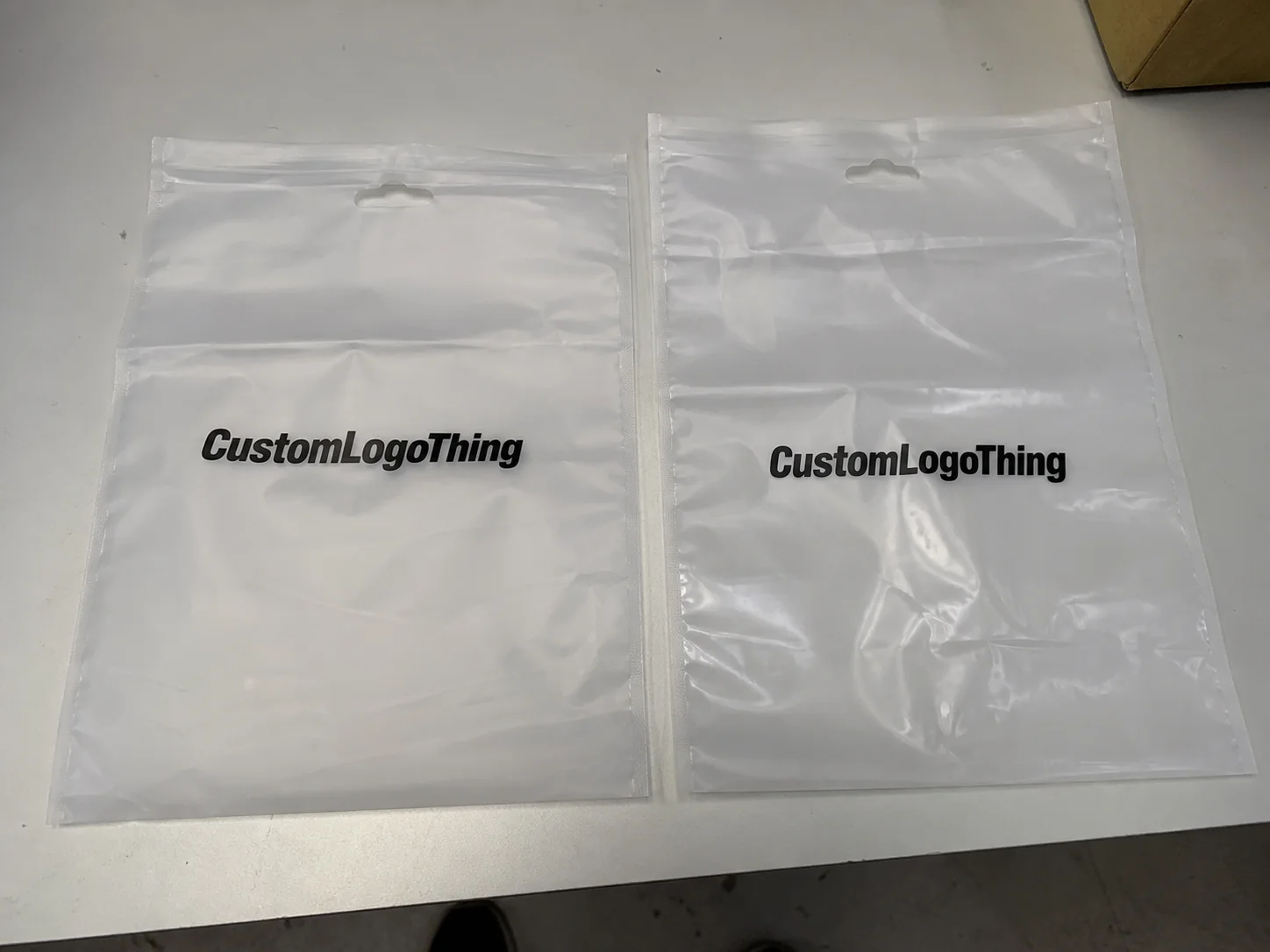
Different bag styles create different windows. Header bags give you more control at the top, but the header can compete with the print. Die-cut bags look clean for retail, although the handle area and shoulder curve reduce usable space. Resealable poly bags are common for tees and accessories because they are practical, yet the adhesive flap can interrupt the design if the artwork is pushed too high. Hoodies are another story. The fold is bulkier, so the safe zone usually needs more vertical margin than people expect.
Contrast is a structural decision as much as a design one. A transparent bag over a dark garment can still read sharply if the artwork has enough opacity. A frosted bag can look refined, but it can also mute fine lines and thin typography. If the brand wants a crisp logo on darker film, spot color ink with a white underbase often performs better than a loose CMYK build. The right answer still depends on the film gauge, the print method, and how detailed the artwork is.
From a production standpoint, the safest print zone is the area that stays visible after folding, sealing, and insertion. That sounds basic. It is also the part that gets missed most often. A good supplier will map the panel, mark no-print areas, and show how the garment sits inside the bag before release.
Print Placement Process and Lead Time
The cleanest production starts with the dieline or final bag size, not a logo floating in blank white space. Once the supplier has the finished dimensions, they can map the artwork to the actual panel and confirm what remains visible after folding. That proof stage is where most expensive mistakes get stopped. For Garment Poly Bags for Streetwear labels print placement guide work, I would rather spend an extra day fixing the layout than burn through thousands of bags with a print that lands wrong.
The proofing sequence should be clear. First comes the layout review. Then the safe zone is confirmed. After that, any adjustments to text, bleed, or color blocking are made. Only then should the placement sheet be signed off. If a supplier sends only a pretty mockup, that is not enough. You want a proof that shows the art on the actual bag size, with measured distances from the seal, flap, and edge.
Production usually follows a familiar path: plate or screen setup, ink matching, printing, curing or drying, slitting, folding, and packing. The exact order shifts depending on whether the job uses flexographic printing, screen printing, or digital printing. Flexo is often efficient for longer runs with stable artwork. Digital helps with shorter runs or last-minute artwork changes. Screen printing is useful for bold spot colors and heavier ink laydown. Offset printing is usually the wrong tool for poly film. It belongs more on paper-based items like hang tags or inserts.
Lead time depends on a few practical factors:
- Quantity ordered and bag size.
- Number of colors, especially if a white underbase is needed.
- Artwork complexity and how tight the placement needs to be.
- Whether the film gauge and bag style are already in stock.
- How many proof rounds are needed before signoff.
For a straightforward run with approved artwork and stocked film, production may land around 10 to 15 business days after proof approval. Complex work, especially jobs with multiple colors, heavy white coverage, or tight registration, usually takes longer. Freight should be separated from production time so nobody confuses transit with manufacturing. If the launch date matters, ask for a schedule that breaks out proofing, press time, finishing, and shipping.
For brands coordinating the rest of the package, it can help to line up supporting pieces like Custom Labels & Tags or compare the overall mix inside Custom Packaging Products. If the outer shipping layer is changing too, Custom Poly Mailers may need to match the same visual system.
When a job has compliance or performance requirements, ask whether the supplier can point to testing or material standards that fit the use case. The packaging world often references bodies like ISTA for distribution testing and FSC for responsibly sourced paper components. Those standards do not solve print placement, but they matter when the packaging system includes cartons, inserts, or display materials.
Cost, MOQ, and Unit Pricing Factors
Price on these jobs is shaped by setup, coverage, and volume. Two quotes can look close and still be miles apart. One may include a thicker film, stronger color density, and tighter placement control. Another may be based on a thinner bag with looser waste assumptions. That is why comparing only unit price is risky. For Garment Poly Bags for streetwear labels print placement guide decisions, the real cost is tied to how much control the printer has to keep the layout where it belongs.
There are two buckets to watch: setup cost and unit cost. Setup covers plate making, screen prep, file adjustments, proofing, and press calibration. Unit cost is what each bag costs once the run is moving. Short runs feel expensive because the setup gets spread across fewer pieces. Larger runs usually lower the unit price, but only if the artwork is stable enough to avoid rework or spoilage. If a brand changes the logo size after proof approval, the real cost climbs fast.
Minimum order quantity usually follows the print method and film spec. Flexographic printing often makes sense at higher volumes because the plates get spread across more units. Digital printing can support smaller quantities, especially for test launches, but the per-unit cost is usually higher. Screen printing can be strong for specific effects or bold spot color work, though each color adds setup and labor. Print finishing choices, such as special sealing, extra adhesive, or custom perforation, can also push MOQ upward because they add process steps.
| Print Option | Best Fit | Typical Setup | Typical Unit Cost Impact | Notes |
|---|---|---|---|---|
| Flexographic printing | Higher-volume bag runs with stable artwork | Moderate to higher | Lower as volume increases | Good for repeat orders and consistent placement |
| Digital printing | Shorter runs, test launches, faster artwork changes | Lower to moderate | Higher per unit | Useful when speed matters more than lowest unit price |
| Screen printing | Bold logos, spot color-heavy layouts, heavier ink coverage | Moderate | Varies by color count | Can be strong on opaque or high-contrast designs |
White ink, special opacity, and custom thickness are the price drivers buyers underestimate most often. A dark garment under a clear or frosted bag may need more ink build than expected. That is especially true if the brand wants a crisp logo with no show-through. A clean quote should separate the cost of the bag, the print method, the artwork prep, and any extra proofing. Otherwise it is hard to know what is actually driving the number.
For planning purposes, many custom printed garment poly bag jobs land in a practical range of about $0.12 to $0.35 per unit, depending on size, film gauge, quantity, and print coverage, with setup charges layered on top. A simple one-color mark on a larger run usually sits near the lower end. A tighter layout with multiple inks, white underbase, and narrow placement tolerances moves upward. That is normal. What is not normal is comparing quotes without matching specs line by line.
Common Placement Mistakes on Streetwear Packaging
The classic error is approving artwork before the bag size is final. Once the actual dimensions change, the logo can drift into the seal zone or sit awkwardly high on the panel. I see this most often when the creative team uses a flat mockup and never checks the folded, filled condition. For garment poly Bags for Streetwear labels print placement guide work, the filled bag is the real reference, not the Photoshop preview.
Another common mistake is cramming too much into one panel. A streetwear package does not need every message on the front. If the logo, tagline, barcode, sizing, and compliance text all fight for the same space, the result is noisy and hard to read in retail or in a social post. Strong packaging knows what to leave out. The front should hold the primary mark, and the back or lower panel should carry functional text.
Thin lines and tiny type are risky on film. Glossy poly can reflect light and make delicate strokes disappear. On a clear bag, the garment color underneath can break legibility. On frosted film, the surface can soften edges enough that hairline art looks fuzzy. If the design depends on small details, ask the printer to confirm minimum line weights and smallest readable type before release. That is more useful than hoping the press will sharpen it later.
Folded state matters just as much as flat state. Once the shirt or hoodie is inserted, the visible center can move. If the logo was placed to look perfect on the raw bag, it can feel off once the product fills the package. Barcode placement deserves its own zone too. It should not compete with the brand mark, and it should not sit where the hand naturally grabs the bag. That sounds small. It changes how polished the pack feels.
Do not treat the front panel like a dumping ground for every compliance note. Fiber content, warnings, and barcode data need to be readable, but they should not dominate the layout. If the legal text needs a separate zone, give it one. A calmer composition usually reads better and makes the brand feel more deliberate.
Artwork Rules That Keep the Print Crisp
Vector artwork is the safest starting point. It holds edges better, scales cleanly, and gives the printer a cleaner file to build from. Fonts should be outlined before submission, and small copy should stay simple. Hairline details can break apart on thin film or dark underlays, especially when the job uses CMYK builds instead of a few controlled spot colors. In packaging, simple usually prints better.
Bleed and safe margin need special attention around seals and edges. If artwork sits too close to the top of the bag, a slight shift in folding can clip it. If it runs too close to the side seal, the print may distort where the film is fused. A measured margin keeps the logo out of danger and gives the finished bag a cleaner frame. That matters more on a premium streetwear drop, where the package is part of the perceived value.
Color needs to be specified early. If the design depends on a tight brand red or a specific black density, say that up front and do not leave it to guesswork. CMYK can work for many layouts, but for a strong identity mark, spot color is often a better fit. White underbases should also be confirmed early because they affect opacity and the final look on clear or tinted film. The better the color brief, the less likely the proof will miss the mark.
There is also a practical file-handling rule that saves time: send one final version, clearly named, with dimensional notes attached. If the printer has to guess which PDF is current, the risk of a placement error rises. A clean file package should include the artwork, the bag size, the position notes, and any special instructions about print finishing or sealing zones. For brands coordinating a broader package system, this is also a good moment to align bag graphics with Custom Labels & Tags and, if needed, the rest of Custom Packaging Products.
Digital printing can be excellent for short runs and quick market tests, but it still needs the same discipline around safe margins and visible area. The technology does not remove the need for a correct placement map. It just shortens the path from proof to production.
Next Steps Before You Approve the Run
Before you approve the run, measure the bag yourself and mark the visible panel. Identify the top seal, bottom seal, side welds, fold lines, hang hole, flap, and any reseal strip. That gives you a real map for the artwork instead of a rough guess. If the bag is being used with different garment sizes, check the smallest and bulkiest fold so you know the package still reads correctly across the line.
Then ask for a proof on the actual bag size. Not a generic centered logo. Not a blank panel with a logo floating in the middle. The proof should show how the art lands relative to the true production dimensions. If the supplier cannot provide that, you are taking on placement risk that does not need to exist. For a launch product, especially in streetwear, that risk usually shows up in the one place you cannot ignore: the customer-facing image.
A solid quote should list the film type, bag style, print method, quantity, color count, setup charge, and target lead time. If the brand is asking for a specific feel, such as clearer contrast, heavier opacity, or tighter registration, that should be written into the quote. Otherwise the result may technically match the file while still missing the visual target. That is where the gap between expectation and production spec gets expensive.
If the design matters to the launch, run one sample or a short pilot batch first. Compare it against the folded garment, not against the artwork file. Then check it under the lighting the customer will likely see: store lighting, warehouse light, phone camera, or natural daylight. Small shifts in gloss, opacity, and color can change the way the package feels. That is normal, but it should be checked before volume production.
For streetwear brands, garment poly bags for streetwear labels print placement guide choices should be confirmed against the final dieline, the folded garment, and the visible retail side. If those three things line up, the package will feel intentional instead of improvised.
Where should print sit on garment poly bags for streetwear labels?
Keep the main logo in the center of the front panel safe zone, away from seals, folds, and hang holes. Check the placement with the garment inserted, because the filled bag can shift the visual center. Leave room for any barcode or legal copy so the branding stays clean and easy to read.
How do I choose print placement on clear vs frosted poly bags?
Clear bags need stronger contrast and cleaner spacing because every alignment issue is visible. Frosted bags soften the look, but they can reduce color intensity if the artwork is too light. Use a white underbase or darker art when readability matters more than subtle branding.
What affects the cost of custom printed garment poly bags?
Quantity, bag size, film thickness, and print method all affect unit price. Setup charges rise with more colors, white ink, and tighter placement control. Rush timing, proof revisions, and freight can also move the final total.
How long does production usually take after artwork approval?
Simple runs can move quickly once the proof is approved and materials are ready. Complex artwork, multiple colors, or special opacity usually add setup and run time. Freight and any sample approval step should be included in the timeline from the start.
What files should I send for the best placement proof?
Send vector artwork, the final bag dimensions, and a marked-up placement note. Include Pantone references or color targets if the brand expects exact matching. Add a flat mockup and a folded-use example so the printer can verify the visible area.