Hotel Logo Patch Beanies Digital Proof Checklist for Buyers
Use this hotel Logo Patch Beanies digital proof checklist to verify size, placement, color, construction, pricing, and turnaround before anything gets approved. A proof should do more than show a logo on a nice-looking mockup. It should answer the boring questions that decide whether the finished beanies will look sharp on a hotel team, under lobby lighting, and in real use.
That is the part people miss when they rush. A digital proof is not a mood board. It is the last clear chance to catch a patch that is too large for the cuff, a logo that is too small to read, or a color that looked fine on screen and turns muddy on knit fabric. The hotel Logo Patch Beanies Digital Proof checklist exists for exactly that reason. It keeps the conversation on production realities instead of vague feedback like “make it cleaner” or “make it premium,” which usually means nothing useful.
For hotel buyers, this matters because beanies are rarely casual swag. They sit in front of guests, on front-desk staff, on valet teams, in winter welcome kits, and sometimes in property-wide seasonal programs. The logo has to hold up at a glance. If the patch looks off by a quarter inch, people will notice. Guests may not know why it feels wrong, but they will feel it.
The best approvals start with the obvious stuff: what decoration method is being used, where the patch sits on the cuff, how much of the knit body is visible around it, and whether the beanie color still supports the hotel brand. One clean proof can save three rounds of correction. That is not marketing language. That is just less pain later.
What Digital Proofs Should Show
A digital proof should show scale first. Not just the artwork. Actual scale. A patch that looks balanced on a screen can feel oversized once it is stitched onto a beanie, especially when the knit texture is dense or the cuff is shallow. On a small front panel, a difference of even 1/4 inch changes the whole read. Too big and the beanie looks heavy. Too small and the logo disappears into the fabric.
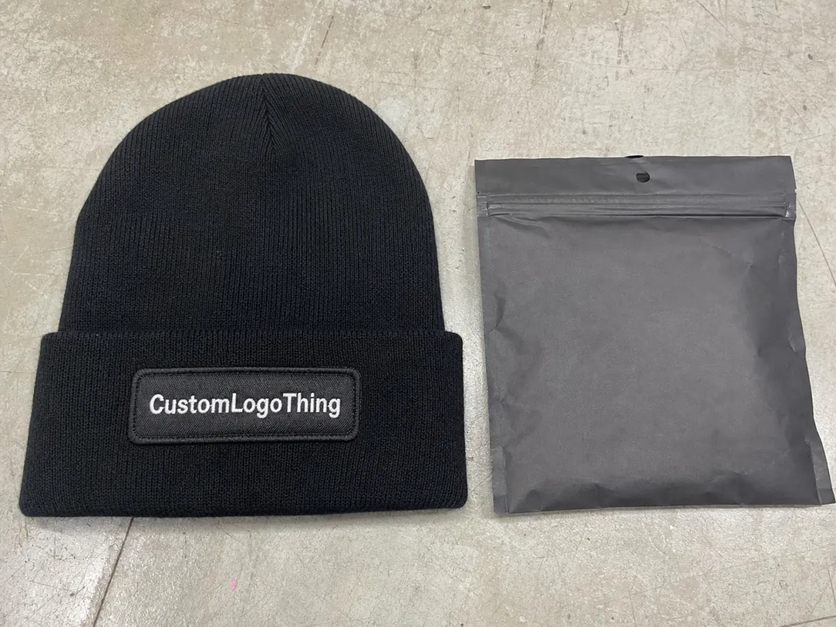
The proof should show the patch shape, the beanie body color, the cuff style, the edge finish, and the logo placement together in one view. Separate views are useful for production, but buyers need to judge the finished item as a whole. A crisp logo can still look awkward if the patch sits too low on the cuff or too close to the fold line. That kind of thing is easy to miss when everyone is staring at artwork instead of the actual garment space.
For hotel programs, legibility matters more than novelty. These pieces are usually viewed from a few feet away, often while someone is moving. If the logo uses thin borders, small type, or tightly packed details, ask for a close-up crop and a written size callout. Guessing is a bad habit here. Guessing is how a decent-looking proof becomes a disappointing shipment.
The proof should also tell you what kind of patch you are approving. Woven, embroidered, PVC, and printed patches all behave differently. A woven patch usually handles small text best. Embroidery gives more texture but can close up fine lettering. PVC is durable and high contrast, though it can feel more sporty than some hotel brands want. Printed patches can carry gradients or more complex artwork, but they need honest review because print clarity on paper and print clarity on a knit product are not the same thing.
A proof should read like production instructions that happen to be visual.
If the supplier only sends a pretty mockup, ask for more. You need dimensions, placement notes, and a clear description of the construction. Otherwise, you are approving a picture, not a product.
Digital Proof Process and Approval Timeline
The cleanest process starts with artwork verification before mockup rendering. That sequence matters. If the logo file has a misspelled hotel name, a border too close to the edge, or a trademark mark placed in the wrong spot, the fix should happen before anyone talks about production. Once a sample has been built or a decoration file has been set, every change gets slower and more expensive. A good hotel Logo Patch Beanies digital proof checklist keeps that sequence obvious from the start.
For straightforward orders, one clarification round and one final revision is a normal pace. If the artwork is ready and the beanie style is already chosen, approval can happen the same day. More often, hotel teams need 24 to 48 hours because procurement, brand, operations, and sometimes property leadership all want a say. That is fine. It is normal. It is also exactly how simple orders turn into slow ones when nobody owns the final call.
One decision-maker helps more than people want to admit. If one person signs off on size, placement, and color, the proof moves. If three departments send separate edits, the supplier ends up reconciling contradictions instead of producing headwear. One person wants a bigger patch. Another wants it lower. Another wants to keep the original dimensions because the budget is already tight. That is how a small item becomes a very long email chain.
Timelines depend on whether you are approving a digital proof only or asking for a physical sample as well. A digital proof may come back in a few hours. A preproduction sample usually adds several business days, often five to ten, depending on the decoration method and how busy the factory is. Bulk production after final approval often runs around two to four weeks for standard stock beanies, then freight adds its own clock. Custom yarn, specialty labels, or color matching can stretch that. The schedule is only realistic if everyone agrees on the spec before the clock starts.
There is also a practical reason to keep approval notes clean. If the hotel ever needs to reorder, the proof trail becomes the record. A dated mockup with clear notes is far better than a vague “looks good” reply buried in a thread somewhere. Production teams work from records, not memory. Memory is charming. It is also unreliable.
Patch Construction, Fabric, and Color Details to Verify
Start with the patch construction. That decision affects almost everything else. Woven, embroidered, PVC, and printed patches all have different strengths, and the wrong choice can make a logo look softer, busier, or more casual than intended. On a compact beanie, the patch has less room to hide weak choices.
Woven patches are usually the safest option for small type, fine borders, and hotel marks with a lot of internal detail. They stay flatter and usually keep crisp edges better than embroidery when the logo is detailed. Embroidered patches add texture and can look more traditional, but tight lettering can fill in if the stitch density is too heavy. PVC gives a molded look and tends to feel durable, though it pushes the style toward athletic or utility branding. Printed patches are handy for color-heavy graphics, but they deserve extra scrutiny because a clean file does not guarantee a clean finish.
The beanie itself matters just as much. Knit gauge, cuff depth, yarn softness, and stretch all affect how much room the patch really has. A deep cuff gives the logo more visual space. A shallow cuff leaves less margin for error. A soft knit can shift slightly when worn, which makes the patch appear a little higher or lower than it looked in the proof. If the mockup shows a generic beanie silhouette, ask whether it matches the actual style code. Generic silhouettes are convenient. They are also where bad assumptions breed.
Color should be reviewed as a system, not a single swatch. Check the base beanie color, patch face, border or merrow edge, and any thread accents together. Hotel branding often depends on subtle shifts in navy, charcoal, black, cream, or muted accent colors, and those shades can move under different lighting. Screen color is only a reference. It is not a promise. Yarn dye lots, thread charts, and monitor settings all affect what you see.
If exact brand matching matters, ask for Pantone references where possible, or at least a written note on how the match is being handled. Sometimes the supplier can match a thread to a chart. Sometimes they are matching by eye to the closest practical option. Those are not the same thing, and they should not be treated like they are.
Patch edges deserve attention too. A dark merrow border on a light beanie can create a stronger outline than the brand expected. A tonal edge can look refined in a mockup and then fade into the knit once the item is finished. That is why the proof should show the patch against the real base color, not against a generic white background. The mockup should expose problems, not hide them.
Use this quick comparison to narrow the decoration choice before final approval:
| Patch Type | Best For | Typical Strength | Common Watchout |
|---|---|---|---|
| Woven | Small text, clean logos, tight borders | Flat finish and good detail control | Can feel less textured than embroidery |
| Embroidered | Bold marks and traditional branding | Classic stitched look with depth | Fine lettering may fill in |
| PVC | High-contrast branding with a modern look | Durable and dimensional | Can read more casual or sporty |
| Printed | Gradients or artwork with many colors | Flexible artwork reproduction | Needs close review for wear and clarity |
One more practical point: the beanie knit can affect how the patch looks even when the decoration itself is correct. Rib structure, fabric recovery, and stitching tension can all change the final appearance. That is not a defect. It is just the reality of putting a flat graphic on something elastic.
Pricing Drivers, MOQ, and Quote Decisions
Cost is shaped by more than patch size. Material choice, stitch density, color count, backing type, and finish all push the number up or down. A simple-looking beanie can still carry a surprising price if the patch needs tiny text, a special border, or a second production step to keep the logo crisp. The cheapest visual on paper is not always the cheapest item to make.
For many stock beanie programs, especially at modest quantities, unit pricing often lands somewhere in the low single digits to high single digits per piece depending on decoration and packaging. A straightforward stock knit with a simple patch can be relatively economical at higher quantities. Add custom yarn, a more detailed patch, or individual presentation packaging, and the cost climbs fast. That is normal. It is also why a quote should be read with care instead of skimmed for the headline number.
MOQ matters because setup costs have to live somewhere. Lower quantities usually mean a higher unit cost. Bigger runs usually spread setup more efficiently. But there is a catch. Some suppliers tie pricing to the exact same beanie style, patch size, and backing method. Change one of those and the pricing tier may reset. If you are sourcing for a hotel group, a seasonal rollout, or a property refresh, confirm which changes keep you in the same quote and which changes start a new one.
Ask what is included before comparing vendors. Does the price cover artwork setup, revision rounds, testing, freight, and label application? Are individual polybags included? What about woven labels, care tags, or private-label packaging? The low quote that later grows extra line items is not actually the low quote. It is just the one that hides its cost longer.
Here are the main drivers that usually move price the most:
- Patch construction: woven and embroidered are common, but detail level changes labor.
- Patch size: larger patches use more material and more application time.
- Color count: more thread or print colors increase setup complexity.
- Backing type: sew-on, iron-on, and adhesive-backed options follow different production paths.
- Packing method: bulk packing, individual polybags, and custom labels add fulfillment cost.
If the proof shows a 3-inch patch but the quote was built around 2.5 inches, stop and fix that before approval. A mismatch between the mockup and the commercial terms is one of the easiest ways to create a dispute later. Buyers should not have to choose between the visual they approved and the price they agreed to.
Step-by-Step Proof Approval Checklist
Start with the logo file. Confirm spelling, punctuation, spacing, and line breaks before you stare at color. If the mark includes a trademark symbol, confirm that it is in the right spot and not distorted. If the brand guide has rules on clear space or minimum size, check them now. Fixing a wrong word is harder than fixing a border color, and both are easier than pretending nobody saw the error.
Next, verify the patch dimensions against the beanie style. Measure the front panel space, then compare it to the proof callout. A patch that is too wide will crowd the cuff and make the whole item feel heavy. A patch that is too small can disappear into the knit. On beanies, the margin for error is thin. That is why eye-balling it is not enough.
Then review placement from more than one angle. Front view matters, but a slight angle can reveal whether the patch sits too close to the seam, too low near the fold, or too high where it loses visual balance. Some styles look better with the patch centered. Others need a little lift above the cuff to avoid the fold line. There is no universal rule. There is only the actual beanie in front of you.
Read the notes, not just the image. The notes should list backing type, thread or print references, edge finish, and any special packing instructions. If the supplier says “final placement aligned to cuff seam” or “match to nearest thread chart,” that is not filler. That is production information. Ignore it and you may approve something that looks fine online and lands wrong in hand.
Then look at the proof the way a guest would. Is the logo readable at a few feet? Does the patch feel appropriate for a hotel team rather than a sports merch drop? Does the color still feel like the brand? That final pass is often where weak approvals get caught, because the item has to work in the real world, not just inside a PDF.
- Match the proof to the original logo file.
- Verify all text, punctuation, and spacing.
- Check patch width, height, and placement.
- Confirm beanie color, patch color, and edge finish.
- Review packing and labeling notes.
- Approve only when every change is documented.
One small but useful habit: keep a dated approval record that names who signed off on size, color, and quantity. If there is ever a reorder question, that note saves time. It also stops the usual “I thought someone else approved it” mess before it starts.
Common Mistakes That Delay Orders
Approving from a phone is a bad idea. Tiny type, stitch density, border alignment, and patch placement are much easier to miss on a small screen. A proof can look fine on a phone and still fail once it is stretched across a beanie cuff. If the item matters enough to buy, it matters enough to review on a larger screen.
Another mistake is treating RGB screen color like a production standard. It is not. A navy patch can appear richer on one monitor and darker on another. Gray can shift warm or cool depending on the device and the room lighting. Knit yarn and thread add their own variation. None of that is unusual. It is just what happens when a digital file meets physical material.
Feedback gets slow when it comes from too many voices in too many messages. One person asks for a bigger patch. Another wants it lower. Another wants the original size back because the budget is already locked. The supplier then has to clean up the contradiction instead of making the product. Consolidated feedback is faster, cleaner, and less annoying for everyone involved.
Quantity and ship date also need to stay tied together. A small change in run size can affect both price and timeline. If the order supports a season launch, a property opening, or a holiday push, the schedule has to reflect actual approval speed, not just the factory estimate. If the internal review takes four days and production starts on day five, the order is already behind.
Finally, do not change the spec after signoff unless the change is genuinely necessary. Even a small shift in patch size, backing, or color can require a new proof and a new price. That sounds obvious until someone decides to “just nudge it a little” two days before production. That little nudge has wrecked more schedules than bad art ever did.
Next Steps Before You Send Approval
Gather the final logo file, brand colors, target quantity, and selected beanie color in one place. That simple step cuts down on back-and-forth and gives the supplier one clear instruction set. If the hotel brand has rules for cuff height, logo clearance, or minimum readable type, include them with the order. Missing details are the fastest way to create a proof that looks polished but solves the wrong problem.
Assign one approver for the final call on size, color, and placement. Everyone else can comment, but one person should own the decision. That keeps the proof moving and avoids contradiction. Once the proof is final, archive the approved version so there is no confusion later about which mockup was used for production. This is the kind of unglamorous admin that saves real money.
Before you release the order, run the hotel Logo Patch Beanies Digital Proof checklist one more time. Check the patch dimensions, confirm the decoration method, compare colors against the brand guide, and read the notes as if you were the person building the item. That last pass catches the mistakes people miss when they are moving too fast.
For teams managing multiple branded items, the same discipline should apply across the board. If the proofing process is sloppy for a beanie, it is probably sloppy for apparel, tote bags, or guest gifts too. Consistent approvals create consistent products. That is not a revolutionary idea. It is just the part that keeps brand teams from cleaning up avoidable errors later.
A strong proof turns a visual into a decision. When size, placement, construction, and commercial terms all line up, approval gets easier and the finished beanies are far more likely to match the hotel’s intent. That is the whole point.
FAQ
What should a hotel logo patch beanies proof include before approval?
It should include the patch shape, logo placement, base beanie color, edge finish, and any thread or print color references that affect the final look. The proof should also show dimensions and production notes so the buyer can judge scale, not just artwork appearance. If the proof does not answer those basics, it is not ready.
How many proof revisions are normal for hotel-branded beanies?
One clarification round and one final revision is common when the artwork is already prepared. More revisions happen when the hotel changes size, placement, color, or patch style after seeing the first mockup. The fastest projects keep feedback in one place instead of scattering comments across multiple emails.
Does patch size affect the cost of logo patch beanies?
Yes. Larger patches use more material and can take more time to apply. Very small patches can also raise the cost if they require tighter stitching or finer construction to keep the logo readable. The most attractive layout is not always the least expensive one to produce.
How fast can the proof-to-production timeline move?
A digital proof can come back quickly, sometimes in the same day for simple artwork. A physical sample takes longer, often several business days depending on the decoration method. Bulk production usually starts after final approval, and the total timeline depends on quantity, complexity, and freight.
What is the most important detail in a hotel logo patch beanies checklist?
Match the proof to the finished product size and placement first. If the patch is too large, too small, or sitting in the wrong spot, the item will not look right even if the artwork is perfect. Color, construction, and packaging matter too, but scale and placement usually decide whether the beanie feels polished or off.


