If you have ever signed off on a mockup that looked perfectly centered and then seen the finished beanie sit lower on the head than expected, you already know why a Logo Patch Beanies logo placement guide matters. Beanies are not flat packaging labels or rigid signage. They move, stretch, fold, and relax in ways that make a tidy screen proof feel more certain than it really is.
The placement decision does more than put a logo on fabric. It affects how quickly a brand is recognized, whether the hat feels premium or forced, and how much the decoration process costs once sampling and labor are added in. A patch can be technically correct and still look awkward if it lands too close to a seam, too high above the cuff, or too large for the knit structure underneath it. The reverse is also true: a modest patch in the right location can look expensive even on a basic blank.
Buyers often spend most of their energy on artwork and color, then treat placement like a final detail. That is usually backward. On a beanie, placement is part design choice, part production constraint, and part quality-control issue. It has to be readable from a few steps away, comfortable on the head, and repeatable across a run of 100 or 10,000 pieces.
This guide keeps the focus on the practical side: where patches read best, how placement affects pricing and lead time, and which checks catch problems before bulk production starts.
Why placement changes how a beanie logo reads in real life
A beanie is a moving canvas. The front panel looks neat on a flat mockup, but the minute it is worn, the cuff flexes, the knit expands, and the visual center shifts slightly. That is why a Logo Patch Beanies logo placement guide should be based on the actual blank and not only on a digital outline. The same patch can look bold on one style and surprisingly small on another.
Shape and fit matter more than many buyers expect. A cuffed beanie creates a natural signboard at the fold, which makes front branding easy to read. A slouch beanie has more vertical fabric and can handle a higher or more relaxed placement without looking crowded. Fisherman styles are shorter and tighter, so the logo usually needs to stay compact or it starts to compete with the wearer’s face.
There is also a visual psychology at work. A logo placed low can disappear into the fold line. A logo placed too high can make the hat look top-heavy. A centered patch often feels stable and direct, while a side patch or subtle offset can read more editorial or fashion-led. None of those choices is automatically better. They serve different product stories.
The question buyers should ask is not just, “Does it fit?” but “How far away does this need to read, and how much visual authority should it carry?” A staff beanie worn on a jobsite has different needs from a retail drop that is supposed to feel understated. The first usually needs fast recognition from 4 to 8 feet. The second may work better with smaller branding and more texture left visible.
Good beanie placement often feels obvious only after you see it on a head. That is usually the right sign. The best layout does not look overworked; it looks inevitable.
Patch shape changes the read too. Rectangular patches feel direct. Rounded woven labels soften the impression. Embroidered patches add texture but can look bulky if the knit is loose or the border is too wide. PVC patches are crisp and durable, though they shift the language toward a more technical or streetwear look. The logo does not sit alone; it sits inside the hat’s construction, and the material choice changes the balance.
There is a useful comparison here with carton artwork. A box panel can be mathematically centered and still feel wrong because the folds interrupt the visual field. Beanies work the same way. Cuff depth, knit density, crown height, and yarn weight all influence where the eye lands first.
Logo patch beanies logo placement guide: cuff, crown, and side panel options
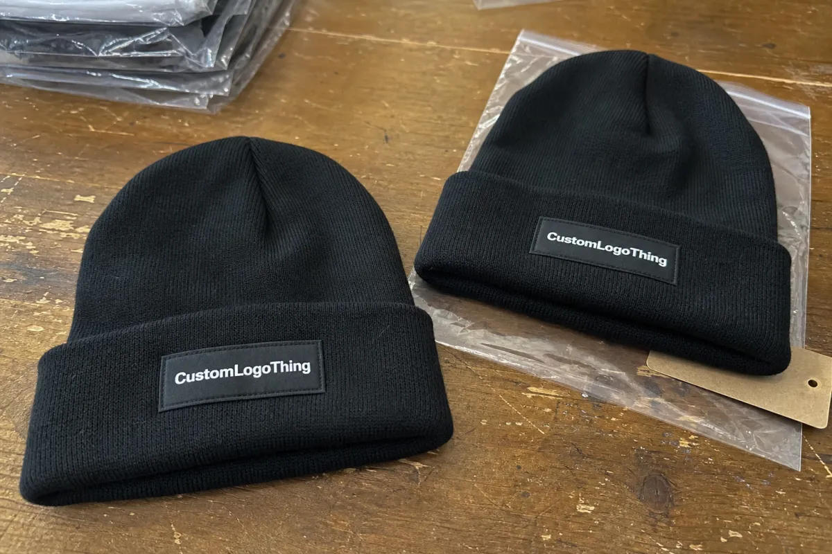
The three placements that come up most often are the front cuff, the higher crown area, and the side panel. Each one gives a different result. Front cuff branding is the classic answer because it is easy to read, easy to quote, and easy to repeat across a line. Higher crown placement feels more fashion-forward, especially on slouch styles. Side placement pulls the logo back a little and works well for brands that want the hat to feel quieter.
Cuffed beanies generally perform best with front-center branding. The fold gives the patch a clear visual stage and helps the logo stay visible once the hat is worn. Slouch beanies can tolerate a higher or slightly offset patch because the extra fabric softens the geometry. Fisherman beanies are less forgiving. Their lower profile means a large patch can crowd the face, flatten the shape, or make the hat feel too busy.
Centered placement and off-center placement serve different goals. Centered usually reads more traditional and more reliable for recognition. A slight offset can look deliberate if the creative direction is more editorial, but it should never look like the factory guessed at the fold. Buyers notice that quickly, even if they cannot explain why it feels wrong.
Patch size matters as much as location. A 2.25-inch woven patch on a slim cuff can feel clean and restrained. Push the same logo to 3 inches on a shallow beanie and the garment may start to feel heavy. Woven patches tend to preserve fine text better than embroidery. Embroidered patches bring more dimensional texture. PVC gives strong edges and strong contrast, but it also creates a more industrial look, which is not right for every line.
| Placement zone | Visual effect | Best use case | Relative cost impact |
|---|---|---|---|
| Front cuff | Most visible, classic, easy to merchandise | Uniforms, giveaways, core retail styles | Usually lowest to moderate |
| Higher crown | More fashion-led, softer brand presence | Slouch beanies, streetwear programs | Moderate, sometimes higher setup care |
| Side panel | Subtle, clean, less logo-forward | Minimalist collections, premium drops | Can rise if placement tolerances tighten |
That table hides an important point: the best placement is the one that fits the product’s job. If the hat is supposed to be seen from across a room, front cuff usually wins. If the goal is a refined retail piece that feels more garment than advertisement, a side patch or higher crown placement may be a better fit because it respects the shape instead of fighting it.
Brands building multiple beanie styles should also think in systems. A placement spec that looks clean on a folded cuff may not translate cleanly to a taller slouch profile. That is why a good Logo Patch Beanies logo placement guide treats silhouette and branding as a single decision, not two separate ones.
What drives cost, pricing, MOQ, and unit cost
Placement changes pricing in more ways than most buyers expect. The patch itself has a cost, but placement also affects labor time, setup complexity, proofing, and how many samples are needed before bulk production can begin. A simple front-cuff application on stock beanies is usually the cleanest route to a lower unit price. Add multiple locations, tighter tolerances, or specialty materials, and the quote climbs.
For many programs, a woven or embroidered patch on a standard acrylic beanie can add roughly $0.45-$1.25 per unit, depending on quantity, patch size, and application method. Lower quantities sit higher because setup gets spread across fewer pieces. Around 1,000 to 2,500 units, the per-unit math tends to improve. At 100 to 300 pieces, almost everything looks more expensive because the factory still has to do the same artwork checks, sampling, and machine setup.
MOQ and placement are tied together more tightly than buyers sometimes realize. A single patch in one position is straightforward. A second placement, a side mark, or a two-piece brand system can add enough labor and proofing to change the quote materially. That does not always double the cost, but it often changes the economics enough to matter.
Material choice matters as well:
- Woven patches are usually the best fit for small text, crisp borders, and a flatter retail finish.
- Embroidered patches bring more texture and usually read slightly bolder, especially on thicker knit caps.
- PVC patches are durable and sharply defined, though they shift the look toward utility or streetwear.
- Heat-seal application can speed some programs, but knit compatibility needs to be checked carefully.
- Sew-on application remains the most common choice because it is durable, but it adds machine time.
Ask what the quote actually includes. Some suppliers price the beanie blank separately from decoration. Others bundle patch creation, application, and packaging into one line. A quote can look cheaper until revision fees, extra samples, or a placement correction appear later. That is where a low initial number becomes a more expensive order than expected.
There is a familiar packaging lesson here. Artwork cost is not the same as finished-pack cost. The same logic applies to beanies: design is only one input. Material, placement, application method, and pack-out all feed the final number. If the project includes retail sleeves or insert cards, it may also be worth checking paper options with FSC certification at FSC. If transit protection matters, ISTA is a useful benchmark for thinking about how the outer pack will hold up before the product reaches the shelf.
Production steps and timeline from art proof to shipped order
Most beanie programs move through the same sequence: artwork review, patch creation, placement proofing, sample approval, bulk application, and final packing. The path is familiar. The delays usually come from the gaps between steps. Missing vector art slows cleanup. Unclear placement stalls sampling. A late change to color or border width can force another proof even if the logo itself stays the same.
Typical lead times vary, but a realistic window for a custom patch beanie run is often 12-20 business days after final approval if the blanks are in stock and the artwork is ready. If the beanie style has to be sourced first, or if the patch needs extra revisions, the schedule stretches. That is not unusual. What causes trouble is pretending the extra time is optional.
The fastest projects usually share three traits: final vector art, one approved placement direction, and a clearly stated patch size. A buyer who says, “Front cuff first, but keep the option to shift slightly if the fold changes the read,” gives the production team room to work. A buyer who keeps changing from centered to side placement after samples are made creates avoidable churn.
A useful Logo Patch Beanies logo placement guide does more than say where the patch should sit. It explains how to measure it. Good specs reference the brim edge, cuff seam, centerline, or side seam so the application can be repeated across the order. If the factory is left to estimate, bulk pieces can drift by a few millimeters. On soft knit goods, a few millimeters is enough to be visible.
Sample approval is where most placement mistakes are caught. A sample reveals whether the patch size, border width, and logo position work together on the actual beanie. If the patch looks too high, too low, or too wide, that needs to be fixed before the run starts. Correcting 50 samples is annoying. Correcting 5,000 units is a lesson nobody wants to repeat.
Packing should be discussed alongside decoration, not after it. Bulk-packed beanies can save space, but compressed cartons may leave fold marks that matter in premium retail programs. Individual bags or header cards add time and material cost. That tradeoff should be part of the first quote, not a late surprise after approval.
Common placement mistakes that make beanies look off
The most common mistake is placing the patch too close to the cuff seam. It looks harmless on paper. Once the cuff folds and the knit relaxes, the logo can tilt visually or get partially hidden. The beanie is still wearable, but the brand read loses clarity.
Oversizing is next on the list. Bigger is not automatically stronger. A patch that overwhelms the knit texture can make a beanie feel stiff and less premium, especially on softer acrylic yarns or looser gauges. The logo should sit on the hat, not compete with the hat.
Another weak point is approving placement on a flat mockup only. A flat image can hide the reality of a deeper cuff, a stretchier knit, or a slouchier fit. The same centered patch can look low, high, or slightly off once it is on the actual blank. A Logo Patch Beanies logo placement guide needs to be checked against the exact beanie style, not a generic cap outline.
Inconsistency across colorways creates a separate problem. If black beanies have a centered patch and heather gray beanies sit a few millimeters lower, the line starts to feel accidental. Customers may not know why something looks off, but they feel it. Consistency is one of the clearest signals of quality.
Logo detail is easy to overlook too. Thin type, open counters, and tiny icon elements can disappear if the patch border is too thick or the knit is too coarse. The patch may be attached in the correct place and still fail its main job: readability. That is why logo simplicity matters more on knit goods than it does on a flat screen.
Buyers often ask for a “safe” placement. Safe usually means a position that protects both comfort and legibility. That tends to be front cuff for classic styles, a restrained higher placement for fashion-led slouch beanies, and a narrow side patch for minimalist looks. Safe is not dull. Safe just reduces surprises.
Expert tips for patch size, visibility, and approval checks
Start with viewing distance. A patch that looks sharp at arm’s length may blur into the knit from six feet away. If the beanies will be worn by staff, fans, or customers who see them across a room, test the logo at that distance. It catches more problems than people expect.
Use the exact blank for placement approval. Knit gauge, cuff height, crown depth, and yarn weight all influence where the visual center lands. Two black acrylic beanies can behave differently if one has a denser knit and a taller fold. The rule is simple: do not approve placement from a generic template if the actual style is already known.
Ask for a placement spec that records measurements from the brim, cuff seam, centerline, or side seam. Documentation sounds tedious until you need a reorder to match the first run. Then it becomes the only thing that keeps the second batch from drifting.
A practical approval checklist should cover a few basics:
- Logo legibility at a few feet, not just on screen.
- Patch orientation relative to the knit and cuff fold.
- Edge clearance so the patch does not crowd seams or borders.
- Size consistency across every planned colorway.
- Material feel so the patch does not make the hat stiff or scratchy.
Language matters during production handoff. Instead of saying “center it,” say something like, “Place the patch one inch above the top edge of the folded cuff, centered on the front seam.” That is clearer, easier to manufacture, and far less likely to drift during sampling. A good logo patch beanies logo placement guide acts as a translation tool between design intent and factory action.
Choosing between woven and embroidered patches usually comes down to the logo itself. Fine lines, small text, and tiny registered marks generally favor woven construction. Bold icons and thicker lettering can carry embroidery better. PVC can work for utility-inspired or streetwear pieces, but the brand has to want that visual language. It changes the feel quickly.
Next steps: build a placement brief before you request quotes
The fastest way to get accurate pricing is to send better inputs. Before requesting quotes, gather the beanie style, patch type, logo file, target quantity, colorway count, and preferred placement zone. That sounds basic, but the difference in quote quality is substantial. A supplier can price a front-cuff woven patch much faster than a vague request to “decorate our beanies.”
Give the factory one primary placement and one backup option. That lets them quote a realistic path without pausing every time a small style detail needs adjustment. It also helps if the first sample shows that a slight shift improves the read. The project keeps moving instead of restarting.
Compare quotes on more than the unit price. Check whether sampling is included, how many revisions are allowed, whether artwork cleanup is covered, and what happens if placement needs a second round of proofing. The cheapest line item is not always the cheapest order. A clearer scope usually saves more than a short-term discount.
Use the logo patch beanies logo placement guide as a working brief, not a slogan. The best placement balances visibility, comfort, cost, and repeatable production. Get those four things aligned, and the beanie is far more likely to look intentional from the first sample through the final carton.
Where is the best place for a logo patch on a beanie?
Front cuff placement is the most recognizable option for most brands because it reads quickly and works well on folded knit styles. Side placement is better if the goal is a quieter, more fashion-led look. The best choice depends on beanie silhouette, patch size, and how far away the logo needs to be seen.
Does logo placement affect beanie pricing?
Yes. Placement can change patch size, labor time, and the number of setup steps needed before production starts. Multi-location branding or specialty patch materials usually increase cost. A simple single-placement layout is usually the easiest path to a cleaner unit price.
How long does logo patch beanies production usually take?
Lead time depends on patch type, sample approval speed, and whether the blank beanies are already in stock. Proof revisions can add days before production starts. The fastest orders are the ones with final artwork and placement approval ready upfront.
What patch size works best on cuffed beanies?
The patch should stay large enough to read clearly but small enough to respect the knit texture. A balanced size usually leaves visible border space so the logo does not feel cramped. The exact size depends on cuff height and whether the beanie has a folded or slouch fit.
Can the same logo placement work on different beanie styles?
Sometimes, but cuffed, slouch, and fisherman beanies do not sit the same way on the head. A placement that is centered on one style may look low or off-balance on another. It is better to test placement by style instead of assuming one spec will fit every blank.


