A wine club shipment can look polished online and still land badly in a customer’s hands: a muddy gray bag, a barcode that refuses to scan, a logo printed too close to the seal, or a burgundy mark that turns into dull brown on matte film. That is the sort of problem a Matte Poly Mailers artwork proof Checklist for Wine Shops is meant to prevent. The proof is the last controlled review before production starts, and it is far cheaper to catch a mistake on a PDF than on cartons of finished mailers.
For a wine shop, proofing is not paperwork for its own sake. It protects the way club shipments, gift orders, tasting kits, and branded accessories feel when they arrive. It also keeps practical details from failing quietly: addresses, QR codes, return information, seasonal offers, and print orientation. If you are still comparing formats, review broader Custom Packaging Products first, then narrow the decision to Custom Poly Mailers once the use case, contents, and protection requirements are clear.
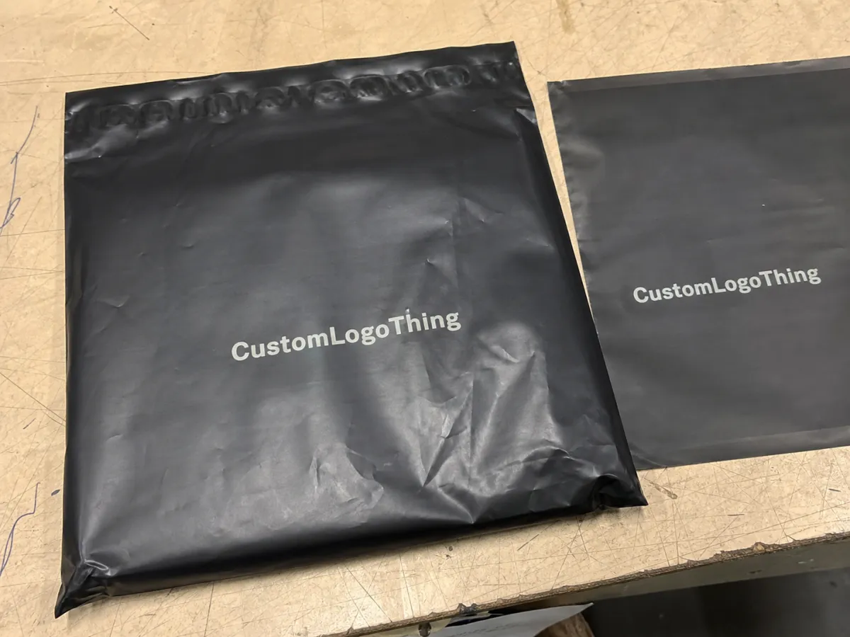
Matte Poly Mailers Artwork Proof Checklist for Wine Shops: What It Prevents
An artwork proof is the digital or physical confirmation of how the finished mailer should print. It should show the bag size, front and back artwork, logo placement, live print area, bleed, seal direction, barcode location, copy, colors, and any production notes that affect the final run. If the proof is vague, the order is vague.
Wine shops need a more careful review than a generic ecommerce brand because their packaging often carries more emotional weight. A matte mailer might hold tasting notes, club paperwork, branded apparel, a corkscrew, a gift card, or small accessories tied to a shipment. Even when the bag is technically outer packaging, customers read it as part of the wine experience. A crisp matte finish can feel restrained and premium; a poorly checked proof can make that same material look cheap.
There is also an important boundary. Matte Poly Mailers are useful for branded outer packaging, soft goods, inserts, documents, tasting kits, small non-fragile accessories, and secondary packaging around items that already have proper protection. They are not wine bottle shippers. They do not replace molded pulp, corrugated dividers, foam inserts, approved bottle protection, or carrier-compliant alcohol shipping materials. A beautiful mailer wrapped around glass without real protection is still the wrong package.
Approve the proof as if you are the person who will answer the customer complaint when the bags arrive. That usually sharpens the review.
A strong proof checklist protects three things at the same time: presentation, readability, and production reality. Presentation covers the brand mark, color balance, and overall impression. Readability covers the text, codes, addresses, and legally or operationally useful information. Production reality covers film type, ink limits, movement tolerance, seal zones, and the small distortions that can happen on flexible material. Ignore any one of those and the finished mailer can look right in a mockup but wrong in use.
How Artwork Proofing Works Before Matte Mailers Go to Print
The usual flow is simple on paper. You submit artwork and specifications. Prepress checks the file quality. A digital proof or dieline proof is prepared. You review, request changes if needed, and provide written approval. Production begins after approval, not after a casual “looks good” in a thread nobody can find later.
A digital proof is best for layout, copy, barcode position, logo size, and general print placement. A dieline proof shows the bag structure: folds, flap, lip, seal strip, live print area, and areas where ink should not run. A physical sample helps with material feel, opacity, finish, and color behavior on actual film. Physical samples cost more and take longer, but they are valuable when the order is large, the color is sensitive, or the shop has not used matte film before.
| Proof Type | Best For | Typical Turnaround | Typical Cost Impact |
|---|---|---|---|
| Digital proof | Layout, copy, barcode placement, logo position | 1-3 business days | Usually lowest |
| Dieline proof | Size, folds, seal zone, print boundaries | 1-3 business days | Low to moderate |
| Physical sample | Color feel, matte finish, opacity, texture | Several days or longer, depending on stock and method | Higher, plus freight |
Matte poly film does not behave like coated paper. Fine rules can soften, tiny serif text can lose definition, and low-contrast tones can flatten. A matte surface diffuses light, which is part of its appeal, but that same softened reflection can make subtle art harder to read. Burgundy, charcoal, cream, olive, and warm gray can all look refined in a brand deck, then lose separation on film if the contrast is too quiet.
Color references help, but they are not guarantees. PMS numbers, CMYK values, and previous print samples give the production team a target. The final color still depends on film color, ink system, opacity, curing, coating, and whether a white underbase is used. If your brand color must be unusually precise, do not treat a standard PDF proof as the final authority. Ask what level of color matching is available and whether a press proof or material sample is realistic for the schedule and budget.
Proof approval is typically treated as production release. Once the signed proof moves forward, the printer will follow the approved file. If the logo is too small, the wrong QR code is embedded, or the opening direction conflicts with the artwork, the finished bags may still match the proof exactly. That is why the review has to be slower than a glance at a phone screen.
Key Proof Details Wine Shops Should Check Before Approval
Start with the bag itself. Confirm width, height, flap, lip, seal strip, gauge or thickness, matte finish, color, and usable interior space. A wine shop mailer may need to hold tasting notes, invoices, club cards, gift tissue, apparel, insulated pouches, or small accessories without stressing the adhesive strip. If the fit is tight during packing, it will only feel worse during a busy club drop.
Next, check the artwork orientation. The front panel should read correctly when the customer receives and opens the mailer. Confirm whether the artwork is centered, offset intentionally, or aligned to a specific edge. Look closely at safe margins around seals and folds. A mark placed too near the edge may look dramatic on the proof and uneven in production because flexible film can shift.
Copy needs its own pass, separate from the design review. Verify the shop name, legal name if used, return address, phone number, website, social handles, tasting room hours, wine club tier names, and promotional language. Seasonal copy deserves extra suspicion. An expired event date or old discount code printed on 10,000 bags will not become charming with time.
Barcodes and QR codes should be large enough to scan, isolated from visual clutter, and placed away from folds, seals, gussets, and heavy texture. Leave quiet space around them. Test the exact QR code from the final proof, not an earlier draft. If a code leads to a club landing page, event registration, compliance notice, or gift message, confirm the destination on both desktop and mobile before approval.
Color and contrast matter more on matte mailers than many buyers expect. Cream on tan, charcoal on black, muted burgundy on kraft-look film, and gold ink without enough density can be difficult to read. Use strong contrast for information customers need to act on. Save the more restrained palette for background fields, decorative marks, or brand atmosphere.
The production notes are just as important as the artwork:
- Ink count: one-color, two-color, or fuller coverage changes price, setup, and visual density.
- White underbase: often needed when bright or accurate color prints on dark or translucent film.
- Print sides: confirm front-only, back-only, or both sides, including any inside/outside assumptions.
- Material specs: thickness, opacity, recycled content, matte texture, and film color should match the quote.
- Seal direction: the opening edge affects packing speed, customer handling, and artwork orientation.
If recycled content, compostability, certification, or chain-of-custody language appears on the bag, ask for documentation before it prints. Marketing claims printed on packaging need to match the material actually being purchased. For general reference on responsible sourcing and transport testing concepts, the standards pages at FSC and ISTA are useful starting points, although poly mailer film specifications will depend on the actual supplier and material.
Process and Timeline: From File Upload to Approved Proof
A clean file review often takes 1 to 3 business days. A first proof commonly takes another 1 to 3 business days once usable artwork and specs are in hand. Each revision round may add 1 to 2 business days, especially if the change affects size, ink count, color, dieline position, or copy that multiple people must approve.
The delays are predictable. Missing vector logos. Low-resolution PNGs. No PMS targets. An unclear bag size. Copy pasted from an old campaign. A purchase order that says one color while the proof shows two. Three approvers sending separate notes because nobody has been named final decision-maker. The timeline rarely breaks because proofing is mysterious; it breaks because the handoff is incomplete.
A clean handoff should include:
- Vector logo files in AI, EPS, or editable PDF format
- PMS or CMYK color targets, plus any prior printed sample if color continuity matters
- Correct bag size, film thickness, matte finish, and mailer color
- Print location, print sides, and orientation notes
- Order quantity, shipping destination, and freight deadline
- Exact copy for URLs, addresses, wine club names, promo codes, and legal or handling text
Request a physical sample when the order has meaningful risk: a first-time matte mailer, a premium club launch, a large run, a new brand system, dark film with light art, or any design where color and opacity are central to the look. If a full printed sample is too slow, ask whether a blank stock sample of the same matte material can be reviewed while the digital proof is being corrected. It will not solve color matching, but it will show feel, opacity, and stiffness.
Production time begins after written approval. Custom Matte Poly Mailers may need additional time for material allocation, plate or cylinder setup depending on print method, press scheduling, drying or curing, converting, packing, and freight. Rush schedules are possible in some cases, but they tend to narrow your options and leave less room for careful proofing.
Wine shops planning club shipments, holiday gifting, spring releases, or tasting-room events should build the mailer schedule backward from the date bags need to be packed, not the date customers receive the wine. The packing team needs inventory in hand before fulfillment starts. A proof approved late on a Friday does not erase production lead time.
Cost, MOQ, and Pricing Factors Hidden Inside the Proof
The proof is also a pricing document. It confirms the choices that drive the quote: bag dimensions, film thickness, material color, matte finish, print colors, print coverage, one-sided or two-sided printing, quantity, and special requirements. Change those choices and the cost changes with them.
Minimum order quantities work like most custom packaging. Higher quantities spread setup and prepress costs across more units, lowering the per-piece price. Smaller runs protect cash flow and allow artwork to change sooner, but the unit cost is higher. Larger runs are efficient, yet they can trap a shop with seasonal art, outdated messaging, or a club name that changes six months later.
For wine shops, evergreen artwork is usually safer for the mailer itself. A clean brand mark, web address, simple club message, or reusable pattern can support many shipments. Seasonal energy can come from stickers, tissue, inserts, bottle tags, or promo cards. Those pieces are easier to change than a full run of custom mailers.
| Run Size | Typical Use | Per-Unit Cost Trend | Best Fit |
|---|---|---|---|
| 1,000-2,500 | Launches, tests, short campaigns | Highest | New programs, small clubs, limited promotions |
| 5,000-10,000 | Core reorder range | Moderate | Wine shops with steady fulfillment volume |
| 20,000+ | High-volume programs | Lowest | Stable packaging systems with repeat artwork |
As a rough buying range, a simple custom matte poly mailer might land around $0.20-$0.35 per unit at a 5,000-piece run. Heavier coverage, two-sided printing, thicker film, dark stock with a white underbase, or special handling can push the range closer to $0.35-$0.60 per unit before freight. These are practical planning numbers, not a fixed price sheet. Resin markets, order timing, print method, freight, and artwork complexity all move the final quote.
Setup charges deserve attention. New artwork, new dimensions, new print colors, and new tooling or plates can add upfront cost. Exact reorders tend to be friendlier because files, specifications, and production notes already exist. If a proof changes from front-only to front-and-back print, or from one color to two, the revised quote should reflect that. If it does not, ask for clarification before approval.
Freight can also surprise buyers. Poly mailers are light compared with rigid packaging, but cartons still take space, and expedited shipping can erase the savings from a tight quote. Confirm packed carton counts, destination, delivery window, and whether the order ships to one location or multiple fulfillment points.
The practical buying strategy is simple: put stable brand elements on the mailer, keep short-term campaign language off the bag when possible, and archive every approved specification. That keeps the matte Poly Mailers Artwork Proof Checklist for wine shops tied to budget, not just appearance.
Common Artwork Proof Mistakes That Make Wine Packaging Look Cheap
The most common mistake is approving for mood instead of detail. Mood is not a specification. It will not catch a wrong phone number, a crooked back-panel mark, or a QR code sitting too close to a seal. A proof should be reviewed as a production document, not as a design inspiration board.
File quality problems show up quickly. Screenshots, flattened exports, low-resolution JPEGs, missing fonts, unoutlined text, RGB files, and logos pulled from a website header all create risk. A logo that looks acceptable at two inches on a screen may break down badly when printed across a larger mailer panel.
Contrast failures are especially visible on matte film because the finish softens reflected light. A muted luxury palette can work beautifully, but only when the elements have enough separation. Dark burgundy on black, warm gray on cream, or tan on kraft-look film may look refined in a mockup and nearly invisible in a stockroom.
Scale causes another set of problems. Artwork that feels balanced on a laptop can look undersized on a large mailer or crowded on a small one. Ask for actual dimensions on the proof and compare them against the finished bag size. If possible, print the proof at 100% scale and place the items nearby so the team can judge proportion with real objects, not imagination.
Barcode and QR placement mistakes are avoidable and expensive. Keep codes away from folds, seals, gussets, curved areas, and heavy ink coverage. Give them quiet space. Test them from the final proof and confirm the destination. A code that looks attractive but does not scan is just decorative noise.
Copy errors weaken trust quickly. Old tasting room addresses, retired club names, expired promo codes, inconsistent capitalization, misspelled varietals, and missing accents in producer or winery names all signal carelessness. Customers may not know how packaging is printed, but they recognize sloppy details.
Approval chaos is the quiet killer: verbal sign-off, no final approver, conflicting notes from different departments, or checking the proof against memory instead of the purchase order. Packaging rewards clear ownership. One person should collect comments, reconcile them, and send the final revision notes in writing.
Expert Tips for Better Matte Poly Mailer Proofs
Print the proof at actual size whenever possible. Screens compress the sense of scale and hide weak contrast. A full-size printout makes tiny text, cramped QR codes, overfilled layouts, and awkward logo placement easier to spot. It does not reproduce matte film, but it does expose proportion problems.
Use a grayscale check. If the design still reads without color, the structure is probably strong enough. If everything melts together, the art depends too much on tint and not enough on hierarchy. That is risky on any matte surface, and it is especially risky with subtle wine-brand palettes.
Keep a short approval grid beside the proof:
- Size, thickness, material color, and matte finish
- Front and back artwork orientation
- Ink count, color callouts, and underbase requirements
- Text, URLs, addresses, and club names
- Barcode and QR code size, quiet space, and function
- Seal direction, flap position, and live print area
- Quantity, carton destination, deadline, and final approver
Ask where movement or distortion can happen during production. Flexible film is not a rigid poster. Some registration tolerance is normal, and good artwork leaves safe margins for that reality. Designs that depend on perfect edge-to-edge alignment, hairline borders, or tiny reverse text near the seal are asking for trouble.
Simplify before the mailer gets crowded. A detailed wine label illustration does not always belong on a flexible bag at the same level of detail. Often the stronger result is a clean brand mark, one useful message, and enough breathing room for the matte finish to do its job.
Matte mailers tend to look best with restrained coverage, confident contrast, and one memorable brand cue. They rarely improve when loaded with every badge, seal, handle, slogan, and tasting note the shop can find. The mailer should support the brand system, not try to become the whole shelf talker.
Archive the final approved PDF, approval date, order quantity, bag dimensions, film thickness, matte material, PMS or CMYK callouts, supplier notes, and any sample photos in one place. Reorders move faster when the specification is not scattered across old emails. Boring recordkeeping prevents expensive reprints, and in packaging, boring often wins.
Next Steps Before You Approve, Reorder, or Request Changes
Before approval, gather the quote, proof, artwork files, purchase order, previous sample if this is a reorder, and any internal copy document. Compare the proof line by line against the order: bag size, film thickness, matte finish, print sides, ink count, quantity, ship-to address, and deadline. If one detail drifts, the job may no longer match the price or the intended use.
Name one final approver inside the wine shop. Not the whole staff, not a group chat, and not whoever happens to answer first. One owner keeps decisions consistent and prevents the supplier from receiving six urgent messages that contradict one another.
If changes are needed, send one clean note with numbered revisions, screenshots if helpful, and exact replacement wording. Do not drip-feed edits over several hours unless the schedule can absorb the delay. Each revision should make the proof cleaner, not create a new round of interpretation.
Only approve when the fit, artwork, color callouts, copy, barcode function, and production specs are confirmed in writing. Do not approve a blurry proof. Do not approve placeholder color. Do not approve the wrong orientation because everyone is tired of looking at it. That is how reprints are born.
A careful matte poly mailers Artwork Proof Checklist for wine shops is not overkill for a premium club shipment or branded retail program. It is basic risk control. It protects the look of the package, the schedule behind the shipment, and the money already committed before ink ever touches film.
What should a wine shop check first on a matte poly mailer artwork proof?
Check the bag size, artwork orientation, logo placement, seal direction, and print sides first because those mistakes are expensive to fix after approval. Then review copy, QR codes, barcodes, URLs, addresses, club names, and promo language against the original order. Finish with material specs such as matte finish, film thickness, opacity, color, quantity, and shipping destination.
Do wine shops need a physical proof for custom matte poly mailers?
Not always. A physical proof is most useful for first orders, premium club packaging, color-sensitive branding, dark films, or large-volume runs. Digital proofs are usually enough for layout approval, but they do not show matte texture, film opacity, stiffness, or real ink behavior as well. If timing is tight, ask whether a stock matte material sample can be reviewed while the digital proof is finalized.
How long does the artwork proof process take for matte poly mailers?
A clean file can often move to a first proof in a few business days. Missing specs, low-quality artwork, copy changes, or multiple approvers can add revision rounds, and each round may add 1 to 2 business days. Wine shops planning club shipments, events, or holiday gifting should build in buffer rather than approving packaging the week orders need to leave.
Can matte poly mailers be used to ship wine bottles?
Matte Poly Mailers are not protective bottle shippers by themselves and should not replace molded pulp, foam, corrugated inserts, or other approved wine bottle protection. They work well for branded outer packaging, paperwork, apparel, small accessories, gift items, tasting kits, and secondary packaging around protected contents. If bottles are involved, confirm carrier rules, breakage protection, and alcohol shipping requirements before choosing the mailer format.
What artwork files are best for a matte poly mailers proof checklist for wine shops?
Vector files such as AI, EPS, or editable PDF are best because logos, text, and linework stay clean at production size. Provide PMS or CMYK color targets, outlined fonts, linked images if needed, and the correct dieline or bag dimensions. Avoid screenshots, tiny JPEGs, website logos, and flattened files with unreadable small text unless you are prepared to pay for avoidable prepress cleanup.


