The phrase event merch Heavyweight Winter Hats logo placement sounds narrow until a finished hat lands in real use. A logo that looks balanced in a flat mockup can shrink on a cuff, bend around knit ribs, or disappear once the hat stretches on a head. Thick yarn changes the visible area, and the fold changes it again.
That is why winter headwear needs a tighter approval process than a shirt or tote. The goal is not just to decorate a hat. The goal is to make the brand readable on a textured, flexible item that gets worn outdoors, photographed at a distance, and often handed out with no second chance. If placement is off, the order still ships; it just does not work as merch.
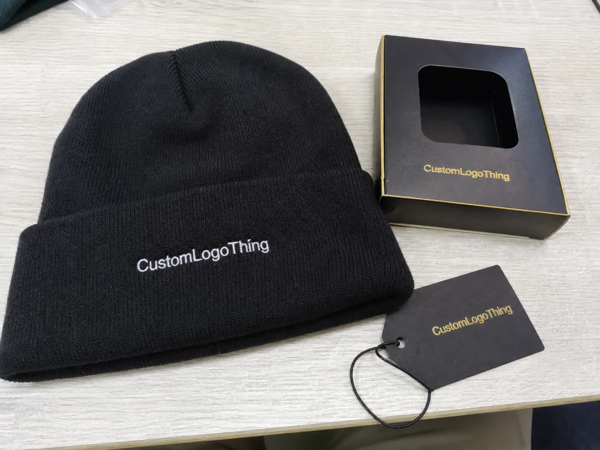
Event merch heavyweight winter hats logo placement: why size matters
The first mistake buyers make is underestimating how much a chunky cuff changes the visible field. A 1.5-inch logo can look fine on screen and nearly vanish on a thick rib knit beanie. Once the cuff folds, the usable window is often smaller than expected. People do not inspect these hats at arm's length; they see them in crowds, in photos, or across a registration table.
Centered front placement is usually the safest choice. It is easy to read, easy to produce, and easy to approve. Side placement can look quieter and more premium, but it usually needs a stronger mark to hold attention. If the logo is tiny or highly detailed, front and center is still the better bet. For staff apparel, subtle branding can work. For giveaways, bolder usually wins.
The real question is not front or side. It is how much visual distance the logo needs to cover. A mark for staff identification can be smaller. A mark that needs to show up in event photos needs more width, more contrast, and less detail. The same art can feel perfect on one hat and weak on another because the use case changes the size requirement.
If the logo looks tiny in the proof, it usually looks even smaller on the finished hat. Knit does not reward optimism.
Judge placement on the worn cuff area, not the flat mockup. A flat art file does not show how the cuff height changes once the beanie is stretched and worn. On the table, the logo may look centered. On a head, it may sit lower than intended or drift toward a seam. Good buyers review the visible field after folding, because that is what people actually see.
How logo placement behaves on thick knit beanies
Heavyweight knit beanies are less forgiving than lighter styles. The texture is denser, the yarn is thicker, and the cuff often has a deeper fold. That is great for warmth and perceived value, but it is less friendly to fine detail. Thin strokes, small counters, and compact lettering can get swallowed by the fabric.
Center-front cuff placement works because the cuff gives decoration a flatter, more stable surface. It also gives the eye a natural landing point. Side placement can feel more fashion-led, but the mark usually needs to be larger than buyers expect. Low placement near the cuff edge can look sharp in a mockup and awkward on the actual hat if the fold lands unevenly.
The decoration method changes what is realistic. Embroidery is durable and familiar, but it has limits. Woven patches preserve more detail. Leather patches add texture and a premium cue, though they favor bold art over delicate marks. Printed labels and small woven tabs are useful for secondary branding, but they rarely carry the main event message by themselves.
- Embroidery is best for simple logos, short words, and repeat use.
- Woven patches hold cleaner edges and finer detail.
- Leather patches suit bold, minimal graphics and a premium finish.
- Woven labels work for small brand marks, not primary messaging.
Embroidery is not automatically the right answer just because it is familiar. Thick knit can make small text fuzzy and thin lines break apart. A patch may cost a little more, but it can preserve legibility and make the hat feel more retail-ready. For Event Merch Heavyweight Winter Hats logo placement, that tradeoff is often worth it.
Style matters too. Embroidery reads classic and practical. A patch reads more deliberate. Leather can feel premium if the rest of the hat supports that cue. The right call depends on who is wearing the hats, how far away the logo needs to be read, and whether the hat should feel like staff gear or a keepsake.
Cost, pricing, MOQ, and unit cost drivers
Pricing for custom winter hats usually follows a simple pattern: quantity first, decoration complexity second, and speed third. A straightforward embroidered cuff logo on a standard acrylic beanie often falls around $2.25 to $4.50 per unit at common event quantities, usually in the 100 to 500 piece range. Smaller orders cost more per hat because setup is spread across fewer units. Larger orders usually price down quickly once production is running.
Those numbers are a starting point, not a promise. Yarn weight, cuff depth, base hat quality, and decorated area size can move the quote more than buyers expect. A heavier body costs more, and a cleaner logo treatment may require a different method. A supplier quoting very low on a thick knit hat may be assuming a smaller decoration area, a simpler thread count, or a lower-grade body.
| Option | Typical unit range | Best for | Tradeoff |
|---|---|---|---|
| Simple embroidery on cuff | $2.25-$4.50 | Fast event merch, clean logos | Fine detail can get lost |
| Woven patch | $2.80-$5.75 | Sharper detail, retail feel | Setup and sew-on labor add cost |
| Leather patch | $3.20-$6.50 | Premium look, bold branding | Not ideal for tiny text |
| Multi-location decoration | $4.25-$8.00+ | Staff merch, high-visibility promos | Extra locations and thread colors raise price quickly |
The hidden costs are where budgets drift. Digitizing often runs about $25-$75 for a simple logo, and more if art needs cleanup. Rush timing can add $0.50-$3.00 per piece, depending on job size and queue. Metallic thread, back decoration, sewn-on patches, and custom finishing can also move the quote. Sample production may have its own fee, especially if the placement needs a real-world check before the main run starts.
Comparing quotes only by unit price is how buyers end up with mismatched orders. A lower sticker price may exclude digitizing, packing, fold style, or freight. A higher quote can be the better value if it bundles the sample, proofing, and shipping into one clear number. Ask what is included before comparing suppliers.
If the hats go into a premium kit, ask about packaging early. Individual polybags, folded tissue, hang tags, or inserts all add labor and material. They also affect carton size and freight cost. For distributed event orders, packaging deserves the same attention as the hat itself because it is what keeps the product looking fresh at the venue or pickup point.
Process and timeline: from proof to shipment
The fastest way to slow a hat order is to send weak artwork and hope the supplier can fix the rest. Start with a vector file. Identify the exact placement. State the target width. If the logo must stay clear of a seam or sit a specific distance from the cuff edge, say that early. For event merch Heavyweight Winter Hats logo placement, a precise brief saves time later.
A typical workflow looks like this: art cleanup, digital proof, placement approval, production, then shipment. For simple designs with stock bodies available, turnaround often lands around 2 to 4 weeks after proof approval. More complex work can take longer, especially during peak cold-weather season. If a supplier says a complicated order can still ship instantly, that deserves a second look.
Samples can be worth the delay. Not every order needs one, but a preproduction sample is valuable when the logo is small, the brand is strict about appearance, or the hat body is expensive enough to justify a checkpoint. A sample can add 3 to 7 business days, depending on decoration method and stock availability.
Rush orders exist, but they usually cost more and still depend on clean artwork. Missing vector files, vague placement instructions, and last-minute color changes are what really break the timeline. If the order includes printed packaging or inserts, ask for those details at the same time. FSC-certified paper is a useful benchmark if the event is trying to make a cleaner material choice, and it is worth checking the standard at FSC.
Step-by-step: spec the hat before you request quotes
Better pricing starts with a better spec sheet. That is less glamorous than sending a logo and asking for a quote, but it prevents most of the confusion that slows custom headwear down. Begin with the hat body: acrylic, acrylic-wool blend, recycled yarn, rib gauge, cuff depth, and color. Those details affect warmth, hand feel, visual density, and usable decoration space.
- Choose the body weight. Heavyweight knit feels more substantial and warmer, but it leaves less room for delicate artwork.
- Measure the live placement area. Use the folded cuff and worn position, not the flat pattern.
- Pick the decoration method. Embroidery, patch, leather, and woven label each behave differently on thick knit.
- Set the quantity and deadline. MOQ, setup, and turnaround all change the quote in a real way.
- Send color targets. Thread colors, Pantone references, or approved palette notes cut down revision time.
The most useful quote request is the least dramatic one. Include the hat body, quantity, logo file, decoration location, target width, deadline, and whether the logo needs to read from the front, side, or back. If the mark must avoid a seam or land above the fold line, say so directly. "Front center on cuff, 2.25 inches wide, keep clear of seam" is much easier to execute than "make it look balanced." Measurements are not subjective.
Specifying the hat before comparing prices also reveals whether the artwork fits the product. If the logo is too intricate for the decoration method, the supplier may need to simplify it, enlarge it, or change the application type. That can alter cost and timing. The result is a better comparison because you are actually pricing the same product across quotes, not three different interpretations of the same idea.
For outdoor staff use, think beyond the logo. A second location can help with role identification or wayfinding. For audience giveaways, one strong front mark usually performs better than multiple tiny marks. For premium bundles, the placement should feel intentional, not crowded.
Common mistakes that make winter hat merch look cheap
The first mistake is making the logo too small. Thick knit creates visual noise, and tiny type gets swallowed fast. The second mistake is placing the mark across a seam, fold, or area that changes shape when worn. The logo may look fine in a photo of the flat hat and then crooked in real use. The third mistake is choosing thread or patch color with too little contrast against the base hat.
Another common problem is forcing the wrong decoration method onto the art. Thin scripts, fine lines, and highly detailed badges do not belong on chunky embroidery. They need simplification or a different application method. That is not a compromise; it is a production reality. Clean art on the right surface usually looks more expensive than overcomplicated art forced into the wrong process.
Skipping the proof is the shortcut that costs the most later. People want to save a day and end up approving a logo that sits too low, too small, or too close to the edge. A proof is the point where placement, size, and decoration method get tested against the actual hat body. For event merch Heavyweight Winter Hats logo placement, proofing is where the order becomes usable or not.
The last mistake is ignoring the event context. A holiday party, a winter athletic event, and a staff uniform order do not want the same visual tone. Some audiences want the logo obvious. Others want it subdued. Some want the hat to feel like a retail piece. Others want something practical and clearly branded. The correct placement follows the use case, not just the logo file.
A good winter hat does not need to shout. It does need to read clearly, sit straight, and survive a real day of wear.
Expert tips and next steps for your order
Keep the logo bold enough to survive texture. Winter hats reward simple geometry, strong contrast, and short words. If the brand mark is complicated, test a simplified version for the hat rather than squeezing the full version into a small cuff space. The same logic applies to long event names. Abbreviations can be the difference between a readable hat and a crowded one.
Order a buffer. A practical overage is usually 10% to 15% beyond attendance, especially if the hats may be handed out to speakers, volunteers, VIPs, or late additions. Reorders are rarely useful on event day. Extra units are cheaper than explaining why the last box ran out one person too soon.
If you are comparing front, side, and back placement, do it on the same mockup scale. The best option is usually the one that balances visibility, cost, and how the hat actually sits on a head. Center-front remains the safest default. Side placement works best for quieter branding. Back placement can help if the goal is visibility from behind, but it should be deliberate rather than decorative afterthought.
The short version is simple: choose the hat body first, measure the worn cuff, match the decoration method to the artwork, and confirm the price at your target MOQ before you finalize the design. That is the path to hats people actually wear, and the best way to keep event merch Heavyweight Winter Hats Logo Placement from becoming an expensive guess.
Where should logo placement go on heavyweight winter hats for events?
Center-front on the cuff is usually the safest placement. It is visible, easy to decorate, and easy to approve. Side placement can work for a quieter look, but the logo often needs to be larger to read well.
Which decoration method is best for event beanies with thick knit?
Embroidery works for simple logos and short text. Woven or leather patches are better when the design needs cleaner detail or a more premium finish. Thin lines and tiny type usually suffer on chunky knit.
How much do heavyweight winter hats with logo placement usually cost?
Simple runs often land in the low single digits per unit at common quantities. Embroidery, patching, extra thread colors, and rush timing can add roughly $1 to $3 per piece or more. Setup, digitizing, sample fees, and freight should be reviewed separately.
What is the turnaround for custom event merch heavyweight winter hats?
Simple orders often move in about 2 to 4 weeks after proof approval. Samples, complex decoration, and peak seasonal demand can extend that schedule. Rush orders usually cost more and still depend on clean artwork.
How many hats should I order for an event merch run?
Order for attendance plus a buffer, usually 10% to 15% extra for staff, VIPs, and replacements. Check the supplier's MOQ before pricing the order, because small runs can become expensive fast.

