Pet Treat Kraft Paper Bags Print Proof Checklist for Buyers
If you are ordering pet snacks for retail, ecommerce, or private label, the pet treat kraft paper bags Print Proof Checklist is where costly mistakes are caught before they become production waste. A barcode placed a few millimeters too low, a logo drifting into the gusset, or legal text that looks readable on a screen but vanishes on natural kraft once the bag is filled can all slip through a casual review. Those are the kinds of problems that lead to reprints, schedule slips, and preventable back-and-forth with the converter.
Pet treat packaging asks more of a proof than a flat label does. The bag has to close correctly, stand or stack well, protect aroma and freshness, and leave enough room for the working parts of the structure: zipper, tear notch, bottom gusset, hang hole, window, seal bands, and sometimes a valve or vent. A proof that only checks color is incomplete. A useful pet treat Kraft Paper Bags print proof checklist checks artwork, structure, and the way the package will behave once it is formed, filled, and packed into cases.
That broader view saves money in a very practical way. A design can look clean in the proof file and still fail in production if the copy falls across a fold, the barcode quiet zone is too tight, or the treat weight makes the panel bow after fill. The real objective is simple: the printed bag has to work on press, on line, in shipping, and on shelf.
What the proof checklist catches before production
The most expensive proof issues are usually not dramatic. They are small shifts: a barcode reduced a touch too much, a legal line that lands inside a seal zone, or a brand mark positioned correctly on a flat dieline but awkwardly centered once the bottom gusset opens. That is why the checklist starts with function, not decoration.
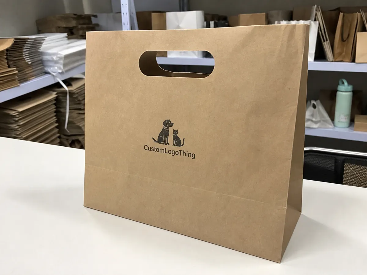
Pet treat Kraft Paper Bags are harder to proof than a simple carton panel because the print zones wrap around real structure. A zipper track steals space at the top. Tear notches can interfere with copy. Side and bottom gussets distort artwork after forming. If the bag includes a clear window, you also have to think about what the shopper will actually see through that opening, not just what looks balanced on the mockup.
The paper itself matters too. Natural kraft has a warmer, more organic look than white board, but that surface changes how ink reads. Pale colors soften, thin lines lose some edge, and small type often needs more weight to stay legible. If the structure uses a laminated layer, foil barrier, or another coating, that should be visible in the proof package, because the final appearance and the sustainability story depend on it. A buyer reviewing kraft paper, post-consumer waste content, or FSC certified fiber needs those details to line up with the actual build, not a marketing description.
“A proof is only useful if it predicts how the finished bag will fill, seal, and read in the real world.”
That is the heart of the checklist. A good proof tells you whether the artwork, the construction, and the performance expectations all agree before the run starts. On launch orders, that kind of confirmation is worth more than a polished file with no structural reality behind it.
How the proof process usually moves
Most proof cycles begin with file intake. The supplier checks the artwork against the dieline, verifies fonts, reviews image resolution, and looks for obvious mismatches between design intent and the structure. That first pass sounds routine, but it is where a lot of time is saved. Missing dieline versions, unoutlined fonts, or a low-resolution product image can add a full revision cycle before anyone sees a visual proof.
After that, the converter typically prepares a digital proof or a prepress mockup. A digital proof is often enough for layout review, especially if the main questions are text placement, barcode location, panel balance, and whether the branding sits correctly around the closure zones. For color-sensitive work, many buyers want a physical proof or ink drawdown on the actual substrate. Kraft stock behaves differently from bright white paper, and a monitor does not show that difference with any accuracy. This is also where digital printing and offset printing decisions start to matter, because the two methods handle saturation, fine detail, and tonal control differently.
Timing depends on how clean the files are and how many things need to be confirmed. A straightforward digital proof can move in 1 to 3 business days. A physical proof often takes 5 to 10 business days, sometimes longer if the structure is custom or the print method needs setup. If a buyer sends several rounds of comments, the calendar stretches fast. The usual causes are not complicated engineering changes; they are missing fonts, unclear finish notes, late color revisions, or a request to change the bag size after the proof has already been built.
That schedule has real business consequences. Proof approval can lock production slots, affect freight bookings, and determine whether a small revision still fits into the current shipping window. If the package is tied to a retail reset, a seasonal launch, or a promotion with a fixed ship date, even a short delay can push the order out of the ideal window.
| Proof option | Best for | Typical timing | Typical cost signal |
|---|---|---|---|
| Digital proof | Layout, text, barcode, and panel placement | 1 to 3 business days | Often lowest or included |
| Ink proof / drawdown | Color expectation on kraft paper | 3 to 7 business days | Moderate proof charge |
| Physical sample bag | Seal behavior, fill look, shelf appearance | 5 to 10 business days | Highest proof cost, strongest risk reduction |
For shipment testing standards, ISTA is useful when the bag needs to survive distribution before it reaches a shelf. For fiber sourcing and chain-of-custody questions tied to packaging claims, FSC is a practical reference.
Artwork, structure, and material details to review
Artwork review is not only about whether the logo looks sharp. On kraft paper, thin strokes can lose edge, and reverse type often needs more contrast than a brand expects from a screen preview. I usually advise buyers to inspect the smallest readable copy on the bag first, not the largest headline. If the ingredients, feeding directions, or regulatory text are only legible at ideal screen zoom, they may be too light for production. Body copy should stay generous, and ultra-thin fonts should be avoided unless the substrate and print method are already proven.
The pet treat kraft paper bags print proof checklist should map every critical element against the dieline: top seal, side seals, bottom gusset, tear notch, zipper area, window, and hang hole if one is present. A design can feel balanced in a flat file and still fail once the bag is formed because the ingredient panel slips into a fold or the barcode lands too close to the seam. Barcode quiet zones matter. So does keeping the code large enough to scan after packing, handling, and case shipment.
Barrier expectations deserve equal attention. Pet treats can be oily, fragrant, or moisture-sensitive, so the package may need grease resistance, odor control, or a stronger moisture barrier. A plain paper structure can work for some dry treats, but not all. If the bag includes a laminate or inner barrier layer, the proof should reflect the actual finish rather than a simplified mockup. A matte kraft look is appealing, yet strong contrast and print density still have to be supported by the selected ink system and substrate surface.
Compliance copy needs line-by-line review. Net weight, ingredient statement, feeding directions, manufacturing country, recycling marks, and claim language all need to be checked against the final file. If the package says “compostable,” “biodegradable packaging,” or “made with recycled materials,” the construction has to support that claim honestly. Mixed-material builds, barrier films, or zipper components can change the end-of-life story. That should be clear before approval, not after the order ships.
For buyers focused on sustainability, a bag made with FSC certified kraft paper or a specified amount of post-consumer waste can fit the brief well. The language still needs to be precise. Claims are strongest when they match the bill of materials, not a broad brand intention. This is one of those spots where careful wording matters more than marketing polish.
There is one more practical check that pays off often: review the filled-bag look, not just the flat proof. A bag that stands neatly on paper may bow, wrinkle, or flare once filled with pellets, chews, or jerky treats. If the package will sit in a retail tray or ship in a corrugated case, confirm how it reads at actual size. Small problems become obvious very quickly once the bag has real product inside it.
That is also where material choices start to affect shelf behavior. A thicker paper face can improve stiffness, but it may change how the fold line behaves. A more aggressive barrier can help aroma retention, but it may add rigidity and cost. Buyers often want the clean look of kraft plus a strong barrier plus a low price. Those three goals do not always line up in one structure, so the proof has to reveal where the tradeoffs are.
Pricing, MOQ, and quote points worth comparing
Price matters, but a useful quote comparison starts with the drivers behind the number. Bag size, paper grade, barrier structure, number of print colors, and proof method do most of the work. A two-color bag on standard kraft paper is a very different build from a full-coverage design with a window, zipper, matte finish, and specialty barrier. If the supplier uses digital printing for short runs, setup may be lower. For larger orders, offset printing or another higher-volume method can be more efficient, depending on the plant and the artwork.
For pet treats, broad pricing ranges often look something like this on custom orders, though the actual quote will shift with size, structure, and print coverage:
- Small MOQ test runs: often about $0.32 to $0.75 per unit.
- Mid-size production orders: often about $0.18 to $0.42 per unit.
- Heavier structures or premium finishes: can move above that range quickly.
MOQ changes the equation because setup cost gets spread across fewer bags. A 3,000-piece order can look expensive next to a 20,000-piece order, even when the bag is identical. If you are managing multiple flavors or seasonal SKUs, ask whether the structure can stay constant while only the printed face changes. That kind of reuse can keep the budget under control without reducing the value of the final package.
There are several other quote items worth comparing closely:
- Proof charges and whether one revision is included.
- Plate or setup fees, especially on longer runs.
- Lead time from approval, not only from quote acceptance.
- Freight terms, including whether the price is EXW, FOB, or delivered.
- Extra cost for windows, zippers, matte finishes, or specialty barriers.
- Cost impact of a color change, copy change, or bag size change.
That last item causes more trouble than many buyers expect. A single extra ink color may trigger a fixed setup charge, and a small structural change can force a new dieline. If you know that before the approval cycle is underway, it is much easier to protect both margin and timing.
There is also the materials question behind the price. Some brands need the look of kraft paper but still require a barrier that protects aroma and shelf life. Others want a more recyclable structure and are willing to accept a shorter shelf window. Neither choice is automatically better. The right answer depends on fat content, shelf life target, distribution distance, and whether the product is headed to specialty retail, club, or direct-to-consumer shipping.
Mistakes that most often trigger reprints
The most common mistake is approving a proof without checking the seal margins. Copy that looks safe on the flat file can end up too close to the heat-seal area after forming. Once that happens, the plant may need to shift the art, rework the proof, or restart setup. That is why the pet treat kraft paper bags print proof checklist should always include the seal zones, not only the front panel.
Another common error is reviewing only on a bright monitor. Kraft paper absorbs ink differently than coated stock, so contrast changes in a way the screen cannot show. Pale tan backgrounds, thin rules, and small reverse type may look fine on a display and print softer in real life. If the brand depends on color accuracy or strong contrast, ask for a physical sample or an ink proof on the actual paper grade. The monitor is helpful, but it is not the substrate.
Skipping the filled-bag test causes plenty of grief as well. Once the package is full, the panel can bow, the gusset can widen, or the barcode can wrinkle just enough to affect scanning. If the bag uses a zipper, the closure can interfere with the top panel artwork too. I have seen designs that were polished in flat form and then became difficult to read after fill because the geometry changed. That risk is higher in stand-up pouches and bottom-gusseted formats, where fold behavior is part of the final presentation.
Version control is another quiet failure point. Buyers sometimes mark a copy edit in email, but the proof file never gets updated. By the time production begins, one team believes the short description changed while another is still looking at the old copy. That confusion is avoidable. One marked PDF, one final filename, one sign-off path. Simple, but effective.
A few other mistakes show up often enough to deserve a place on the checklist:
- Barcode data was not checked against the final SKU list.
- Ingredient or claim text was shortened without legal review.
- Brand colors were described loosely instead of with exact references.
- The window was approved without checking what it covers on the filled bag.
- The proof was signed off before comparing it with the quote and purchase order.
That last comparison seems tedious, but it prevents some of the worst delays. If the proof shows one size, the quote shows another, and the PO lists a third, the order will almost certainly slow down. The strongest buyers treat the proof as a controlled document, not a decorative preview.
Final approval before the run starts
Before final sign-off, gather a locked approval packet. It should include final artwork, exact dimensions, color notes, finish notes, dieline version, and one dated approval file. If the job calls for a matte look, a window position, a reseal zipper, or a specific tear notch location, spell that out clearly so no one has to infer intent later. The cleaner the packet, the fewer questions during press setup.
Then compare the proof against the quotation and purchase order. Confirm the quantity, material, print count, Finish, and Lead Time all match what the buyer actually needs. If the order supports a seasonal or promotional launch, one missing week can matter more than a small unit-price difference. Save the approved proof as the master reference for reorders as well. That baseline helps keep future runs consistent, especially when several people touch the file over time.
For a practical approval flow, use this sequence:
- Check layout, size, and legal copy against the dieline.
- Review seal zones, zipper areas, windows, gussets, and barcode clearance.
- Confirm substrate, finish, and barrier structure match the quote.
- Approve only one final version, with one dated sign-off.
- Archive the proof for the next production run.
That process is the cleanest way to avoid a reprint. The pet treat kraft paper bags print proof checklist is not just paperwork; it is the point where the package is tested against reality. If the artwork is clean, the structure makes sense, the pricing is understood, and the approval is documented well, the production run has a far better chance of matching what was expected.
What should be checked on a pet treat kraft paper bags print proof?
Review artwork placement, logo clarity, barcode sizing, and all legal text before approval. Check seal areas, gussets, zipper zones, and tear notches so no critical copy gets buried. Confirm the proof matches the quoted size, material, finish, and print count.
How long does the proof process usually take for pet treat kraft paper bags?
Simple digital proofs can move quickly if the artwork is clean and the dieline is already approved. Physical proofs take longer because they must be produced, shipped, and reviewed on the actual substrate. Changes to structure, color count, or compliance copy can add extra revision time.
What affects the price of pet treat kraft paper bags the most?
Bag size, paper construction, barrier needs, and the number of print colors are the biggest drivers. MOQ matters because smaller runs carry more setup cost per bag. Windows, special finishes, and extra proof rounds can also raise the total.
Can a digital proof be enough for pet treat kraft paper bags?
Yes, if you are only checking layout, copy, and general placement. No, if you need to judge how inks sit on kraft stock, how the seal area looks, or how the bag behaves when filled. For launch orders, many buyers use both a digital proof and a physical sample when risk is higher.
What files should I send to get the cleanest proof for pet treat bags?
Send a print-ready vector file, fonts outlined or packaged, and the correct dieline version. Include exact dimensions, barcode data, color references, and any compliance copy. Mark the areas that must stay clear of seals, folds, and closure hardware.
For a buyer trying to launch with fewer surprises, the pet treat kraft paper bags print proof checklist should feel like a control point, not an extra chore. Used well, it protects the artwork, the structure, the pricing, and the schedule at the same time. That is what keeps a package from looking good only on screen and nowhere else.


