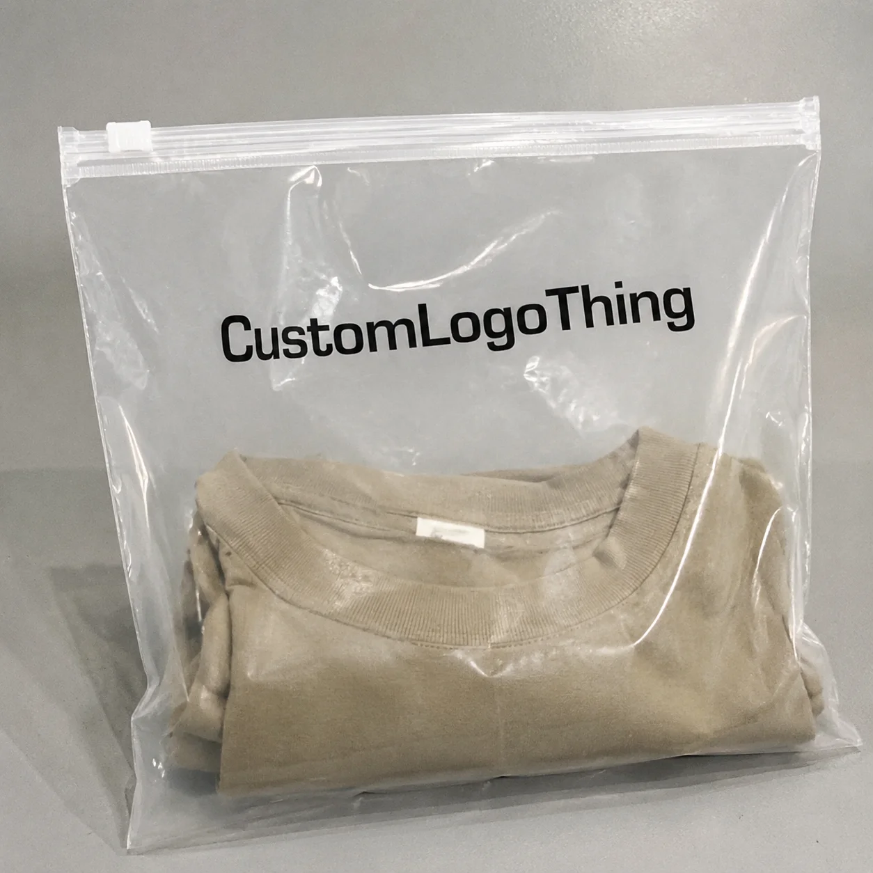
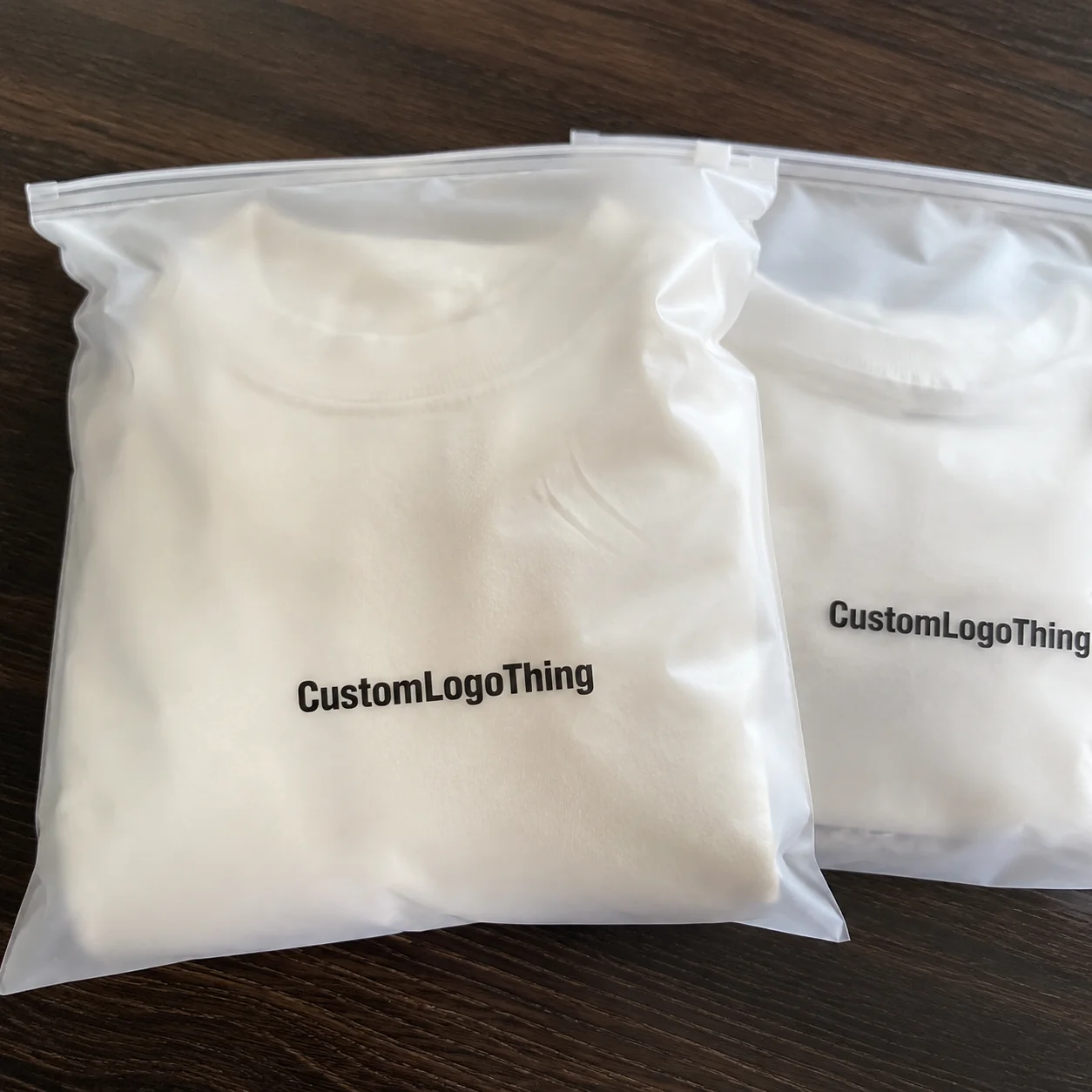
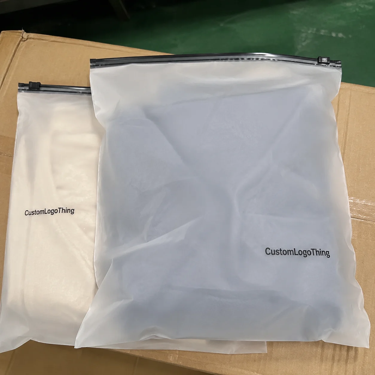
Skincare Frosted Zipper Bags Packaging Insert checklist sounds unusually specific because the job is unusually specific. A frosted zipper bag can make the outer package feel polished, but the insert does the heavier lifting. It explains the product, protects the brand, and keeps avoidable returns from turning into expensive noise. If the insert is vague, too small, or printed on the wrong stock, the package can still look finished while the customer experience quietly breaks down.
From a buyer’s perspective, the insert is not filler. It carries usage instructions, ingredients, warnings, batch space, and the small pieces of brand language that make a kit feel intentional instead of assembled in a rush. That matters more in skincare than in many other categories. The product may sit in a humid bathroom, a travel pouch, or a shipping carton for weeks. Paper choice, contrast, and layout all start to matter in ways a mockup rarely shows.
There is another reason to treat the insert seriously: it is one of the few packaging pieces that gets read. A frosted bag may attract attention, but the insert has to answer practical questions quickly. What is this? How do I use it? What should I avoid? What lot or batch information ties back to the run? If it fails there, the branding may still look expensive, but the system underneath it becomes unreliable.
What Actually Goes Inside the Bag
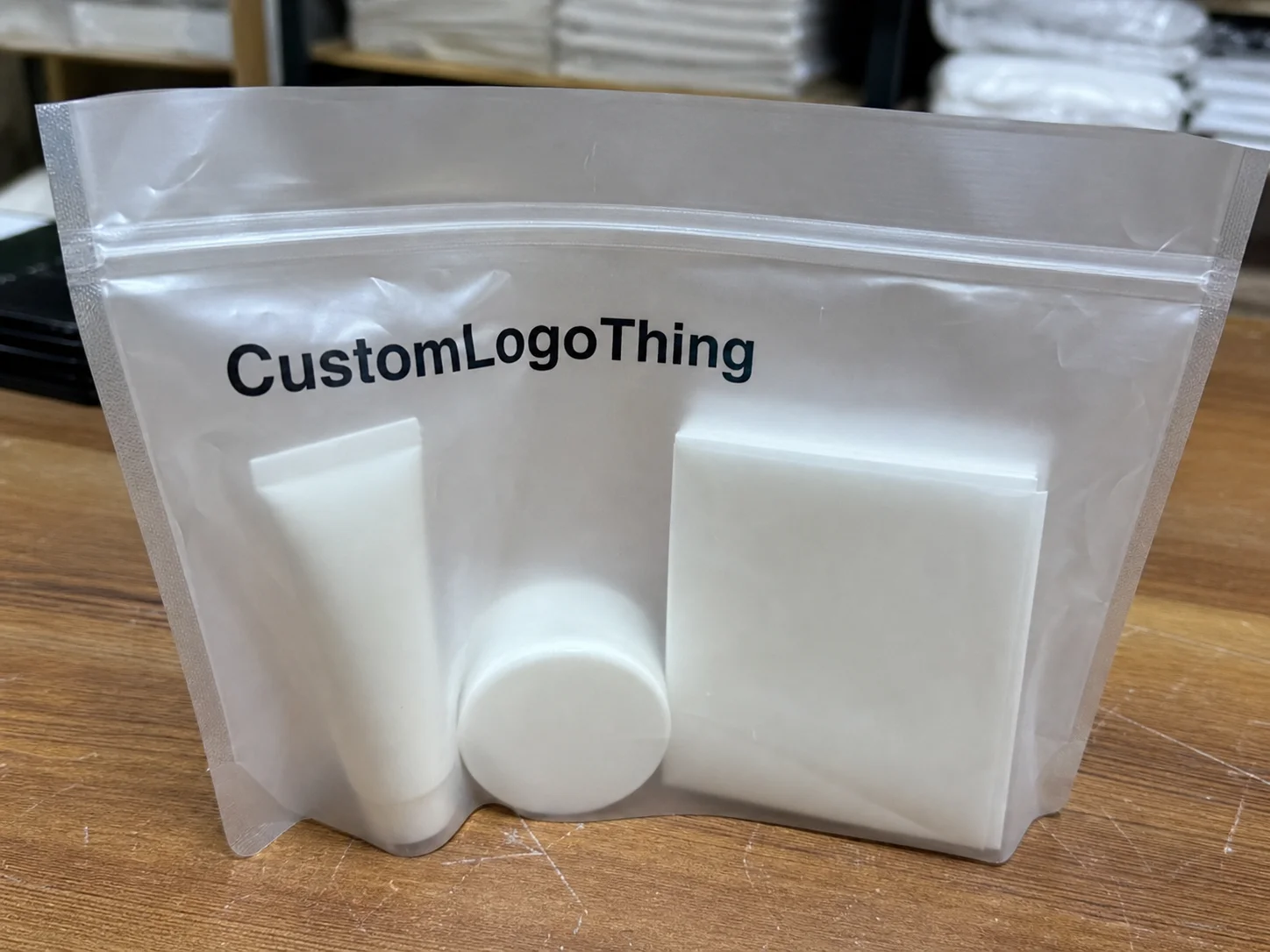
A useful insert starts with the job it has to do. It is part sales tool, part operating document, and part compliance buffer. The first information should always be the information that prevents misuse. Product name. Directions. Warnings. Storage notes. If needed, ingredients or a correct ingredient reference. Decorative copy comes later, if there is room left after the functional content is clear.
That is different from a thank-you card. A thank-you card improves tone. A product card improves presentation. A true insert improves packaging performance. For serums, masks, exfoliants, and travel-size sets, a bad insert creates avoidable customer service work. For example, a two-step routine that is not explained clearly can drive more questions than a new SKU with no insert at all. Customers rarely complain that a package is too clear.
Frosted Zipper Bags change the visual equation. The bag is semi-opaque, so the insert has to do more visual work than a plain clear pouch would require. A white card behind frosted film can look clean, but weak contrast turns good design into a blurred block of gray. In practice, that means stronger hierarchy, cleaner spacing, and less decorative clutter. Small type, pale ink, and overly airy layouts can disappear faster than expected once they are behind the film.
If the bag looks premium but the insert reads like an afterthought, the package branding feels unfinished. Customers notice that even when they do not say it out loud.
The most useful inserts are usually the least theatrical. A simple layout with one clear headline, one short usage section, and one compact compliance block often performs better than a dense sheet filled with icons and marketing language. The insert should feel designed, but it should also survive actual use. That balance is harder than it sounds.
For teams that sell across multiple channels, the insert may also have to bridge retail, ecommerce, and samples. A shopper in a store may skim it once. A subscription customer may keep it. A fulfillment team may use it as a packing reference. One piece, three jobs. That is why the skincare frosted zipper Bags Packaging Insert Checklist should be treated as a small packaging brief, not a stationery order.
How the Insert Works With Frosted Bags
Bag size drives almost everything. If the insert is too large, it folds awkwardly and looks cheap. If it is too small, it disappears behind the product and becomes functionally invisible. Measure the actual bag interior, not the marketing mockup. Leave safe margins so the card does not catch on the zipper track, and make sure the top edge does not interfere with the seal. A few millimeters can decide whether the card slides in cleanly or gets bent on every pack.
For narrow Frosted Zipper Bags, common insert sizes often land around 3.5 x 5 inches or 4 x 6 inches, but that only works when the kit is simple. If the bag holds bottles, sachets, a QR card, and a folded leaflet, the layout should be built around the physical order of the contents. The goal is fit, not symmetry for its own sake. A rigid card works well for presentation. A folded leaflet makes more sense when the copy is longer or when the brand needs multilingual space.
Material choice matters more than many buyers expect. Coated paper gives sharper color and cleaner images. Uncoated stock feels softer and more natural, which can fit a clean skincare line. Recycled stock supports sustainability messaging, though print contrast can be slightly weaker. If the kit may leak, sweat, or sit in a damp bathroom, synthetic or moisture-resistant stock is the safer option. Standard paper can warp, curl, or pick up edge wear faster than people predict.
Print behavior changes too. Frosted film dulls reflections, but it also softens the visual edge of whatever sits behind it. That means type size, line spacing, and contrast have to carry more weight. Small light-gray text on a pale insert is usually wasted money. Strong black or deep charcoal text tends to read better than trendy washed-out palettes that look good on screen and weak in the bag. What seems minimal in a brand deck can become illegible in production.
For kitted sets and samples, the insert may need scoring or folding so the edges stay clean. A flat sheet that looks fine in a PDF can buckle once it is packed with a bottle or tucked beside a sample vial. That is why one-size-fits-all thinking fails here. Different bag widths, product heights, and pack counts usually need separate insert specs, even if the branding stays consistent.
It helps to think about visual hierarchy rather than simply “adding a card.” A label has to be read at arm’s length. A shipper insert is often scanned and tossed. A skincare insert inside frosted retail packaging sits somewhere between those two. It should feel deliberate, but not crowded. If the design demands too much effort, the customer will move on before the message lands.
Cost, Pricing, and MOQ Basics
Pricing usually breaks into six parts: artwork setup, print method, paper stock, finishing, folding or packing, and freight. The insert itself is rarely the most expensive line item. Setup and revision cycles are where budgets get damaged. Buyers who compare only unit price often discover the final cost after proofing, finishing, and packing have been added back in.
For a standard 5,000-piece run, rough pricing often falls into these ranges:
| Insert option | Typical use | Approx. unit cost | Main tradeoff |
|---|---|---|---|
| Uncoated paper card | Simple instructions, natural look | $0.09-$0.20 | Lower glare, but weaker color pop |
| Coated paper card | Retail-ready branded packaging | $0.10-$0.22 | Crisper print, but less moisture resistance |
| Synthetic or moisture-resistant stock | Bathroom kits, samples, travel sets | $0.22-$0.45 | Costs more, but handles humidity better |
MOQ depends on the print method. Digital jobs can sometimes start around 500 to 1,000 pieces if the artwork is simple. Offset runs usually make more sense at 2,000 to 5,000 pieces and up, because setup costs need more units to spread across the order. Once the art is approved and the files are locked, unit cost often drops after the first break point. That is why it can be cheaper to move from a tiny test run to a more realistic pilot size than to hover in the middle.
Special finishing changes the math. Foil, soft-touch coating, spot UV, and custom die-cut shapes can add $0.03-$0.15 per unit, sometimes more on a small run. Folding, polybagging, or kit packing adds labor too. None of these looks expensive when listed alone. Add them across several thousand units and the total becomes visible very quickly. The buyer’s job is to decide whether that spend improves the insert’s function or just improves the mood board.
Here is the practical rule: if the insert is part of launch packaging, spend on legibility and durability before decorative extras. A nice-feeling card is good. A card that survives the product’s life cycle is better. The same logic applies whether the package is for retail shelves, ecommerce, or sample distribution.
If you are sourcing the full set, review Custom Packaging Products alongside the insert spec. The insert should match the bag, the label, and the broader product packaging system instead of fighting it. That is where package branding starts to feel deliberate rather than improvised.
For sustainability claims, do not improvise the language. If the job involves recycled fiber or certified paper, keep the supplier’s documentation on hand and verify it against recognized standards such as FSC certification guidance. Buyers who need durability testing for transit should also look at the methods used by ISTA. Those references matter because packaging claims and packaging performance are not the same thing.
Production Steps and Timeline
The production path is usually straightforward: brief, size confirmation, copy approval, proofing, print, finishing, packing, and shipment. The part that slows everything down is rarely the press itself. It is the gap between what the brand thinks it wants and what the file actually says. Missing ingredient copy, vague dimensions, and half-approved artwork can add days fast.
A practical timeline looks like this:
- Simple digital insert jobs: often 5-8 business days after proof approval.
- Offset printed inserts with standard finishing: often 10-15 business days after proof approval.
- Special stock, foil, lamination, or custom die cuts: often 15-20 business days before freight.
Those are production windows, not shipping promises. Freight can add another 2-7 days domestically and longer for international moves. Rush orders help when the artwork is locked and the spec is clean. They do not help when the copy is still being rewritten by three people in three different threads. Clean inputs shorten the schedule more reliably than urgency does.
Proofing discipline matters more than a lot of teams admit. If the insert must fit a frosted zipper bag exactly, one wrong dimension in approval can waste an entire run. A press proof or comp sample is cheap compared with scrapping 3,000 inserts built for the wrong pouch width. The same is true for fold lines. A slight offset on screen may become a visible error once the card is in hand.
Teams that already buy Custom Printed Boxes usually understand this principle. The approved dieline is the source of truth. The same rule applies here. An insert that is “close enough” is usually a future problem. It may still pack, but it will not feel precise, and precision is one of the few signals customers read as quality.
For regulated claims or heavier compliance language, keep the approval chain short. More reviewers is not always better. It often means more versions, more confusion, and a slower release date. The packaging ends up waiting while the copy keeps mutating. That is how a straightforward launch turns into a line-item parade.
Skincare Frosted Zipper Bags Packaging Insert Checklist
This is the section that saves money. The skincare Frosted Zipper Bags Packaging Insert checklist should verify the actual content before anyone starts talking about embellishment. If the copy is incomplete, the rest is noise. A pretty layout cannot rescue missing instructions or weak compliance language.
Core content to confirm
- Product name and SKU or internal code.
- Ingredients, or the correct ingredient reference if required for the product type.
- Directions for use, including frequency and application order if needed.
- Warnings, storage notes, and any known caution statements.
- Batch space, lot code area, barcode, or QR code if the workflow needs it.
- Company name, website, customer contact details, and country of origin if applicable.
Readability is not optional. On light stock, small type can disappear. On tinted or frosted presentations, contrast matters even more. Body copy should be large enough to read at normal arm’s length, with enough white space that the card does not look crammed. Tiny text packed wall-to-wall is how a useful insert turns into something people ignore.
Claims need to match everywhere. If the insert says something one way, the website and carton should not say something different. That includes “clean,” “dermatologist tested,” “vegan,” “reef-safe,” and any other claim the brand wants to use. If a claim is borderline, get the legal or regulatory review done before print approval. Not after. Once the job is on press, the bill gets larger and the options get smaller.
If the product ships across regions, plan for language versions early. One insert may work for one market. It rarely works cleanly for several markets unless the layout was built for localization from the start. A cramped two-language insert is still a cramped insert. The same goes for longer translations. If the typography cannot absorb them, the format needs to change, not the rules.
File preflight is basic, but it still catches a surprising number of problems. Check image resolution, bleed, safe area, linked fonts, and file naming. Make sure the proof version matches the approved version. If the file label says “final_final_v7,” that usually means somebody has already lost control of the process. Packaging production rewards clarity and punishes drift.
One more practical point: if you use FSC claims, recycled-content language, or transit durability language, document it. The insert is part of the brand story, but it still has to be backed by actual specs, not wishful thinking. That keeps branded packaging credible. It also makes supplier conversations shorter, which is helpful when the launch calendar is already tight.
Common Mistakes That Waste Money
The most expensive mistake is simple: ordering inserts before the bag size is final. That creates rework, and rework is where margins go to die. It happens when the team approves graphics first and treats pouch dimensions like a detail. It is not a detail. It is the starting point.
Another common failure is decorative hierarchy with no function. The insert looks attractive, but the usage instructions are buried under a logo, three claims, and a mood photo. If the customer cannot find the directions in five seconds, the insert is not doing its job. Good packaging does not hide the useful part inside the pretty part.
Overstuffed copy is another quiet budget killer. Too many tiny icons. Too many claims. Too many lines of text. The page starts to resemble a compliance memo instead of retail packaging. Buyers often try to “get more value” by adding more content. In practice, they make the piece harder to read and more expensive to print. There is a point where more information reduces the usefulness of the information already there.
Stock choice can backfire too. A very thin sheet may wrinkle inside the bag, while an overly glossy sheet can look slick but feel out of place with a natural skincare line. If the kit is likely to travel through humid spaces, standard paper can warp. That is why spec selection should reflect real use, not only the mockup. A sample that looks clean on a monitor may behave poorly in a bathroom cabinet.
Last-minute revisions cost more than people think. A changed ingredient list may be a quick text edit on paper. On press, it can mean reproofing, rescheduling, and sometimes restarting the job. That becomes especially frustrating when the insert order is tied to a larger launch bundle or a matching package branding system. One late change can ripple across several materials.
For teams buying broader product packaging, the same caution applies to custom packaging products across the kit. A good insert paired with the wrong bag size, label shape, or carton insert still creates waste. The pieces need to be planned together. That is the difference between a coordinated order and a pile of separate decisions that happen to share a logo.
Best Practices Before You Place the Order
Do a final sample check using the actual frosted zipper bag, not just a digital mockup. Screen renders are useful, but they leave out the problems that matter most. Put the sample card inside the real bag, close the zipper, and check visibility, fit, and readability under normal light. If the card shifts, buckles, or disappears behind the product, the layout needs adjustment.
Keep three things under control: one approved print file, one approved spec sheet, and one owner for final sign-off. If three different people can still change the copy, the job is not approved yet. That sounds blunt because it is. Packaging delays usually come from unclear ownership more than from technical complexity.
If the insert includes QR codes, batch instructions, or launch-specific claims, a pilot run is smart. A small test order lets you check scan performance, fold behavior, and bag fit before committing to volume. It is cheaper to catch an error on 250 units than on 5,000. That logic is boring, which is exactly why it works.
When comparing suppliers, ask for a written quote that separates setup, printing, finishing, packing, and freight. Ask for proof turnaround too. If the quote is vague, the final invoice probably will be too. Clear suppliers do not hide the math, and buyers should not have to reverse-engineer it after the fact.
Good packaging design is not about adding more pieces. It is about making each piece carry its own weight. The insert should support the bag, the product, and the customer without competing with them. That is the difference between a tidy kit and a messy one.
If the order needs to stay on budget, keep the spec tight, compare options honestly, and use the skincare frosted zipper bags packaging insert checklist before production is approved. When the bag size, copy, and finish are aligned, the rest is execution. That sounds simple because the hard work already happened in the decisions.
For a faster sourcing pass, review Custom Packaging Products and match the insert to the bag from the start. That one step removes most of the expensive mistakes people make with skincare frosted zipper bags packaging insert checklist orders.
FAQ
What should a skincare frosted zipper bags packaging insert checklist include?
It should cover size, copy, artwork, compliance language, material choice, and approval steps. The insert should also be checked against the actual bag dimensions and the final product claims.
What paper stock works best for skincare bag inserts?
Coated stock helps with sharp color and images, while uncoated stock gives a softer, more natural look. If moisture is a concern, a synthetic or coated option is safer than plain paper.
How much do packaging inserts add to unit cost?
Small runs cost more per insert because setup is spread across fewer pieces. Color count, finishing, folding, and special materials usually move the price more than the paper itself.
How long does production usually take for insert cards?
Standard jobs move faster once artwork is approved and specs are final. Timeline slows down when the copy is incomplete, the dieline changes, or a proof needs multiple revisions.
Can one insert work for multiple skincare frosted zipper bag sizes?
Sometimes, but only if the text stays readable and the insert still fits without folding awkwardly. For different bag sizes or bundle types, separate versions are usually cleaner and easier to produce.