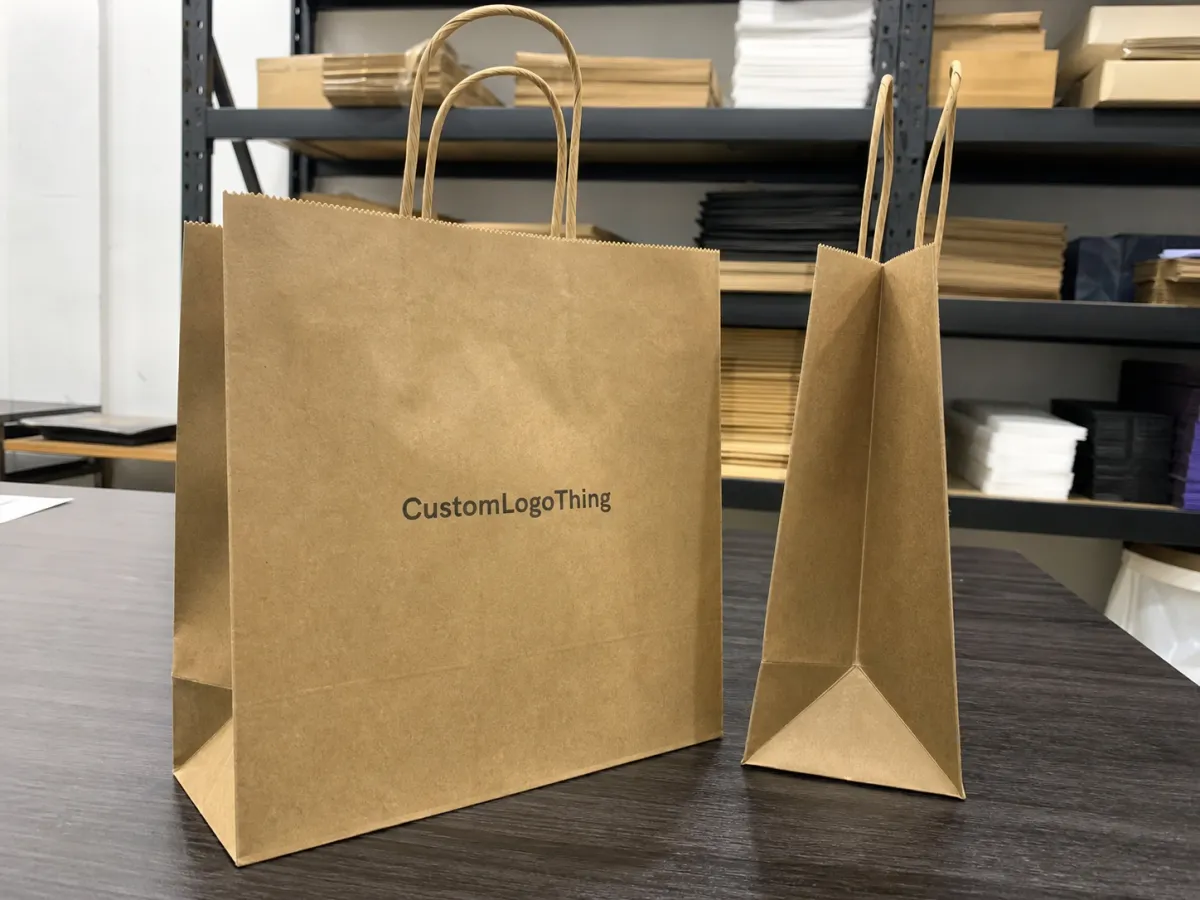
Small Retail Paper Bags Print Options for Custom Orders
Small Retail Paper Bags print options matter more than most buyers expect. The bag is seen at checkout, in a customer’s hand, and often in a photograph long before anyone studies the product itself. If the print is fuzzy, badly placed, or too busy for the panel size, the whole package feels less considered. If it is clean and proportionate, the bag does quiet branding work every time it leaves the store.
That is why the printing choice should not start with decoration. It should start with use: what is being carried, how far the bag has to travel, how much handling it will take, and whether the brand wants a natural, premium, or promotional look. Those answers shape the right paper, the right ink system, and the right production route.
What Small Retail Paper Bags Print Options Really Cover
When buyers ask about Small Retail Paper Bags print options, they usually mean logo color and general appearance. That is only the visible layer. Underneath, the print method affects registration, ink absorption, surface feel, turnaround, and the amount of waste a press run creates before the first saleable bag is packed.
The most common routes are single-color flexographic printing, digital printing for shorter or more variable runs, offset printing on pre-printed sheets or components, and premium effects such as foil stamping or spot varnish. Each method solves a different problem. Flexo is efficient for repeatable spot-color work. Digital is useful for fast setup and smaller orders. Offset is better when the artwork demands crisp detail and tighter color control. Foil and varnish are accents, not substitutes for a solid base design.
There is also a practical constraint buyers often overlook: paper behaves differently depending on the ink and finish. A dense black logo on uncoated kraft will soften a little as the ink sinks into the fibers. A coated white stock will hold edges more sharply, but may show rub marks sooner if the bags are stacked tightly or handled a lot. The same artwork can look refined on one substrate and slightly tired on another.
That is why the right answer is rarely “the best print option” in the abstract. The better question is which option matches the merchandise and the retail setting. A bakery bag, a cosmetics bag, and a fashion bag do not need the same print strategy. The best small retail paper Bags Print Options are the ones that fit the product without making production unnecessarily expensive or fragile.
A small bag gives you less room to hide weak decisions. On a narrow front panel, clarity and proportion matter more than visual tricks.
How the Printing Process Works From Artwork to Bag
Most paper bag jobs begin with a logo file and a dieline. That sounds simple until the artwork has to navigate folds, gussets, handle reinforcements, glue zones, and the bottom turn. A graphic that looks centered on a flat proof can shift once the bag is converted, so layout needs to account for construction from the beginning.
The standard production sequence is artwork prep, proofing, approval, printing, converting, finishing, and packing. Suppliers generally prefer vector files for logos, text, and line art because they scale cleanly and hold edges better in print. If the design includes photography or gradients, the file should be prepared with enough resolution for the chosen method. For digital work, that usually means clean source files and careful color management. For offset, it means tighter control over separations and overprint behavior.
Bleed and safe zones are not optional housekeeping. They keep critical art away from cut lines and glue points. On a small paper bag, even a few millimeters can matter. A handle patch can clip a letter. A fold can swallow a thin rule. A bottom crease can distort a border. The dieline should be treated as a production map, not a decorative template.
Proofing usually happens in two stages. First comes a digital mockup to confirm placement and copy. Then comes a production check once the printer has reviewed separations, spot colors, and any finishing elements. If the artwork is simple, that cycle can move quickly. If there are multiple revisions or brand-standard colors that need matching, the schedule stretches.
Print method changes the workflow too. Flexographic printing is often used for repeat orders, spot colors, and higher volumes where a fixed setup can be amortized. Digital printing is better for shorter runs, frequent design changes, and lower setup overhead. Offset printing can deliver excellent detail on pre-printed stock, but it usually makes more sense once the order size justifies the prep work.
How Small Retail Paper Bags Print Options Affect Cost and Lead Time
Price usually comes down to five variables: quantity, number of colors, paper weight or grade, bag size, and finishing. Add foil, lamination, embossing, or heavy ink coverage and the quote can move quickly. Two bags that look similar in a catalog can land in very different price brackets once setup, waste, and finish complexity are included.
For rough planning, a simple one-color flexographic run may land around $0.18-$0.35 per bag at a few thousand pieces, depending on dimensions and stock. Lower-volume digitally printed orders may sit closer to $0.35-$0.85 per bag. Offset usually becomes more attractive as volume rises and setup is spread across more units. Premium finishes can add a meaningful step above those ranges. These are planning figures, not promises; paper market swings, shipping distance, and finishing requirements can move the final number.
Minimum order quantity matters as much as unit price. A slightly larger run can reduce the cost per bag enough to justify carrying extra inventory, especially if the bags are generic enough to use across several months. A very small run can be useful for seasonal promotions or new product launches, but the price per unit often reflects the setup burden more than the paper itself.
| Print Method | Best Fit | Strength | Watch-out | Cost Pressure |
|---|---|---|---|---|
| Digital printing | Short runs, artwork variation, seasonal campaigns | Fast setup and flexible graphics | Less economical as volume climbs | Lower at small quantities, higher at scale |
| Flexographic printing | Spot-color logos, repeat orders, steady demand | Efficient for consistent production | Less friendly to complex gradients | Moderate and often competitive |
| Offset printing | Crisp graphics, controlled CMYK work | Sharp detail and strong color control | Setup makes tiny runs less attractive | Better once volume supports the press prep |
| Foil or special finishing | Gift, fashion, and premium retail bags | High visual impact | Adds time and process risk | Highest add-on cost |
Lead time follows the same pattern. A straightforward repeat order can move in roughly one to two weeks after artwork approval, depending on stock availability and the vendor’s queue. New artwork, specialty finishes, or color-critical matching can stretch that to two to four weeks or more. The main delay is often not the press itself but the back-and-forth around proofs, stock confirmation, and finishing.
It also helps to ask what is included in the quote. Proof charges, remake fees, rush setup, and color correction can change the real cost more than the headline unit price. A lower quote with vague inclusions is not necessarily a better quote.
For buyers who care about paper sourcing, FSC certification is a useful reference point for chain-of-custody and responsible paper claims; the standards are described at fsc.org. For shipping resilience and packaging test methods, ista.org offers useful guidance on transit testing and damage reduction.
Choose Paper, Handles, and Finishes That Match the Store Use
Paper stock changes the tone of the bag before the logo ever appears. Brown kraft gives a natural, grounded look and is often a good fit for brands that want a practical or eco-forward feel. White paper makes color appear brighter and tends to suit artwork that depends on contrast or subtle brand colors. Coated stocks sharpen image edges, though they also change the tactile feel and can introduce scuff considerations if the bags are handled frequently.
Paper weight matters in a more literal way: too light, and the bag feels thin in the hand; too heavy, and the bag may cost more than the item inside can justify. Many small retail bags sit in the middle ground, strong enough for apparel, boxed gifts, or cosmetics, but not overbuilt for a single lightweight purchase. If the bag will carry jars, candles, or multiple items, the stock and handle construction should be chosen with load strength in mind rather than appearance alone.
Handle style is not a cosmetic afterthought. Twisted paper handles are common because they balance price and everyday performance. Flat paper handles can work well for lighter loads. Die-cut handles give a cleaner silhouette for gift or fashion use, but they need careful reinforcement if the contents are heavy. The wrong handle style can make an otherwise polished bag feel fragile the moment a customer lifts it.
Finishing should support the print, not compete with it. Matte finishes often feel calm and restrained. Gloss can make saturated colors feel brighter and more retail-forward. Uncoated paper suits brands that want a more natural or tactile presence. Foil can be elegant, but it works best as a controlled accent on a simple logo or key mark. If the design already has strong color and good contrast, extra finish may not add much beyond cost.
The most reliable approach is to match the bag to the merchandise and the sales environment. A candle shop may need heavier stock and a sturdier handle than a boutique selling folded accessories. A bakery bag may care more about grease resistance and fast turnover. A fashion retailer may care more about presentation and consistent logo placement. The best Small Retail Paper Bags print options fit the use case instead of fighting it.
How to Build a Print Spec That Manufactures Cleanly
A clean spec sheet prevents a surprising amount of friction. Start with the basics: bag width, gusset depth, height, quantity, paper grade, handle style, color count, finish, and target delivery date. If any of those are missing, the quote may look fine at first and then change once the supplier starts checking actual production fit.
Artwork should be placed with conversion in mind. Keep critical text away from side seams, handle attachments, and bottom folds. On narrow bags, a centered logo can still look balanced, but oversized graphics that try to occupy every inch can distort where the bag is glued or folded. Some empty space is not wasted space; often it is what makes the design read as deliberate.
File preparation is where a lot of avoidable problems start. Vector is best for logos and type. If images are used, they should be large enough for the print method and viewed at the final size, not just at screen scale. Spot colors should be named clearly. CMYK files should be checked for brand tolerance, because process color can drift more than buyers expect when moved between paper types or presses.
The strongest proof is the one that reveals the weaknesses before production does. If a line is too thin, a fold too close, or a color too flat, the proof should make that obvious.
A useful quality check is to shrink the artwork on screen until it feels uncomfortably small. If the logo, line work, or tagline loses authority at that size, it will probably lose authority on a real bag too. Thin type, reversed-out copy, and low-contrast marks may look elegant in a mockup but disappear once they are printed on textured paper and seen in motion.
Before approving the order, compare the proof, the sample, and the written spec line by line. Check whether the finish matches the approval, whether the logo sits in the right panel, whether the paper tone is consistent, and whether the handle style is exactly what was requested. That kind of review sounds tedious. It is less tedious than remaking a run.
Common Mistakes That Make Small Bags Look Cheap or Print Poorly
The most common mistake is trying to do too much on too little surface area. A paper bag is not a poster. Dense illustrations, tiny slogans, and multiple fine lines can lose their edge once the bag is converted and handled. On a small front panel, simple usually reads better than elaborate.
Poor placement creates another layer of damage. Text too close to a fold can distort. A logo too near a seam can break apart visually. Graphics that extend into the bottom area may pick up unevenness from the structure of the bag itself. Respecting the dieline is not an administrative chore; it is the difference between a clean production run and a bag that feels off by a few millimeters in a customer’s hand.
Too many colors can weaken a design rather than strengthen it. Extra inks do not automatically create a stronger identity. If the artwork lacks hierarchy, six colors may still look less polished than a restrained two-color system with good spacing and good contrast. That is one reason spot-color printing remains popular for small retail bags: it keeps the message focused and the production easier to control.
Paper and finish mismatches are just as common. A low-grade stock may absorb ink too quickly, leaving the color muted or uneven. A slick coated surface can hold type beautifully, but it may also show scuffing if bags are packed tightly or shipped across rough routes. Finish should be chosen for durability as much as for style.
Skipping a sample or proof check is the fastest way to discover a problem after the order lands. Registration, handle placement, glue integrity, and ink behavior can all look different in hand than they do on a screen. Even for a simple job, a physical sample is cheap insurance.
Practical Tips for Color, Readability, and QC
If the bag has to read from across a counter, design for distance first. Strong contrast, one main logo panel, and clear spacing usually outperform busy layouts. Customers do not spend long decoding a checkout bag. They see it for a second, maybe two, and form an impression immediately.
Keep one side calm and let the other side do the work. A logo on the front and a website or social handle on the back often feels more expensive than filling every available panel. It also gives the printer a cleaner target and gives the eye a place to rest. Visual restraint is not the same as minimal effort; it is a sign that the brand understands proportion.
Color matching deserves practical expectations. Process color can vary slightly across paper types, especially when moving from a coated sample to an uncoated production stock. Pantone or spot color matching usually gives tighter results for logos, but even then paper tone and ink coverage can shift the final look. If the brand is color-sensitive, ask for a physical drawdown or a press-side check rather than relying only on a screen proof.
Lead time is often shaped by small delays: artwork revisions, stock confirmation, finishing queue, and shipping. If the order is tied to a store opening or seasonal promotion, leave room for one adjustment. The fastest schedule is often the one that assumes something will need correcting.
For presentation-critical programs, ask for a physical sample whenever the surface texture, color accuracy, or handle feel has to match a standard. A digital image cannot show paper grain, scuff resistance, or the way ink settles into an uncoated stock. Those tactile differences are often what decide whether the bag feels ordinary or branded.
What to Include in a Quote Request
A useful quote request is specific enough to prevent guessing. Include bag size, quantity, paper grade, handle style, print colors, finish, and delivery location. If the artwork is ready, send the most current file and say whether the brand needs exact color matching or a close visual match. If the design is still in progress, say that too. A supplier can only price what is actually being produced.
It also helps to compare at least two approaches instead of asking only for the lowest-number version. A one-color flexographic bag may be the smartest answer for one use case, while digital printing may make more sense for a short campaign with changing artwork. Sometimes a plain kraft bag with a strong spot-color logo is better than a coated stock with extra ink and less character.
Ask for a dieline and proof review before approving production, especially if the artwork includes fine type, edge-to-edge coverage, metallic accents, or a barcode. If the bags will carry heavier items, request a plain sample or prototype so you can check handle strength and paper feel in hand. These checks do not slow the project nearly as much as a remake would.
For buyers comparing small retail paper bags print options, the best result usually comes from a practical brief, a clean proof, and an honest conversation about what the paper and press can do. A well-chosen bag does more than carry a purchase. It carries the brand message without shouting, and it holds up long enough for that message to register.
Frequently Asked Questions
What print method is best for small retail paper bags?
Digital printing is often the most practical choice for short runs, multiple colors, or artwork that changes seasonally. Flexographic printing is usually stronger for repeat orders and simpler spot-color logos. Offset can be excellent for crisp graphics when the run size supports the setup work. Foil or specialty finishes are best treated as accents.
How do small retail paper bags print options affect price?
Price changes with quantity, color count, paper stock, bag size, and finish complexity. A low-volume, highly finished bag costs more per unit because setup and waste are spread across fewer bags. Larger quantities usually lower the per-bag cost, but only if the design and stock are suitable for the production method.
What artwork details matter most for small paper bag printing?
Keep logos and text away from folds, seams, and handle attachments. Use strong contrast and avoid ultra-thin details that may disappear on textured paper. Provide a dieline, and make sure the printer knows whether the artwork uses spot colors or CMYK.
How long does it take to produce printed retail paper bags?
Simple repeat orders can move fairly quickly after proof approval, often within one to two weeks depending on stock and scheduling. New artwork, specialty finishes, and exact color matching usually take longer. Build in extra time if samples or multiple revisions are part of the process.
What should I include when asking for a quote on small retail paper bags print options?
Include size, quantity, paper grade, handle type, print colors, finish, and delivery deadline. Send the current artwork file and note whether exact color matching is required. If the bag needs to hold heavier merchandise, mention the load so the supplier can recommend a suitable stock and handle construction.

