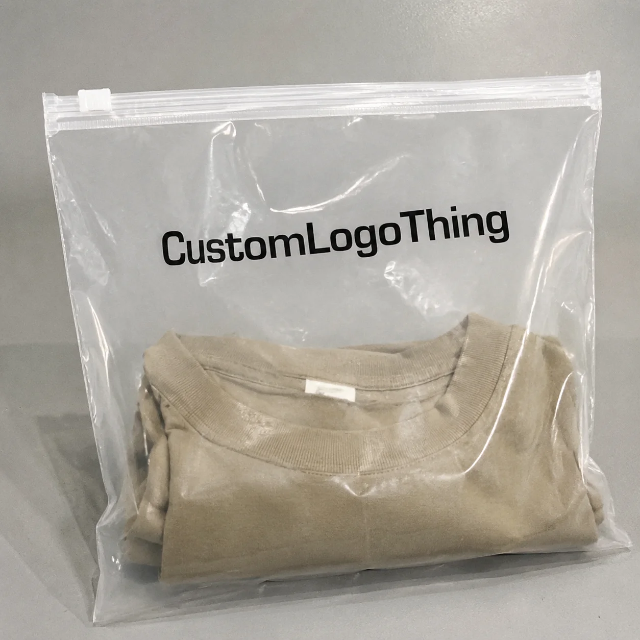
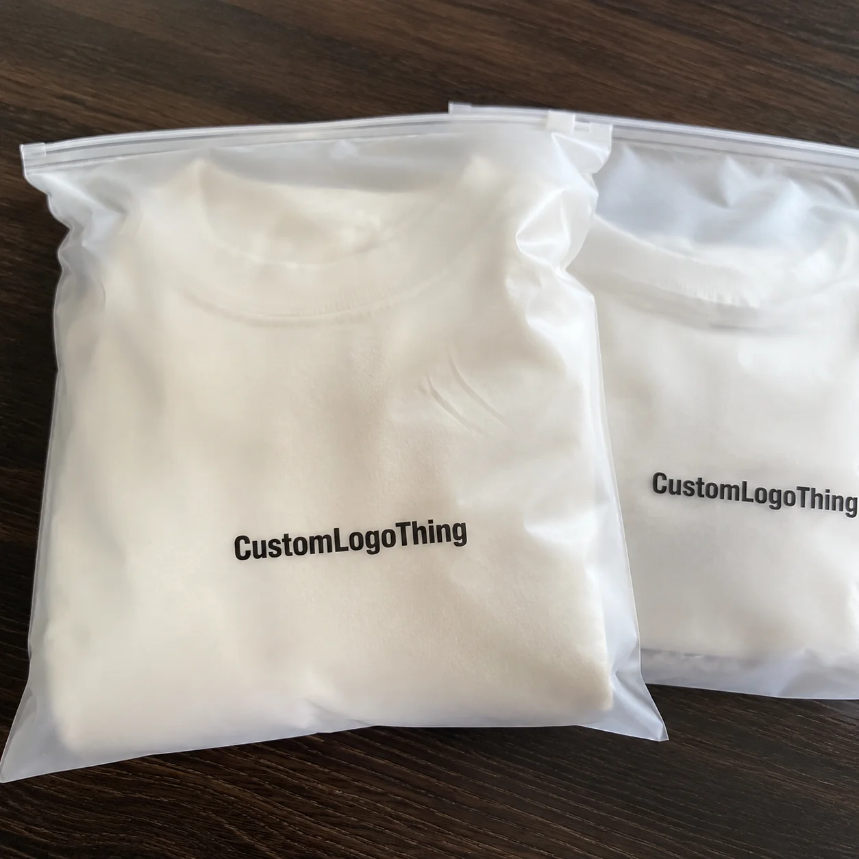
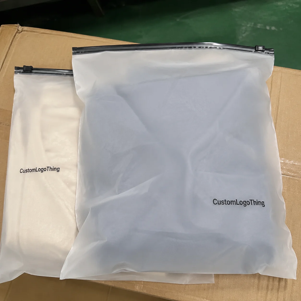
A trade show Frosted Zipper Bags Packaging insert checklist is not a branding exercise dressed up as logistics. It is a practical control list for a very short moment of attention. People are walking, talking, and carrying other materials when they pick up your bag. If the insert does not communicate quickly, the package feels incomplete even if the bag itself looks polished.
Frosted Zipper Bags create a cleaner first impression than a plain poly sleeve, but the insert still does the heavy lifting. It has to identify the offer, explain why it matters, and point the buyer toward a next step without wasting space. That is a narrow brief, but it is manageable if the layout is disciplined and the copy is specific.
From a packaging buyer’s point of view, the insert sits in the same family as product packaging, retail packaging, and custom printed boxes. It has to inform, persuade, and look intentional in one pass. That is why structure matters more than decoration. Clear hierarchy beats cleverness almost every time.
A useful trade show insert answers three questions fast: what is this, why should I keep it, and what do I do next?
The best packages feel deliberate because every piece supports the same message. The worst ones look assembled from leftovers: generic flyer, generic bag, generic action step. This checklist helps avoid that outcome by focusing on size, stock, contrast, layout, Cost, and Production timing.
Why This Insert Has to Work in 3 Seconds
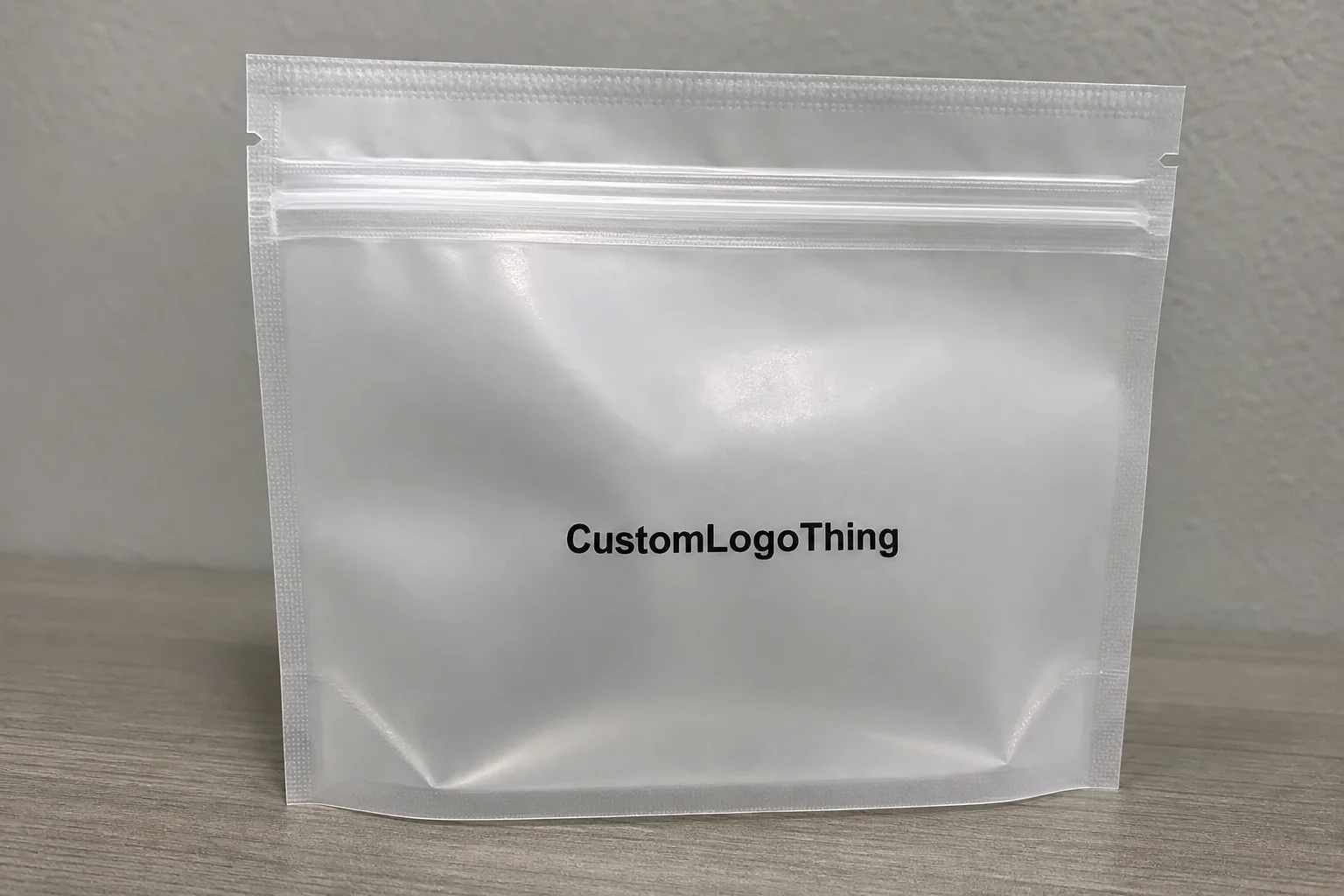
Trade show traffic is unforgiving. Booth visitors are moving quickly, and they are sorting through bags, samples, brochures, and business cards in real time. That gives the insert a tiny window to prove it deserves to stay in the stack. If the front panel cannot explain the offer quickly, the rest of the sheet may never get read.
The insert usually has three jobs. It acts as a sales sheet, an instruction card, and a brand memory cue. A good version carries one clear headline, one or two benefit statements, and one action step. A weak version tries to tell the whole company story in a single pass, which usually creates clutter and weakens the message.
Function matters more than style in this setting. The bag can be visually attractive, but the insert needs to be readable under trade show lighting and understandable without any explanation from staff. If the card requires a second look to make sense, the odds drop quickly.
The most useful inserts are usually compact. They use plain language, a clear product name, and enough visual hierarchy to guide the eye. If the piece contains a sample, the insert should support that sample instead of competing with it. That means the headline and main benefit need to be visible even when the product sits in front of the card.
This is where practical packaging design shows up. Not decorative design. Practical. The insert should be understandable while someone is still standing at the booth, not after they get back to a hotel room and sort through the stack later. That short time frame shapes everything else, from paper choice to how much copy belongs on the page.
How the Insert Works Inside a Frosted Zipper Bag
The relationship between the bag, the insert, and the sample matters more than many teams expect. A frosted zipper bag diffuses what sits behind it, which softens contrast and can mute small details. That affects typography, color, and how much of the insert remains readable through the plastic film.
Single-sheet inserts are the simplest and usually the least expensive. They work well when the message is short and the campaign is straightforward. Folded inserts are better when the team needs more room for product details, usage notes, or a short FAQ. A rigid card is worth the extra cost when the package needs to feel more substantial or when the sample itself is light and the handout needs more body.
Paper stock changes the experience more than some teams expect. Uncoated paper feels more natural, but it can lose sharpness behind a frosted surface. Coated stock usually gives better color density and stronger contrast, especially for logos, product photography, and QR codes. If the sample or accessory already darkens the view, avoid weak type color. Pale gray copy on a frosted bag is a fast way to make a handout unreadable.
Size matters as well. An insert that is too large buckles against the zipper seam or curls at the edges. One that is too small disappears inside the bag and looks like an afterthought. Measure the usable interior space, not just the exterior dimension on the bag spec. Leave enough room for easy insertion and a flat presentation.
For teams comparing formats, the trade show frosted zipper Bags Packaging Insert Checklist works best when the insert is treated as part of a small packaging system. The bag, the sample, and the printed card should feel like they were planned together. If the project includes other branded pieces, align them early so the visuals stay consistent.
Matching components matter most when the insert is part of a larger event kit or retail packaging program. Consistency does not mean repeating the exact same layout everywhere. It means the typography, color logic, logo treatment, and tone should belong to the same brand family. That is a lower bar than people imagine, and it still gets missed often.
For related components, see Custom Packaging Products. If the insert has to sit inside a branded kit, it should match the rest of the presentation without trying to outshine it.
Cost, MOQ, and Quote Variables That Move the Price
Insert pricing is usually less volatile than bag pricing, but the quote still changes in familiar ways. Size, paper weight, print sides, coating, special finishes, die-cutting, and assembly all move the number up or down. A simple flat card is cheap because it is simple. That is manufacturing, not mystery.
Minimum order quantity depends on format. Small runs are possible, but unit pricing climbs quickly when the job includes premium stock, multiple versions, folded construction, or extra finishing. A one-color flat card at 500 pieces behaves very differently from a two-sided insert with soft-touch lamination at 2,000 pieces. Same category. Different economics.
Assembly can matter as much as the print itself. If the bag, insert, and sample need to be packed together, the labor cost rises and the project becomes more sensitive to timing. Event teams often approve a clean-looking proof and then get surprised by the final invoice because the kitting work was never priced as a separate activity. That is avoidable if the quote is read carefully.
| Insert Format | Typical Qty | Approx. Unit Cost | Best Use | Notes |
|---|---|---|---|---|
| 4 x 6 in flat card, 14 pt C1S, 1 color | 500-1,000 | $0.34-$0.58 | Simple handout with one offer | Lowest setup, fast turnaround, limited content |
| 5 x 7 in flat card, 16 pt C2S, full color front | 1,000-2,500 | $0.18-$0.32 | Standard trade show insert | Good balance of cost and presentation |
| Folded 8.5 x 11 in sheet, text stock | 1,000-5,000 | $0.24-$0.41 | More copy, product details, FAQ | More space, but more handling |
| Premium card with lamination or soft-touch finish | 2,000+ | $0.28-$0.46 | High-value branded packaging | Looks better, costs more, feels sturdier |
Ask suppliers for tiered pricing if the campaign may repeat. Compare 500, 1,000, and 2,500 units rather than only asking for the exact quantity you need today. That makes the unit economics visible and often avoids a second, rushed run later at a worse price. If the insert is part of a larger event kit, coordinate the order with custom packaging products so the pieces move through production together.
If the package will be shipped to a show or distributed through a fulfillment channel, think about how it will hold up during handling. The ISTA test framework is useful when inserts travel with products or sample packs. It is better to learn how the kit behaves before it reaches the booth than after the materials have been tossed around by shipping and setup crews.
Process and Lead Time: From File Prep to Delivery
The production flow is straightforward, but delays usually happen in the same places: missing copy, late artwork, and approvals that linger too long. A printer cannot move forward without final files, and every revision after proofing pushes the schedule. That is not a creative problem. It is a calendar problem.
A normal sequence looks like this: brief, size confirmation, artwork prep, proofing, print, finishing, packing, and shipping. If the inserts are being paired with Frosted Zipper Bags or sample kits, add time for assembly. For many projects, 12 to 15 business days from proof approval is realistic. Specialty finishes, multiple SKUs, or higher levels of handwork can extend that.
Rush orders cost more because they compress two things at once: production capacity and shipping time. If the event date is fixed, build in a buffer for receiving, inspection, and replacements. A late backup still helps. A perfect package that arrives after the show does not.
It helps to treat the insert as part of the full branded packaging sequence rather than as an isolated print job. That means the file set should be locked before the order is released. Final copy, final dimensions, final logo files, final quantity. If that sounds rigid, it is. Rigid planning is what keeps event materials from drifting into last-minute revisions.
For projects that need a stronger paper sourcing story, the FSC system is worth considering. Buyers increasingly ask where the paper came from, and it is easier to answer that question before the show than after someone asks it at the booth.
When an insert has to match a bag, card, or display piece, coordinate the entire order early with Custom Packaging Products. The more interdependent the pieces are, the more useful it is to treat them as one production system rather than as separate jobs that happen to share a deadline.
Step-by-Step Trade Show Frosted Zipper Bags Packaging Insert Checklist
Use this sequence before artwork is released. The trade show Frosted Zipper Bags Packaging Insert checklist works best when the message hierarchy is settled first. If design starts before the content is clear, the layout gets built around whatever copy happened to land in the first draft. That usually creates crowding.
1. Lock the message hierarchy
Start with headline, product benefit, proof point, and call to action. In that order. If the headline is vague, everything below it becomes decorative noise. The strongest inserts answer the core buyer question immediately: what is this and why should I care?
2. Size the insert to the bag interior
Measure the usable interior space, not the outer bag dimension on the quote. Leave room for seams, the zipper edge, and any sample or accessory that sits in front of the insert. A slightly smaller insert often looks cleaner than a sheet that fights the bag.
3. Choose stock based on visibility and feel
Coated stock often performs better behind frosted film because it holds color and sharpness more effectively. A heavier card also helps the piece sit flat and feel intentional. If the sample is light and the package is meant to feel premium, the extra stiffness is usually worth it.
4. Keep the copy tight
Short paragraphs. Short bullets. Real facts. If the audience needs more detail, put it on the back side or send them to a QR-linked landing page. No one wants to carry a brochure that reads like a white paper.
5. Make the follow-up action easy to see
Include the booth number, website, QR code, or contact path. One action is better than three competing ones. If the goal is an email reply, say that. If the goal is a sample request, say that instead. Vagueness slows response.
6. Review technical print details
Check bleeds, safe area, color mode, image resolution, and orientation inside the bag. If the insert will sit behind a sample, check contrast again at actual scale. A mockup viewed at 30 percent on a laptop does not count as approval.
Practical rule: if the insert cannot be explained in one sentence by someone outside the project, it is not ready yet. That sounds blunt because it is useful. Overdesigned handouts are expensive to print and easy to ignore.
For teams managing multiple event pieces, align the insert with the same visual rules used across custom printed boxes, sample mailers, and booth graphics. Consistency is part of package branding. Randomness just looks unfinished.
Common Mistakes That Make the Package Look Cheap
The first mistake is overcrowding. Too much copy turns a useful insert into an unreadable brochure. The second is weak contrast, especially pale ink on frosted packaging. That can look refined on a proof and invisible under trade show lighting. On a monitor, subtlety can look elegant. On the floor, it often looks like a problem.
The third mistake is using stock that is too light. Thin paper curls, wrinkles, and makes the entire kit feel temporary. If the bag and sample are meant to represent a serious brand, the insert should not behave like it was printed on leftover office stock. That is poor product packaging, and buyers notice it quickly.
Inconsistent branding is another issue that stands out fast. Mismatched colors, random fonts, and half-finished messaging make the kit look assembled instead of designed. A frosted zipper bag already signals that the brand cares about presentation. The insert should reinforce that signal, not dilute it.
Another operational miss is printing one generic insert for every event and every audience. A trade show buyer, a retail buyer, and a distributor are not looking for the same information. If the insert has to support different use cases, make versions for each one. That is not excess. That is basic packaging discipline.
There is a place for restraint too. Not every insert needs foil, spot UV, or a dramatic finish. Those treatments can work in premium retail packaging, but they only pay off when they improve readability or strengthen the brand story. If they are there just to look expensive, they usually do the opposite.
Do not hide the action step. A well-designed insert with no obvious follow-up is just a souvenir. The point is to move the buyer to the next step while the booth conversation is still fresh.
Next Steps Before You Send the Order
Before approval, confirm the final dimensions, print quantity, approved copy, and whether the insert is being paired with a sample or accessory. Then check whether the order needs one version or several. If there are multiple SKUs or event audiences, decide that now instead of after proofing starts.
Prepare one clean spec sheet for the supplier. Include size, stock, print side, finish, quantity, shipping address, and deadline. That cuts down on back-and-forth email threads, which are where schedules tend to slip. If the insert has special handling or needs to be packed with a bag, spell it out clearly.
Ask for a physical proof when the type is fine, the background is dark, or the branding depends on precise color. A digital proof is fine for basic approval, but it does not always show how the insert will behave inside a frosted zipper bag. If the piece is central to the campaign, a real proof is cheap insurance.
Confirm booth delivery rules, shipping windows, and backup inventory before the date gets close. That matters even more for shows where replacement stock is hard to source once the event starts. A small overrun can save the day. A short shipment can create a very public problem.
Then compare the finished layout against the actual use case, not against a clean mockup on a screen. Hold the sample, look through the frosted film, and imagine someone carrying it across a hall for ten minutes. If it still reads well in that setting, the package is doing its job.
That is the point of the trade show frosted zipper bags packaging insert checklist: make the insert clear, sturdy, and fast to read, then align it with the bag so the whole package feels intentional. If those pieces work together, the handout survives the booth rush and keeps working after the conversation ends.
What should a trade show frosted zipper bag packaging insert include?
A clear product headline, one or two benefit statements, and a direct next step. Booth number, website, QR code, or contact details should be easy to spot. If the bag includes a sample, explain what it is and how to use it in one line.
What size is best for a frosted zipper bag insert at a trade show?
Measure the bag’s usable interior space, not just the outer size. Leave margin so the insert slides in flat and does not curl against the zipper or seams. If the sample is bulky, a slightly smaller insert often looks cleaner than a full-bleed sheet.
How do I reduce cost without hurting the insert quality?
Use one insert size across multiple SKUs when possible. Keep print to one side unless the back side is doing real work. Avoid special finishes unless they support the brand story or improve readability.
What is the usual lead time for custom inserts with frosted zipper bags?
Lead time depends on print complexity, proof approval, and whether the bags and inserts are being packed together. Rush orders cost more because they compress production and shipping windows. Build in extra time for approval, transit, and a buffer before the event.
Should the insert be printed on one side or both sides?
One side works when the message is short and the goal is fast scanning. Two sides make sense if you need product specs, instructions, or a stronger follow-up path. Do not use both sides just because space is available; every panel should earn its place.